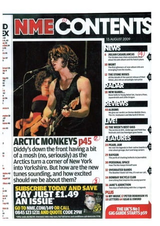
2. This contents page is taken from the magazine NME. The contents page has a bold
masthead which says ‘contents’ in white as well as including the NME logo all sharing
a black background. Also, underneath the word contents is the date that the
magazine was issued. The large photo that has been placed in the middle is Alex
Turner from artic monkeys, who also are the main story of the magazine and
underneath the picture has a quick introduction of what the article may be about.
There are two index list placed on both the left side and the right side of the page.
The reason why they have two separate index list is so the audience can find what
they are looking for easier. The index list on the left is much smaller and is longer,
this is because it is showing the reader everything that the magazine has in it. The
right said is much small and the writing is bigger, this only incudes the more
important things that the magazine has so if the audience is looking for a more
popular part of the magazine then they don’t have to look through the whole long
list to find what they are looking for.
The colours that are mainly used in the contents page are black, red and yellow.
However, the colour that is used the most is black. This means that the other colours
stand out a lot more because there is less of it and it makes the audience attention
glide to that colour as there is less of it. This means that the colour is only used for
the most important things such as the page numbers. The main titles are in white
with black background so they can stand out more for the audience.
Underneath the main picture is a box with information about subscribing. The reason
why it is placed underneath the main information is because the reader will
automatically be drawn to the colours of it when they have finished reading the little
introduction about the main article. Also, the main instructions such as ‘go to’ and ‘or
call’ are in yellow because it helps the readers notice them parts more.