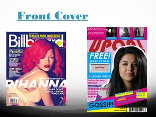
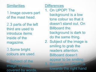
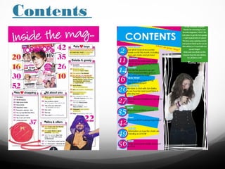
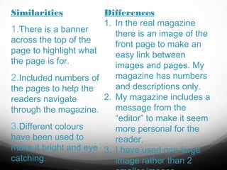
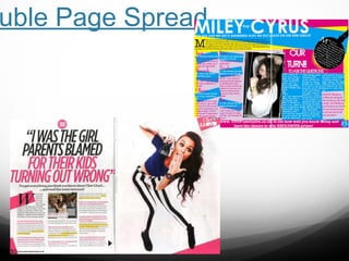
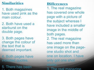
product use,
develop or
challenge forms
and conventions
of real media
products?
Front Cover
Similarities

1.Image covers part
of the mast head.

2.3 parts of the left
third are used to
introduce items
inside of the
magazine.

3.Some bright

colours are used.

4.Subject of the

image is partly
covered by words.

Differences
1. On UPOP! The
background is a low
tone colour so that it
doesn’t stand out. On
Billboard the
background is dark to
do the same thing.
2. Subject of the image is
smiling to grab the
readers attention.
Billboard doesn’t
appear to be smiling.
3. Barcode on UPOP! Is
towards the right hand
Contents
Similarities

1.There is a banner

across the top of the
page to highlight what
the page is for.

2.Included numbers of
the pages to help the
readers navigate
through the magazine.

3.Different colours

have been used to
make it bright and eye
catching.

Differences
1. In the real magazine
there is an image of the
front page to make an
easy link between
images and pages. My
magazine has numbers
and descriptions only.
2. My magazine includes a
message from the
“editor” to make it seem
more personal for the
reader.
3. I have used one large
image rather than 2
uble Page Spread
Similarities
1. Both magazines
have used pink as the
main colour.
2. Both have used a
starburst on the
double page.
3. Both pages have
change the colour of
the text that is
deemed important.
4. Both pages have
included quotes.
5. There has been

Differences
1. The real magazine
has covered one whole
page with a picture of
the subject whereas I
have included a smaller
image in the middle of
both pages.
2. The real magazine
has used more than
one image on the pageone studio shot and
one on location. I have
only got one shot
studio.

Question 1 AS Media

  • 1.
    product use, develop or challengeforms and conventions of real media products?
  • 2.
  • 3.
    Similarities 1.Image covers part ofthe mast head. 2.3 parts of the left third are used to introduce items inside of the magazine. 3.Some bright colours are used. 4.Subject of the image is partly covered by words. Differences 1. On UPOP! The background is a low tone colour so that it doesn’t stand out. On Billboard the background is dark to do the same thing. 2. Subject of the image is smiling to grab the readers attention. Billboard doesn’t appear to be smiling. 3. Barcode on UPOP! Is towards the right hand
  • 4.
  • 5.
    Similarities 1.There is abanner across the top of the page to highlight what the page is for. 2.Included numbers of the pages to help the readers navigate through the magazine. 3.Different colours have been used to make it bright and eye catching. Differences 1. In the real magazine there is an image of the front page to make an easy link between images and pages. My magazine has numbers and descriptions only. 2. My magazine includes a message from the “editor” to make it seem more personal for the reader. 3. I have used one large image rather than 2
  • 6.
  • 7.
    Similarities 1. Both magazines haveused pink as the main colour. 2. Both have used a starburst on the double page. 3. Both pages have change the colour of the text that is deemed important. 4. Both pages have included quotes. 5. There has been Differences 1. The real magazine has covered one whole page with a picture of the subject whereas I have included a smaller image in the middle of both pages. 2. The real magazine has used more than one image on the pageone studio shot and one on location. I have only got one shot studio.