1. ANALYSIS OF ARTICLES- DOUBLE PAGE SPREAD 1
NME the top right third of the
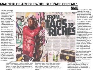
In
The Mise en scene is
created with a graffiti page the artist name
tagging wall. “Dizzee” is in small bold
The graffiti shows that white capitals on a black
Dizzee Rascal (the background making it stand
artist) is rebellious out, this informs the reader
and shows he lives on who the article is about.
life on the edge. The In small italics the Byline
tagging sticks to (credit for author and
Dizzee Rascals genre photographer) is shown.
of music which is hip- This just tells the reader
hop and rap. information on who wrote
The main image used the article and who the
dominates the whole photographer is.
page, the shot is taken The main heading/headline
of him so he's in the is in black bold text jumping
centre of the frame out of the page to the
relating to him always reader as it‟s the first thing
wanting to be centre of you notice. It‟s a play on
attention, the shot is words as it says “Tags to
also taken of him riches” and not “Rags to
looking away as he's up riches” as Dizzee explains
to mischief and rebelling in his article he used to
against everyone. rebel and graffiti linking
back to the main image.
The page number and
masthead is again seen The second image used is
on the bottom of the the background on the
page, this runs through article page. This is of beer
out all of the magazine bottles and a stereo linking
just to remind the reader to the main image and Mise
what article/ issue they en scene of rebellion and
are reading. mischief.
In the article there are 4 columns used so its set Copy (text) begins with A large letter Y using The sub-heading is a small preview of
out in a neat and appealing way for the reader Drops Cap, this is a more appealing way to what's to read about in the article, it
to enjoy the article. Also our eyes are drawn to start the article drawing the attention of the tells us how Mercury Prize and Kate
the stereo and beer bottles as that is where our reader to the start of the article and to carry on Moss have been in the news but this is
focus is at. reading. an article worth reading.
2. Analysis of
written article
The article itself is basically about Dizzee‟s life now he is famous,
what has changed, what he has succeeded and about what's
going to happen next for his music career.
The article includes information about Dizze Rascals music career,
dress, style and being the main attention in the music industry. The
article also talks briefly about how she became famous and history
of becoming where she is today.
The style of the article is professional and reporting Dizzee
Rascals life. It has a lot of information about his new found fame
life, and how he is normally on a day to day basis.
It is written in 4 short columns each of approx 75-100 words this
breaks down the article for the reader so its not to daunting for the
reader.
The main heading/headline is bold and black on top of a white
background as if the words are jumping out the page and onto the
reader, making it the main focal point of the page.
3. ANALYSIS OF ARTICLES- Q
MAGAZINE
The main image is
of Lady Gaga Lady Gaga‟s
which is who the name is across
article is about. the banner on the
The image uses the article side of the
rules of third putting spread, it is
her in centre, it is a shown quite small
close shot of her but looks like it
dominating the has been written
entire page so all by hand but with a
focus and eye sophisticated
contact is on her. edge.
The photo has The copy starts of
been edited so that with the letter „L‟
it is black and and this letter is
white/ sepia printed filling up the
creating a vintage whole page being
and sophisticated/ the focal point, the
sexy look to the clour chosen is red
article. this being one of
the house style
The image is colours of Q
simple and she magazine as well
seems to be as being a feminine
wearing no clothing sexy colour.
on top but chains Showing her to be
around her neck, a strong dominant
this shows she isnt woman.
afraid to be natural
The black writing on top of the white The copy is set out so its in 3
background shows elegance columns and blocks within that The page number and masthead is shown at
suggesting the audience of this so its clear and neat and not the bottom of the page reminding the audience
magazine is a sophisticated woman. busy for a reader who wants what the magazine is and what page it is.
nothing but the article to read. Also a website telling you to subscribe is shown
at the bottom.
4. Analysis of written article 2
The article includes information
about Lady Gaga‟s music career,
dress, style and being the main
attention in the music industry. The
article also talks briefly about how
she became famous and history of
becoming where she is today.
The style of the article is
professional and reporting Lady
Gaga‟s life. It has a lot of
information about how she thinks
about things, her llife now famous
and what she has had to give up
along the way to where she is
today.
It is written in 3 short columns each
of approx 200 words this simply
breaks down the article for the
reader so its neat and tidy to read.
There isn't a main
heading/headline however Lady
Gaga‟s name is printed in the
banner of the page and this shows
her simplicity and elegance. It also
show's she doesn‟t need a lot of
fuss to come across as her
personality is big enough.
5. Analysis of double page spread
3- We Love Pop On the right page
The title is in the
of the double page
spread there is a
font colours of
long shot of the
pink and black.
artist “Cher
Pink being girly
Lloyd”, by using
and feminine
the rules of thirds
appealing to
her face is the
young girls,
focal point being
however the black
in the centre of
gives the article
the shot. She is
and edge and
sharpness
shown on a white
background
appealing to the
creating the shot
reader to read on.
to be simple and
The pink and
engaging. We see
black is also the
she is using a
colours used
camera taking
throughout the
pictures which
magazine as it is
shows her fun and
the house style.
girly side
appealing to the
target audience of
young girls.
However her hand
on her mouth in a
“shock” posistion
suggests she has
been up to
The article is set out in blocks and in mischief giving the
question and answer making it very basic. The heading is in simple black writing telling us to read the article because everything article a rebellious
This appeals to the younger audience as we already know about the artist doesn‟t compare to this interview. By telling us to feel .
they can search there favourite questions read the interview “Now!” it feels as if we as the reader are being shouted at to read
and answers easy and quick. the article because we will be amazed by the interview, which gives the interview
rebellion.