SlideShare a Scribd company logo
1 of 3
The color scheme of the magazine
includes grey, white, red and
green- which are all quite punk-
esque colors. The green heading
draws the reader’s eye in and
relates to the band being Green
Day.
The more minor stories
are headed in red, the
font is also significantly
smaller.
The light grey background
compliments the band’s black
clothes.
The black border around the
white writing is a great
contrast and really stands
out, draws the eye in. It’s a
very monochromatic theme
and links in again with the
punk-esque vibe. The
different artists are separated
by equally contrasting red
stars.
The issue number tells
the reader how long the
magazine has been
running and therefore,
whether it is successful.
The white color of
the heading stands
our brilliantly
against the black
and grey and the
aggressive,
exuberant font
choice really links
in with the punk
theme.
The position of the band
members is significant as
the closest person to the
camera is the most
important, working
down to the least
important being furthest
away.
The photo is a ‘head and
shoulders’ shot to evoke
more emphasis on the
bizarre facial features which
again, links in with the wild
side of being in a punk
band. This shot is an
example of Direct Mode of
Address and forms a
connection with the reader.
(eye contact)
The color scheme of the
contents page is very different
to that of the front cover- the
colors are more ‘toned down’ ,
makes it easier on the eyes after
the loud, bright font cover.
The main colors are grey, red
and black- it’s still bordering
rock-related colors but not as
high-impact. The red
numbering stands out so the
reader knows what pages to
turn to.
The black bold font are the
article headings and the
smaller black font tells the
reader what the article is
about.
The shot of Billie Joe is a
medium shot (waist
upwards) as that is where
the detail is focused. It is
better to have this shot as a
close-up shot because the
picture may portray a
different affect on the
reader. E.G; a close-up shot
of his face, encapsulates his
expression and those
earphones which brings the
main focus on music.
The main bright colour
that really stands out is
Billie Joe’s scarf- it draws
the eye into the shot of
Billie and links in with the
rocky pop-art-esque feel.
The bold black fonts
are parallel to each
other which makes it
easy for the reader to
read. The writing
headlined in bold are
what the reader should
be paying attention to,
like the contents
header and date
number.
As we can see, one
page is dedicated to a
full scale picture of
Green Day which could
signify their influence
on the music industry
and the full scale shot
of them feels very
powerful and superior
which would relate to
this iconic rock band’s
impact.
The colour scheme of the next page is based on fiery
colours which could relate to the sexual euphemism
in the article.
The most significant
writing is headlined in
bold red (like the sub-
heading ) to catch the
eye of the reader.

More Related Content

What's hot

Front cover analysis
Front cover analysisFront cover analysis
Front cover analysisCharis Creber
 
Audience profiling
Audience profilingAudience profiling
Audience profilingLewisCusker
 
Analysing Doublepage Spreads
Analysing Doublepage SpreadsAnalysing Doublepage Spreads
Analysing Doublepage Spreadsguestcde365
 
Magazine Double Page Spread Research
Magazine Double Page Spread ResearchMagazine Double Page Spread Research
Magazine Double Page Spread ResearchEvieTheodore
 
Magazine advert analysis jay z
Magazine advert analysis jay zMagazine advert analysis jay z
Magazine advert analysis jay zjadeashworthx
 
Print Production Case Study
Print Production Case Study Print Production Case Study
Print Production Case Study Hannah Wicks
 
Analysis of double page Spread
Analysis of double page SpreadAnalysis of double page Spread
Analysis of double page SpreadSeadaM97
 
Double Page Spread 1
Double Page Spread 1 Double Page Spread 1
Double Page Spread 1 HannahO4997
 
Task 3 - Brand identity and Mode of Address
Task 3 - Brand identity and Mode of AddressTask 3 - Brand identity and Mode of Address
Task 3 - Brand identity and Mode of Addressgregor9386
 
Task 2 ~Front Cover Reveiw
Task 2 ~Front Cover ReveiwTask 2 ~Front Cover Reveiw
Task 2 ~Front Cover Reveiwjoeeroper
 
Billy Lynn’s Long Halftime Walk
Billy Lynn’s Long Halftime WalkBilly Lynn’s Long Halftime Walk
Billy Lynn’s Long Halftime WalkElizabeth Cali
 
Task 4 – Representation Analysis
Task 4 – Representation AnalysisTask 4 – Representation Analysis
Task 4 – Representation Analysisjoeeroper
 
Task 4 - Representation Analysis
Task 4 - Representation AnalysisTask 4 - Representation Analysis
Task 4 - Representation Analysisgregor9386
 
Task 3 Brand Identity And Mode Of Address
Task 3 Brand Identity And Mode Of AddressTask 3 Brand Identity And Mode Of Address
Task 3 Brand Identity And Mode Of Addressjoeeroper
 

What's hot (18)

Cover 3
Cover 3Cover 3
Cover 3
 
Front cover analysis
Front cover analysisFront cover analysis
Front cover analysis
 
Audience profiling
Audience profilingAudience profiling
Audience profiling
 
Radial analysis
Radial analysisRadial analysis
Radial analysis
 
Radial analysis
Radial analysisRadial analysis
Radial analysis
 
Analysing Doublepage Spreads
Analysing Doublepage SpreadsAnalysing Doublepage Spreads
Analysing Doublepage Spreads
 
Magazine Double Page Spread Research
Magazine Double Page Spread ResearchMagazine Double Page Spread Research
Magazine Double Page Spread Research
 
Magazine advert analysis jay z
Magazine advert analysis jay zMagazine advert analysis jay z
Magazine advert analysis jay z
 
Textual analysis genre
Textual analysis   genreTextual analysis   genre
Textual analysis genre
 
Print Production Case Study
Print Production Case Study Print Production Case Study
Print Production Case Study
 
Analysis of double page Spread
Analysis of double page SpreadAnalysis of double page Spread
Analysis of double page Spread
 
Double Page Spread 1
Double Page Spread 1 Double Page Spread 1
Double Page Spread 1
 
Task 3 - Brand identity and Mode of Address
Task 3 - Brand identity and Mode of AddressTask 3 - Brand identity and Mode of Address
Task 3 - Brand identity and Mode of Address
 
Task 2 ~Front Cover Reveiw
Task 2 ~Front Cover ReveiwTask 2 ~Front Cover Reveiw
Task 2 ~Front Cover Reveiw
 
Billy Lynn’s Long Halftime Walk
Billy Lynn’s Long Halftime WalkBilly Lynn’s Long Halftime Walk
Billy Lynn’s Long Halftime Walk
 
Task 4 – Representation Analysis
Task 4 – Representation AnalysisTask 4 – Representation Analysis
Task 4 – Representation Analysis
 
Task 4 - Representation Analysis
Task 4 - Representation AnalysisTask 4 - Representation Analysis
Task 4 - Representation Analysis
 
Task 3 Brand Identity And Mode Of Address
Task 3 Brand Identity And Mode Of AddressTask 3 Brand Identity And Mode Of Address
Task 3 Brand Identity And Mode Of Address
 

Similar to House theme mag analusis

Hannah Wood Music Magazine Analysis
Hannah Wood Music Magazine Analysis Hannah Wood Music Magazine Analysis
Hannah Wood Music Magazine Analysis hannahwood88
 
Double page spread analysis 2
Double page spread analysis 2Double page spread analysis 2
Double page spread analysis 2heatherjanew
 
My magazine research
My magazine researchMy magazine research
My magazine researchadinewenner
 
My magazine research
My magazine research My magazine research
My magazine research adinewenner
 
My magazine research
My magazine research My magazine research
My magazine research adinewenner
 
Research- Double page spread
Research- Double page spreadResearch- Double page spread
Research- Double page spreadalicegrimshaw
 
Music magazines pp
Music magazines ppMusic magazines pp
Music magazines ppGatkinson27
 
Research- Double page spread
Research- Double page spreadResearch- Double page spread
Research- Double page spreadalicegrimshaw
 
Signs And Signifiers - Music Magazines
Signs And Signifiers - Music MagazinesSigns And Signifiers - Music Magazines
Signs And Signifiers - Music MagazinesMattR298
 
Rock magazine covers
Rock magazine coversRock magazine covers
Rock magazine coversSigridsynnove
 
Double page spread analysis
Double page spread analysisDouble page spread analysis
Double page spread analysisjosha008
 
Similar music magazine analysis
Similar music magazine analysisSimilar music magazine analysis
Similar music magazine analysisJessica Davies
 

Similar to House theme mag analusis (20)

Hannah Wood Music Magazine Analysis
Hannah Wood Music Magazine Analysis Hannah Wood Music Magazine Analysis
Hannah Wood Music Magazine Analysis
 
Radial analysis
Radial analysisRadial analysis
Radial analysis
 
Double spread analysis
Double spread analysisDouble spread analysis
Double spread analysis
 
Double page spread analysis 2
Double page spread analysis 2Double page spread analysis 2
Double page spread analysis 2
 
My magazine research
My magazine researchMy magazine research
My magazine research
 
My magazine research
My magazine research My magazine research
My magazine research
 
My magazine research
My magazine research My magazine research
My magazine research
 
Research- Double page spread
Research- Double page spreadResearch- Double page spread
Research- Double page spread
 
Music magazines pp
Music magazines ppMusic magazines pp
Music magazines pp
 
Research- Double page spread
Research- Double page spreadResearch- Double page spread
Research- Double page spread
 
Signs And Signifiers - Music Magazines
Signs And Signifiers - Music MagazinesSigns And Signifiers - Music Magazines
Signs And Signifiers - Music Magazines
 
Rock magazine covers
Rock magazine coversRock magazine covers
Rock magazine covers
 
Double page spread analysis
Double page spread analysisDouble page spread analysis
Double page spread analysis
 
Similar music magazine analysis
Similar music magazine analysisSimilar music magazine analysis
Similar music magazine analysis
 
Textual Analysis
Textual AnalysisTextual Analysis
Textual Analysis
 
Textual Analysis
Textual AnalysisTextual Analysis
Textual Analysis
 
Deconstructions
DeconstructionsDeconstructions
Deconstructions
 
Double page spread analysis
Double page spread analysisDouble page spread analysis
Double page spread analysis
 
Double page spread analysis
Double page spread analysisDouble page spread analysis
Double page spread analysis
 
Magazine research
Magazine researchMagazine research
Magazine research
 

House theme mag analusis

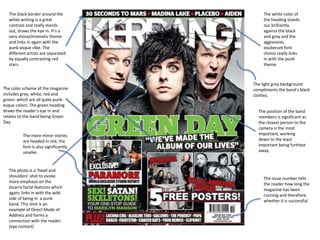
  • 1. The color scheme of the magazine includes grey, white, red and green- which are all quite punk- esque colors. The green heading draws the reader’s eye in and relates to the band being Green Day. The more minor stories are headed in red, the font is also significantly smaller. The light grey background compliments the band’s black clothes. The black border around the white writing is a great contrast and really stands out, draws the eye in. It’s a very monochromatic theme and links in again with the punk-esque vibe. The different artists are separated by equally contrasting red stars. The issue number tells the reader how long the magazine has been running and therefore, whether it is successful. The white color of the heading stands our brilliantly against the black and grey and the aggressive, exuberant font choice really links in with the punk theme. The position of the band members is significant as the closest person to the camera is the most important, working down to the least important being furthest away. The photo is a ‘head and shoulders’ shot to evoke more emphasis on the bizarre facial features which again, links in with the wild side of being in a punk band. This shot is an example of Direct Mode of Address and forms a connection with the reader. (eye contact)
  • 2. The color scheme of the contents page is very different to that of the front cover- the colors are more ‘toned down’ , makes it easier on the eyes after the loud, bright font cover. The main colors are grey, red and black- it’s still bordering rock-related colors but not as high-impact. The red numbering stands out so the reader knows what pages to turn to. The black bold font are the article headings and the smaller black font tells the reader what the article is about. The shot of Billie Joe is a medium shot (waist upwards) as that is where the detail is focused. It is better to have this shot as a close-up shot because the picture may portray a different affect on the reader. E.G; a close-up shot of his face, encapsulates his expression and those earphones which brings the main focus on music. The main bright colour that really stands out is Billie Joe’s scarf- it draws the eye into the shot of Billie and links in with the rocky pop-art-esque feel. The bold black fonts are parallel to each other which makes it easy for the reader to read. The writing headlined in bold are what the reader should be paying attention to, like the contents header and date number.
  • 3. As we can see, one page is dedicated to a full scale picture of Green Day which could signify their influence on the music industry and the full scale shot of them feels very powerful and superior which would relate to this iconic rock band’s impact. The colour scheme of the next page is based on fiery colours which could relate to the sexual euphemism in the article. The most significant writing is headlined in bold red (like the sub- heading ) to catch the eye of the reader.