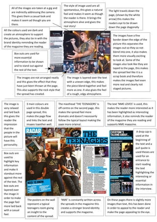
1. The style of image used are all
All of the images are taken at a gig and
spontaneous, this gives a natural The light travels down the
are indirectly addressing the camera.
feel and makes it seem as though page, (shown by the white
This gives them a casual look and
the reader is there. It brings the arrow) this makes the
makes it seem ad though you are
atmosphere alive and gives the readers eye to be drawn
there.
real story! down the page diagonally
All the colours used are dark and
create an atmosphere to support The images have a fine
the pictures, they also tie in with the border down the edge of the
brand identity reminding the reader picture this separates the
of the magazine they are reading. images out so they so not
blend into one, it also makes
Box outs are used for
them more visually exciting
more essential
to look at. Some of the
information to be shown
images also look like they are
and to stand out against
taped to the page, this makes
the rest of the text.
the spread feel like it is a
The images are not arranged neatly The image is layered over the text scrap book and therefore
and this gives the effect that they with a uneven edge, this makes makes the images feel even
have just been thrown at the page. the piece blend together and feel more real and clearly not
This also supports the rock style that more as one. It also gives the feel staged pictures.
the spread has created. of a rough, edgy atmosphere.
The image is 3 main colours are The masthead ‘THE TEENAGERS’ is The text ‘NME LOVES’ is used, this
very relaxed used in this double off centre on the second page, this makes the reader more interested as it
and laid back page spread, this makes the spread feel more has been highlighted as interesting
this gives the makes the page flow dramatic and doesn’t necessarily information, it also reminds the reader
reader the and links the text and follow the typical layout making the of the magazine they are reading and
impression images together well. page more original. supports NME magazine.
that the
people in the A drop cap is
picture will used at the
have this beginning of
personality. the text and a
pull quote is
Box outs are used theses are
used to used for an
highlight key entrance to
information start reading
and make it the text
standout more highlighting the
against the rest interesting or
of the text. The essential
box outs are information in
layered over the interview.
the image in
order to make
The posters on the wall ‘NME’ is constantly written across On these pages there is slightly more
the page feel
represent a typical the spreads in the magazine this images than text, this has been done
more laid back
teenagers room giving creates a stronger brand identity in order to appeal to the reader and
with a casual
an insight to the and supports the magazine. make the page appealing to the eye.
feel.
content of the spread.