
Recommended
More Related Content
What's hot
What's hot (20)
Similar to TITLE SEQUENCE ANALYSIS - Rush Hour (1999)
Similar to TITLE SEQUENCE ANALYSIS - Rush Hour (1999) (20)
Recently uploaded
Recently uploaded (20)
TITLE SEQUENCE ANALYSIS - Rush Hour (1999)
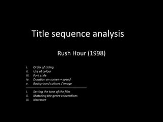
- 1. Title sequence analysis Rush Hour (1998) i. Order of titling ii. Use of colour iii. Font style iv. Duration on screen + speed v. Background colours / image ---------------------------------------------------------- i. Setting the tone of the fIlm ii. Matching the genre conventions iii. Narrative
- 2. Distribution company logo This is the first thing to appear in the title sequence. Displaying the distribution company logo is a typical convention of title sequences as it portrays that it is the most important company involved in the film.
- 3. Director credit This is given twice to display the significance of the director. This credit is also the only name besides the main actors’ credits that appear in the centre of the scene, connotating the recurring convention of having the most important names in the centre. Font style The sans-serif font is very simple and has the names of companies and people in bold, capital letters while the supplementing words of the credit – e.g. “Directed by” – are significantly smaller and thinner as they allow a contrast to be built between the role of the person/company and the actual name. This credit is the first credit that does not attempt to give more attention to the scene. Rather than this, it gives equal importance to the director and the scene. The scene where this credit appears and is giving importance happens to be the scene in which one of the main actors, Jackie Chan, makes their first appearance in the film.
- 4. Main actor names These are the first casting credits that appear in the title sequence. This is a typical convention of action-comedy films as these actors are the ones delivering the majority of the action and the jokes. These are the only casting credits that appear in the centre of the shot, representing the importance of the A-list actors who are given privilege over any other actors. Due to this special privilege, they are granted greater prominence on the screen. These credits are also the first to appear over scenes of the film. This correlates with how these people are part of the actual film.
- 5. Film name This is the only title credit to appear in a different colour to the rest of the credits, giving more significance to the film name more than any other credit. The animation of this credit is entirely different compared to the rest of the credits as well. It explodes onto the screen, decreasing in size and centres itself in the space of a second. The sudden and quick appearance of the credit shocks the audience and thus gives connotations of a typical action film due to the fast-pace and explosive nature of the credit.
- 6. Supporting actor names Now that the main actors’ names are out the way, the supporting actors’ names appear smaller and either to the left or right – unlike the main actor names that appeared enlarged and right in the centre. The supporting actors are given less space on the screen as they are less important than the main actors. The purpose of this is to enable the film to go into its opening scene now that the main opening credits – the distributor, production company, director and main actors – are out of the way. The rule of thirds is utilised to convey the side of the scene that the audience should be focusing on, during which the supporting actor credit appears in either the first third or final third. For example, the actor’s name is on the right of the screen while the boat is to the left, which is what we should be focusing on instead of the credit. This signifies how the supporting actors’ credits are given less importance and allows the scene to develop.