1. Draft Layouts Film Magazine
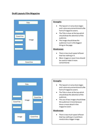
Title
Coverline
Image
Coverline
Image
Title
Coverline
Coverline
CoverlineImage
Strengths
The layoutis inveryclearstages
and isalsoveryconventional tothe
formof magazine covers.
The Title isclear at the top which
shoulddraw the attentionof the
audience.
The image shoulddraw the
audience in asit isthe biggest
thingon the page.
Weaknesses
There istoo much space leftover
that has nothinginit.
More imagesor coverlinesshould
be usedto make it more
conventional.
Strengths
The layoutis inveryclearstages
and isalsoveryconventional tothe
formof magazine covers.
The Title isclear at the top which
shoulddraw the attentionof the
audience.
The use of two imagesshoulddraw
the audience inmore because
there ismore detail inthe
magazine cover.
Weaknesses
There istoo much space leftover
that has nothinginit and there
needstobe a biggerimage.
2. Draft Layouts for a filmposter
Title
Image
Cast and directors
Title
Image
Cast and directors
About the film (Quote)
Strengths
The layoutis inveryclearstages
and isalsoveryconventional tothe
formof horror filmposters.
The Title isclear at the top which
shoulddraw the attentionof the
audience.
The use of the big image inthe
middle clearlygivesthe audience
an ideaof what the filmtrailerwill
be about.
Weaknesses
There isn’tmuchdetail aboutwhat
the filmwill be about,onlythe
image will give the audience a
roughidea.
Strengths
The layoutis inveryclearstages
and isalsoveryconventional tothe
horror genre.
The Title isclear at the side which
shoulddraw the attentionof the
audience.
The use of the big image inthe
middle clearlygivesthe audience
an ideaof what the filmtrailerwill
be about.
The use of the quote aboutthe
filmwill draw the audience in.
Weaknesses
The layoutis slightly
unconventional tothe formof
posters.
The layoutis slightlyclustered
because the image isslightly
too big.