Hifi Laxmi Nagar Call Girls Service WhatsApp -> 9999965857 Available 24x7 ^ D...
Film magazine analysis
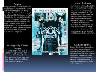
1. Graphics Mode of address
The graphics chosen for this particular In an attempt to try and make the
magazine cover are intended to relate film seem much more interesting
and simulate the genre and design and exciting to the targeted
behind the film idea itself. For example audience, quotes such as “The
the solid neon like font is used so that it world’s best movie reviews” are
relates to the film being advertised on used in order to make the film
the front of the page (Tron Legacy). seem like a more interesting
The way in which the disc being held release for the public to look at.
by the character on the front to The way in which the film
represent an “O” is also an interesting characters and graphics are laid
feature as it makes the characters and out is done primarily so that it
the film itself seem much more seems more interesting to the
involved in the magazine. certain age group and fans that
might be interested in such a film.
Photography / Cover Latest headlines
Despite this film being one of the
image main topics in this magazine,
The photo used for this cover is headlines for different films being
supposed to represent the main released around the same time are
characters of the film and make shown also. For example it says
them seem much more important “Jackass returns” which helps to
since they are standing boldly on advertise for this film as well as
the front of the magazine. helps towards making the public
aware of the release.
2. Graphics Mode of address
The graphics of the cover are Despite this film being one of the
intended to try and relate to the idea main topics in this magazine,
and design behind the film itself. For headlines for different films being
example the way in which the title is released around the same time are
designed to look like the design of a shown also which allows the
city from a birds eye view. Also the readers to be informed about an
idea of having the main character of even larger selection of films apart
the film (Dom Cobb) helps to relate from the main one displayed on
to the fact that the film mainly being the front of the magazine.
displayed (Inception) is the main
topic of this magazine. Also the font
that has been chosen for the
magazine relates to the cover as it
consists of a colour and layout that
bends well with the rest of the cover.
Photography / Cover
Latest headlines
image Despite this film being one of the
The photo of Dom Cobb (Played by main topics in this magazine,
Leonardo Dicaprio) used for this headlines for different films being
cover is supposed to represent the released around the same time are
main character of the film and make shown also. For example on the right
him seem much more important of the cover it lists a series of new
since he is standing boldly on the films and various opinions and the
front of the magazine. Also the way latest news for them. Such as “Toy
the lighting of the character story 3 vs Shrek 4” Which shows that
suggests that the film has a rather the magazine consists of topics
mysterious or secretive side to it. which relate or involve arguments
about the topic.
3. Graphics Latest headlines
The designs for the cover are very Along the side of the picture rather
basic with no extreme usage of than listing the films by their titles
texture or pictures to make the they have been given headers that
cover stand out however the idea of relate to the film but try to keep you
having Megan Fox on the front in guessing what they are (For
order to advertise the film example “The Facebooking fincher”
“Jennifer's body” helps to capture for the film “The social network”.
the viewers attention instead. Also Also the first half of the headers are
the idea of having one of her hands set in bold which draws your
covered in blood helps to give the attention towards the most striking
viewers a rough idea of what the part of the header.
film relates to.
Photography / Cover Mode of address
image The cover is laid out so that it has
The idea of having not only main headlines listed all around the
headlines to advertise the films but main topic in the centre which is the
also photos from the latest main film being covered in the
releases helps to give viewers a magazine “Jennifer’s body”. By
rough outline of what to expect in having headlines such as “128 films
the films as well as key scenes that reviewed” and “94 more movers,
possibly will be included in them. shakers, movies & makers!” this
allows for the viewers to understand
that the product is advertising for
more than one film.
4. Graphics Latest Headlines
The graphics of the cover are The headlines for many films are
intended to try and relate to the displayed and laid out all around
idea and design behind the film the main image in the centre and
itself. For example the idea of have been arranged into
having streaked lighting in the categories so that each header
background helps to show that the relates to a specific part of the
film relates to car chases hence cover such as the new releases
also the idea of having the car in (Cowboy’s and aliens, Sherlock
the foreground. Also the title of holmes 2, etc) being displayed on
the film “The green hornet” has a the left.
font, colour and look about it that
makes it relate to the product
much more as it has a similar look
to it.
Photography / Cover
Mode of address
image Although the film shown in the
The main image used for the centre of the cover is the
cover has been taken from the magazine’s main topic it also
main film which this magazine is includes advertisements for
advertising but also photos have various other films of either
been used to help advertise for similar genre or release date so
various other films which have that the whole product relates to
been planned to be released at a every part that is being displayed.
similar time.
5. Photography / Cover Graphics
image The graphics for the cover are
The main image being shown in not particularly extreme as the
a bold font at the top of the cover has no headlines or major
cover, taking up most if not all of pieces of artwork that stand
the space on the page along with out. The cover is made up of the
the main photo/image used for main photo used, the magazine
the magazine. And since the title and one headline that takes
magazine is well known the up the whole bottom right
image is shown over lapping the corner. The graphics for the
title. photo chosen however stand
out as they allow for the viewer
to immediately understand just
what the magazine is about .
Latest Headlines
Mode of address No other headlines for other films
In an attempt to try and make the have been shown which has made
film seem much more interesting the cover seem very basic without
and exciting to the targeted giving the viewers any other
audience, quotes such as “The sins information apart from the
of Spider-man” and “Inside the fun Magazine title and a few quotes
and fear of Spider-man 3” are used about the magazine also. This is
in order to make the film seem like one of the reasons why I find this
a more interesting release for the specific magazine very poorly
public to look at. done as it does not include any
other information that is
necessary for the viewers to know
about.
6. Photography / Cover Mode of address
The magazine intends on
image showing the viewers that the
The main image being shown in magazine is advertising for a
the centre, taking up most if not number of films and topics
all of the space on the page and which are listed and displayed
since the magazine is well across the front cover (Listed
known the image is shown over on the bottom left for
lapping the title. example). However to show
what the magazine is talking
about specifically, a photo has
been included in order to make
the viewers understand what
the magazine is talking about in
particular.
Graphics Latest Headlines
Rather than having most of
The graphics of the cover are
the headlines scattered in
intended to try and relate to the
small arranged groups around
idea and design behind the film
the cover , instead has the
itself. The way in which this
headlines all grouped
magazine has gone about doing
together in one specific spot
this is by having the main
which in this case is on the
character (The mad Hatter) on
bottom left hand side which
the front to help show that the
means that much more of the
main topic is covering the film
cover can be utilised for
“Alice in Wonderland”.
things such as photos and
titles.