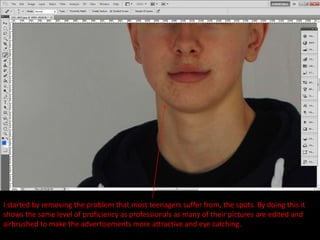
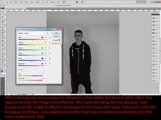
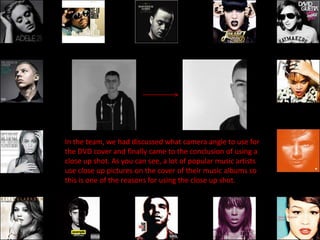
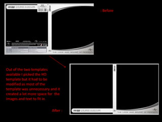
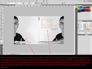
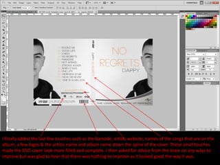
The next 2 slides will feature some edited pictures that were created to be used for
both the DVD cover & the magazine advertisement. Many colleagues did believed
they were really good but I decided not to use them because I questioned my self if
people would understand what the angel wings represented and how they link to
the video so I believed that it was best to just leave them out.
Here are the final samples of
the edited pictures that were
created but not used.
After countless hours of looking through photos, this is the photo chosen by myself and the
team to use for the music DVD cover which I believe is an excellent choice as the quality is
perfect.
I started by removing the problem that most teenagers suffer from, the spots. By doing this it
shows the same level of proficiency as professionals as many of their pictures are edited and
airbrushed to make the advertisements more attractive and eye catching.
After removing any unnecessary bits and pieces I then added the black & white effect that
appears to make the image more effective. The reason for doing this was because I had
chosen to do the simple & effective technique for the music DVD cover instead of a colourful
& creative technique. I also applied the feather tool that smoothens the photo to give that
more ‘professional’ look.
In the team, we had discussed what camera angle to use for
the DVD cover and finally came to the conclusion of using a
close up shot. As you can see, a lot of popular music artists
use close up pictures on the cover of their music albums so
this is one of the reasons for using the close up shot.
: Before


Out of the two templates
available I picked the HD
template but it had to be
modified as most of the
template was unnecessary and it
created a lot more space for the
images and text to fit in.

                           After :
We had trouble finding a small plain font to fit with the basic style that we had
chosen to do for the subsidiary tasks so we didn't have many fonts to choose
from but these fonts look perfect for the style and layout. After getting a sample
of each and trying to visualize what it would look like it came down to ‘NEOU’ &
‘Eurofurence.’ These both look very similar but after a few discussions amongst
the team we came to the conclusion of using the ‘NEOU’ font from dafont.com
After deciding what font to use, I placed the pictures onto the template and attempted different places for
the images to go and finally came to the idea of having some sort of symmetrical effect. I also added the text
and used a vibrant orange colour for the name of the album to detach the artists name and the album name
apart and to also add a bit of colour as I knew it would stand out from the black and white effect of the
pictures.
I finally added the last few touches such as the barcode, artists website, names of the songs that are on the
album, a few logos & the artists name and album name down the spine of the cover. These small touches
made the DVD cover look more filled and complete. I then asked for advice from the team on any ways to
improve but was glad to hear that there was nothing to improve as it looked good the way it was.
Music dvd cover

Music dvd cover

  • 2.
    The next 2slides will feature some edited pictures that were created to be used for both the DVD cover & the magazine advertisement. Many colleagues did believed they were really good but I decided not to use them because I questioned my self if people would understand what the angel wings represented and how they link to the video so I believed that it was best to just leave them out.
  • 4.
    Here are thefinal samples of the edited pictures that were created but not used.
  • 5.
    After countless hoursof looking through photos, this is the photo chosen by myself and the team to use for the music DVD cover which I believe is an excellent choice as the quality is perfect.
  • 6.
    I started byremoving the problem that most teenagers suffer from, the spots. By doing this it shows the same level of proficiency as professionals as many of their pictures are edited and airbrushed to make the advertisements more attractive and eye catching.
  • 7.
    After removing anyunnecessary bits and pieces I then added the black & white effect that appears to make the image more effective. The reason for doing this was because I had chosen to do the simple & effective technique for the music DVD cover instead of a colourful & creative technique. I also applied the feather tool that smoothens the photo to give that more ‘professional’ look.
  • 8.
    In the team,we had discussed what camera angle to use for the DVD cover and finally came to the conclusion of using a close up shot. As you can see, a lot of popular music artists use close up pictures on the cover of their music albums so this is one of the reasons for using the close up shot.
  • 9.
    : Before Out ofthe two templates available I picked the HD template but it had to be modified as most of the template was unnecessary and it created a lot more space for the images and text to fit in. After :
  • 10.
    We had troublefinding a small plain font to fit with the basic style that we had chosen to do for the subsidiary tasks so we didn't have many fonts to choose from but these fonts look perfect for the style and layout. After getting a sample of each and trying to visualize what it would look like it came down to ‘NEOU’ & ‘Eurofurence.’ These both look very similar but after a few discussions amongst the team we came to the conclusion of using the ‘NEOU’ font from dafont.com
  • 11.
    After deciding whatfont to use, I placed the pictures onto the template and attempted different places for the images to go and finally came to the idea of having some sort of symmetrical effect. I also added the text and used a vibrant orange colour for the name of the album to detach the artists name and the album name apart and to also add a bit of colour as I knew it would stand out from the black and white effect of the pictures.
  • 12.
    I finally addedthe last few touches such as the barcode, artists website, names of the songs that are on the album, a few logos & the artists name and album name down the spine of the cover. These small touches made the DVD cover look more filled and complete. I then asked for advice from the team on any ways to improve but was glad to hear that there was nothing to improve as it looked good the way it was.