SlideShare a Scribd company logo
7 TOOLS OF QUALITY CONTROL
A POWERPOINT PRESENTATION BY ARYAN RAI(WITH CONCISE INDUSTRY RELATABLE EXAMPLES)
INTRODUCTION-
Definition of Quality Control: Quality control refers to the systematic process of ensuring that products or services meet
specified standards and customer requirements.
Importance in Various Industries: Quality control is crucial across diverse industries such as manufacturing, healthcare,
software development, construction, and service sectors. It helps organizations minimize defects, enhance customer
satisfaction, and maintain competitiveness.
Objective of this powerpoint: The primary objective of this presentation is to utilize the time I got in my vacation time
and provide a industry relatable examples on the subject matter of quality control and problem solving in a concise
manner while doing so I will also enhance my presentation skills as well as I firmly believe that learning is a journey not a
a destination.
OVERVIEW OF THE 7 TOOLS:
The 7 tools of quality
control, also known
as the "7 QC Tools,"
are a set of
techniques used for
process
improvement and
problem-solving.
They are:
Pareto Chart
Cause and Effect
Diagram (Ishikawa or
Fishbone Diagram)
Check Sheet Control Chart Histogram Scatter Diagram Flowchart
1-PARETO CHART
 Explanation of Pareto Principle: The Pareto Principle, also known as the 80/20 rule, suggests that roughly
80% of effects come from 20% of causes. In quality control, it means that a significant portion of
problems (80%) is often caused by a few key factors (20%).
 How to Construct a Pareto Chart: Steps include identifying and listing problems or causes, collecting
data on their frequency or impact, arranging them in descending order, and plotting them on a bar
chart. The tallest bars represent the most significant issues.
 Example Application : Lets plot a pareto chart for our incrency inprocess system and find out the vital
few reasons causing inprocess errors(hypothetically)
EXAMPLE PARETO CHART-INPROCESS ERRORS
Reason of
error
Number
of errors
Total
Percentage
Cumulative
percentage
Human
error/mishan
dling
11 50% 50%
Balance
fluctuation
5 23% 73%
Auto capture 3 14% 86%
Vernier
caliper failure
2 9% 95%
Actual below
limits
1 5% 100%
0%
20%
40%
60%
80%
100%
120%
0
2
4
6
8
10
12
14
16
18
20
Human
error/mishandling
Balance fluctuation Auto capture Vernier caliper
failure
Actual below limits
CUMULATIVE
PERCENTAGE
NUMBER
OF
ERRORS
ERROR TYPE
Inprocess error pareto chart
2-CAUSE AND EFFECT DIAGRAM (ISHIKAWA OR FISHBONE
DIAGRAM)
Purpose and Benefits: The Cause and Effect Diagram helps visualize the potential causes
of a problem or effect. It organizes brainstormed ideas into categories, facilitating root
cause analysis and solution generation.
Steps to Create a Cause and Effect Diagram: Identify the problem or effect, draw a
horizontal line (the "spine" of the fishbone), brainstorm potential causes categorized into
branches (e.g., people, methods, machines, materials, environment), and analyze the
causes. 5 Whys or Why-Why analysis can then be incorporated to fishbone diagram for
better brainstormoing.
Real-Life Example: In manufacturing, a cause and effect diagram can be used to
investigate defects in a product by considering 5+1 M factors related to
Man,Machine,Methods,Material,Measurement and Mother Nature.
FISHBONE DIAGRAM IN PHARMA
3-CONTROL CHART
 Definition and Importance: A Control Chart is a statistical tool used to monitor processes over time and detect any deviations or variations from
desired performance. It helps distinguish between common cause variation (inherent to the process) and special cause variation (due to external
factors).
 Statistical Monitoring: Control charts are statistical tools used to monitor processes over time. They provide a visual representation of process
variation and help distinguish between common cause variation (inherent to the process) and special cause variation (due to external factors).
 Key Components: A control chart typically consists of a central line representing the process mean and upper and lower control limits (UCL and
LCL) based on the process variation. These limits are usually set at three standard deviations from the mean and serve as boundaries for
identifying significant deviations from the norm.
 Types of Control Charts: There are various types of control charts depending on the nature of the data being monitored. Common examples
include the X-bar and R charts for variables data (measurements), and p-chart and c-chart for attribute data (counts or proportions of
nonconforming items).
 Interpretation: Control charts help users interpret process behavior. When data points fall within the control limits and show a random pattern,
the process is considered to be in statistical control, indicating that variations are consistent with common causes. However, if data points fall
outside the control limits or exhibit non-random patterns, it suggests the presence of special causes requiring investigation and corrective action.
 Continuous Improvement: Control charts are integral to the concept of continuous improvement in quality management. By providing early
warning signals of process deviations, they enable timely interventions to prevent defects, reduce variability, and enhance overall process
performance, thus supporting the pursuit of operational excellence.
EXAMPLE-CONTROL CHARTS.
 Lets plot a hypothetical control chart for Batch assay results.
 As you can see we have given random data and set a upper
Control limit and lower control limit in our excel formula bar.
 After setting ucl and lcl we have freeze the limits and now
I will delibratly let batch no. B329 and B334 assay result go out
Of limit.
 Which will be detected in our control chart in a trendline
mannar
Sr. No Batch no.
Assay
Result(%)
Average/
Mean(%)
Standard
Deviation
Upper
Control
Limit(+3)
Lower
Control
Limit(-3)
1 B321 97 99.4 7.73 114.59 84.21
2 B322 94 99.4 7.73 114.59 84.21
3 B323 92 99.4 7.73 114.59 84.21
4 B324 94 99.4 7.73 114.59 84.21
5 B325 99 99.4 7.73 114.59 84.21
6 B326 98 99.4 7.73 114.59 84.21
7 B327 107 99.4 7.73 114.59 84.21
8 B328 105 99.4 7.73 114.59 84.21
9 B329 119 99.4 7.73 114.59 84.21
10 B330 107 99.4 7.73 114.59 84.21
11 B331 95 99.4 7.73 114.59 84.21
12 B332 102 99.4 7.73 114.59 84.21
13 B333 102 99.4 7.73 114.59 84.21
14 B334 81 99.4 7.73 114.59 84.21
15 B335 103 99.4 7.73 114.59 84.21
16 B336 103 99.4 7.73 114.59 84.21
17 B337 105 99.4 7.73 114.59 84.21
18 B338 100 99.4 7.73 114.59 84.21
19 B339 93 99.4 7.73 114.59 84.21
20 B340 104 99.4 7.73 114.59 84.21
EXAMPLE-CONTROL CHARTS.
97
94
92
94
99
98
107
105
119
107
95
102 102
81
103 103
105
100
93
104
Mean(99.4)
UCL(114.59)
LCL(84.21)
80.00
85.00
90.00
95.00
100.00
105.00
110.00
115.00
120.00
B321 B322 B323 B324 B325 B326 B327 B328 B329 B330 B331 B332 B333 B334 B335 B336 B337 B338 B339 B340
Assay
Batch Number
Assay control chart
4-CHECK SHEETS
Definition and Purpose: A Check Sheet is a simple data recording tool used to collect and
organize data systematically. It helps in identifying patterns, frequencies, or trends in
processes or events.
Types of Data Captured: Check sheets can be used to record various types of data, such as
defects, errors, occurrences, or observations, depending on the specific quality control
needs.
Example of Check Sheet in Action: In a service industry, a check sheet can be employed
to track customer complaints by recording details such as the type of issue, time of
occurrence, and frequency, enabling the organization to prioritize improvement areas.
4-CHECK SHEETS
Structured Data
Collection: Check
sheets provide a
structured format for
collecting data,
ensuring consistency
and uniformity in
recording
observations or
occurrences.
Real-Time Recording:
They enable real-time
recording of data,
allowing teams to
capture information
as it occurs without
delay or reliance on
memory.
Versatility: Check
sheets are versatile
tools applicable
across various
industries and
settings, from
manufacturing to
healthcare, customer
service, and beyond.
Pattern Identification:
By organizing data in
a systematic manner,
they facilitate the
identification of
patterns, trends, or
recurring issues,
helping teams
pinpoint areas for
improvement.
Evidence-Based
Decision Making: The
data collected with
check sheets serves
as evidence for
decision making,
enabling teams to
prioritize
improvement efforts
and implement
targeted
interventions based
on factual insights.
EXAMPLE-CHECK SHEET.
5-HISTOGRAM
Definition and Purpose: A Histogram is a graphical representation of the distribution of
data, showing the frequency or count of observations within predefined intervals (bins).
It provides insights into the central tendency, dispersion, and shape of the data.
Steps to Create a Histogram: Determine the range of data values, divide them into
intervals or bins, count the number of observations falling into each bin, and plot the
data as bars with heights proportional to the frequencies.
Interpretation and Use in Quality Control: Histograms help identify patterns, trends, or
abnormalities in data distributions, enabling informed decision-making and process
improvements based on data analysis. Now lets create a hypothetical histogram in excel
and paste it here.
EXAMPLE-HISTOGRAM
Batch no.
Batch
Yield
BB001 93
BB002 89
BB003 89
BB004 96
BB005 97
BB006 91
BB007 97
BB008 89
BB009 89
BB010 95
BB011 89
BB012 91
BB013 97
BB014 96
BB015 91
BB016 98
BB017 91
BB018 97
BB019 90
BB020 96
6-FLOWCHART
 Definition and Importance in Quality Control: A Flowchart is a visual representation of a process or
workflow, depicting the sequence of steps, decisions, and interactions involved. It helps in
understanding, analyzing, and improving processes.
 Steps to Create a Flowchart: Identify the process to be documented, define the starting and ending
points, map out the sequence of steps, decision points, and feedback loops using standard symbols, and
review and refine the flowchart for accuracy.
 Example of Flowchart in Process Improvement: In Pharmaceutical manufacturing, a flowchart can be
used to illustrate the product journey from one process to another, identifying bottlenecks, delays,
Probable root causes of inefficiencies for targeted improvements.
EXAMPLE-FLOWCHART.
Tablet hardness above
limit
Review
compression
Process
Compression force within
BMR limit?
NO
Compression force high
or low?
Compression force high
plan of action
separated
and
quarantined
already
compressed
tablets
Sent for
destruction?
Sent for
destruction.
Sent for reprocess?
Resetted
machine
parameters
to get
optimum
hardness
Tablet Hardness within
limit.
Compression Machine
RPM Optimus?
Yes
Temp.,RH,DP within limit
Yes
Blend
parameters
met?
Yes
Review compression
process
No
Reprocess the blend
7-SCATTER DIAGRAM
 Purpose and Benefits: A Scatter Diagram visualizes the relationship between two variables by plotting data
points on a graph. It helps identify correlations, trends, or patterns in the data.
 How to Create a Scatter Diagram: Plot pairs of data points representing the two variables on a Cartesian
coordinate system, with one variable on the x-axis and the other on the y-axis. Analyze the pattern of points to
determine the relationship.
 Application in Identifying Relationships: In pharma manufacturing, a scatter diagram can be used to
investigate the relationship between process parameters (e.g., temperature, pressure) and product quality
characteristics (e.g., hardness, dissolution).
 Now lets plot a scatter plot between compression force and average hardness achieved per batch which
will show a positive correlation in the scatter plot along a trendline which will prove the conclusion
that increasing compression force will increase ave. hardness.
EXAMPLE-SCATTER PLOT DIAGRAM.
Compression
force(kn)
Average
Hardness(N)
30 89
28 88
22 82
21 82
33 91
43 110
32 89
48 113
28 86
43 103
22 79
46 108
32 90
28 85
47 111
21 79
23 85
42 103
50 118
33 88
70
75
80
85
90
95
100
105
110
115
120
20 25 30 35 40 45 50
Average
Hardness(N)
Compression force(kn)
Scatter Plot Diagram
CONCLUSION
 In conclusion, the "7 Tools of Quality Control" offer indispensable methods for organizations striving for
excellence in their processes and products. From Pareto charts pinpointing critical issues to flowcharts
illustrating workflows, each tool serves as a compass for navigating the complexities of quality
management. I have tried to contain this ppt as concise and practical as possible with relatable
examples and anecdotes. By implementing these techniques, businesses can uncover inefficiencies,
address root causes, and elevate standards to meet and exceed customer expectations. Yet, mastery of
these tools is not a destination but a journey of continuous improvement. Embrace the spirit of learning,
experimentation, and adaptation, for it is through these efforts that organizations truly thrive in today's
competitive landscape. Let us commit to the pursuit of quality, knowing that with dedication and
diligence, we can forge a path towards sustainable success. Thank you for joining me on this
exploration this far with so much paitence, and may your quality endeavors be fruitful and
rewarding.

More Related Content

Similar to Seven tools of quality control.slideshare

Retail service quality management
Retail service quality managementRetail service quality management
Retail service quality managementselinasimpson351
 
process monitoring (statistical process control)
process monitoring (statistical process control)process monitoring (statistical process control)
process monitoring (statistical process control)
Bindutesh Saner
 
Control Charts28 Modified
Control Charts28 ModifiedControl Charts28 Modified
Control Charts28 Modifiedvaliamoley
 
Quality control and inspection
Quality control and inspectionQuality control and inspection
Quality control and inspection
Sujal Topno
 
Spc overview mfg
Spc overview mfgSpc overview mfg
Spc overview mfg
James Yencho
 
Quality management system example
Quality management system exampleQuality management system example
Quality management system exampleselinasimpson0201
 
Notes
NotesNotes
Spc overview mfg
Spc overview mfgSpc overview mfg
Spc overview mfg
innobun
 
Quality management software reviews
Quality management software reviewsQuality management software reviews
Quality management software reviewsselinasimpson311
 
Iso quality management system definition
Iso quality management system definitionIso quality management system definition
Iso quality management system definitionselinasimpson321
 
Advantages of quality management system
Advantages of quality management systemAdvantages of quality management system
Advantages of quality management systemselinasimpson2201
 
Quality management in manufacturing
Quality management in manufacturingQuality management in manufacturing
Quality management in manufacturingselinasimpson2201
 
Purpose of quality management system
Purpose of quality management systemPurpose of quality management system
Purpose of quality management systemselinasimpson1801
 
Definition quality management
Definition quality managementDefinition quality management
Definition quality managementselinasimpson1401
 
IMPLEMENTATION OF STATISTICAL PROCESS CONTROL TOOL IN AN AUTOMOBILE MANUFACTU...
IMPLEMENTATION OF STATISTICAL PROCESS CONTROL TOOL IN AN AUTOMOBILE MANUFACTU...IMPLEMENTATION OF STATISTICAL PROCESS CONTROL TOOL IN AN AUTOMOBILE MANUFACTU...
IMPLEMENTATION OF STATISTICAL PROCESS CONTROL TOOL IN AN AUTOMOBILE MANUFACTU...
Angela Williams
 
Definition quality management system
Definition quality management systemDefinition quality management system
Definition quality management systemselinasimpson361
 

Similar to Seven tools of quality control.slideshare (20)

Retail service quality management
Retail service quality managementRetail service quality management
Retail service quality management
 
process monitoring (statistical process control)
process monitoring (statistical process control)process monitoring (statistical process control)
process monitoring (statistical process control)
 
Control Charts28 Modified
Control Charts28 ModifiedControl Charts28 Modified
Control Charts28 Modified
 
Introduction to SPC
Introduction to SPCIntroduction to SPC
Introduction to SPC
 
7qc Tools 173
7qc Tools 1737qc Tools 173
7qc Tools 173
 
7qc Tools 173
7qc Tools 1737qc Tools 173
7qc Tools 173
 
Quality control and inspection
Quality control and inspectionQuality control and inspection
Quality control and inspection
 
Spc overview mfg
Spc overview mfgSpc overview mfg
Spc overview mfg
 
Quality management system example
Quality management system exampleQuality management system example
Quality management system example
 
Notes
NotesNotes
Notes
 
Spc overview mfg
Spc overview mfgSpc overview mfg
Spc overview mfg
 
Quality management software reviews
Quality management software reviewsQuality management software reviews
Quality management software reviews
 
Iso quality management system definition
Iso quality management system definitionIso quality management system definition
Iso quality management system definition
 
Advantages of quality management system
Advantages of quality management systemAdvantages of quality management system
Advantages of quality management system
 
Quality management in manufacturing
Quality management in manufacturingQuality management in manufacturing
Quality management in manufacturing
 
Purpose of quality management system
Purpose of quality management systemPurpose of quality management system
Purpose of quality management system
 
Definition quality management
Definition quality managementDefinition quality management
Definition quality management
 
C O N T R O L L P R E S E N T A T I O N
C O N T R O L L  P R E S E N T A T I O NC O N T R O L L  P R E S E N T A T I O N
C O N T R O L L P R E S E N T A T I O N
 
IMPLEMENTATION OF STATISTICAL PROCESS CONTROL TOOL IN AN AUTOMOBILE MANUFACTU...
IMPLEMENTATION OF STATISTICAL PROCESS CONTROL TOOL IN AN AUTOMOBILE MANUFACTU...IMPLEMENTATION OF STATISTICAL PROCESS CONTROL TOOL IN AN AUTOMOBILE MANUFACTU...
IMPLEMENTATION OF STATISTICAL PROCESS CONTROL TOOL IN AN AUTOMOBILE MANUFACTU...
 
Definition quality management system
Definition quality management systemDefinition quality management system
Definition quality management system
 

Recently uploaded

一比一原版(Bradford毕业证书)布拉德福德大学毕业证如何办理
一比一原版(Bradford毕业证书)布拉德福德大学毕业证如何办理一比一原版(Bradford毕业证书)布拉德福德大学毕业证如何办理
一比一原版(Bradford毕业证书)布拉德福德大学毕业证如何办理
mbawufebxi
 
Unleashing the Power of Data_ Choosing a Trusted Analytics Platform.pdf
Unleashing the Power of Data_ Choosing a Trusted Analytics Platform.pdfUnleashing the Power of Data_ Choosing a Trusted Analytics Platform.pdf
Unleashing the Power of Data_ Choosing a Trusted Analytics Platform.pdf
Enterprise Wired
 
做(mqu毕业证书)麦考瑞大学毕业证硕士文凭证书学费发票原版一模一样
做(mqu毕业证书)麦考瑞大学毕业证硕士文凭证书学费发票原版一模一样做(mqu毕业证书)麦考瑞大学毕业证硕士文凭证书学费发票原版一模一样
做(mqu毕业证书)麦考瑞大学毕业证硕士文凭证书学费发票原版一模一样
axoqas
 
一比一原版(UIUC毕业证)伊利诺伊大学|厄巴纳-香槟分校毕业证如何办理
一比一原版(UIUC毕业证)伊利诺伊大学|厄巴纳-香槟分校毕业证如何办理一比一原版(UIUC毕业证)伊利诺伊大学|厄巴纳-香槟分校毕业证如何办理
一比一原版(UIUC毕业证)伊利诺伊大学|厄巴纳-香槟分校毕业证如何办理
ahzuo
 
Malana- Gimlet Market Analysis (Portfolio 2)
Malana- Gimlet Market Analysis (Portfolio 2)Malana- Gimlet Market Analysis (Portfolio 2)
Malana- Gimlet Market Analysis (Portfolio 2)
TravisMalana
 
一比一原版(Adelaide毕业证书)阿德莱德大学毕业证如何办理
一比一原版(Adelaide毕业证书)阿德莱德大学毕业证如何办理一比一原版(Adelaide毕业证书)阿德莱德大学毕业证如何办理
一比一原版(Adelaide毕业证书)阿德莱德大学毕业证如何办理
slg6lamcq
 
办(uts毕业证书)悉尼科技大学毕业证学历证书原版一模一样
办(uts毕业证书)悉尼科技大学毕业证学历证书原版一模一样办(uts毕业证书)悉尼科技大学毕业证学历证书原版一模一样
办(uts毕业证书)悉尼科技大学毕业证学历证书原版一模一样
apvysm8
 
Everything you wanted to know about LIHTC
Everything you wanted to know about LIHTCEverything you wanted to know about LIHTC
Everything you wanted to know about LIHTC
Roger Valdez
 
The Building Blocks of QuestDB, a Time Series Database
The Building Blocks of QuestDB, a Time Series DatabaseThe Building Blocks of QuestDB, a Time Series Database
The Building Blocks of QuestDB, a Time Series Database
javier ramirez
 
06-04-2024 - NYC Tech Week - Discussion on Vector Databases, Unstructured Dat...
06-04-2024 - NYC Tech Week - Discussion on Vector Databases, Unstructured Dat...06-04-2024 - NYC Tech Week - Discussion on Vector Databases, Unstructured Dat...
06-04-2024 - NYC Tech Week - Discussion on Vector Databases, Unstructured Dat...
Timothy Spann
 
Enhanced Enterprise Intelligence with your personal AI Data Copilot.pdf
Enhanced Enterprise Intelligence with your personal AI Data Copilot.pdfEnhanced Enterprise Intelligence with your personal AI Data Copilot.pdf
Enhanced Enterprise Intelligence with your personal AI Data Copilot.pdf
GetInData
 
My burning issue is homelessness K.C.M.O.
My burning issue is homelessness K.C.M.O.My burning issue is homelessness K.C.M.O.
My burning issue is homelessness K.C.M.O.
rwarrenll
 
一比一原版(CBU毕业证)卡普顿大学毕业证如何办理
一比一原版(CBU毕业证)卡普顿大学毕业证如何办理一比一原版(CBU毕业证)卡普顿大学毕业证如何办理
一比一原版(CBU毕业证)卡普顿大学毕业证如何办理
ahzuo
 
The affect of service quality and online reviews on customer loyalty in the E...
The affect of service quality and online reviews on customer loyalty in the E...The affect of service quality and online reviews on customer loyalty in the E...
The affect of service quality and online reviews on customer loyalty in the E...
jerlynmaetalle
 
State of Artificial intelligence Report 2023
State of Artificial intelligence Report 2023State of Artificial intelligence Report 2023
State of Artificial intelligence Report 2023
kuntobimo2016
 
Global Situational Awareness of A.I. and where its headed
Global Situational Awareness of A.I. and where its headedGlobal Situational Awareness of A.I. and where its headed
Global Situational Awareness of A.I. and where its headed
vikram sood
 
Machine learning and optimization techniques for electrical drives.pptx
Machine learning and optimization techniques for electrical drives.pptxMachine learning and optimization techniques for electrical drives.pptx
Machine learning and optimization techniques for electrical drives.pptx
balafet
 
STATATHON: Unleashing the Power of Statistics in a 48-Hour Knowledge Extravag...
STATATHON: Unleashing the Power of Statistics in a 48-Hour Knowledge Extravag...STATATHON: Unleashing the Power of Statistics in a 48-Hour Knowledge Extravag...
STATATHON: Unleashing the Power of Statistics in a 48-Hour Knowledge Extravag...
sameer shah
 
一比一原版(Coventry毕业证书)考文垂大学毕业证如何办理
一比一原版(Coventry毕业证书)考文垂大学毕业证如何办理一比一原版(Coventry毕业证书)考文垂大学毕业证如何办理
一比一原版(Coventry毕业证书)考文垂大学毕业证如何办理
74nqk8xf
 
Data_and_Analytics_Essentials_Architect_an_Analytics_Platform.pptx
Data_and_Analytics_Essentials_Architect_an_Analytics_Platform.pptxData_and_Analytics_Essentials_Architect_an_Analytics_Platform.pptx
Data_and_Analytics_Essentials_Architect_an_Analytics_Platform.pptx
AnirbanRoy608946
 

Recently uploaded (20)

一比一原版(Bradford毕业证书)布拉德福德大学毕业证如何办理
一比一原版(Bradford毕业证书)布拉德福德大学毕业证如何办理一比一原版(Bradford毕业证书)布拉德福德大学毕业证如何办理
一比一原版(Bradford毕业证书)布拉德福德大学毕业证如何办理
 
Unleashing the Power of Data_ Choosing a Trusted Analytics Platform.pdf
Unleashing the Power of Data_ Choosing a Trusted Analytics Platform.pdfUnleashing the Power of Data_ Choosing a Trusted Analytics Platform.pdf
Unleashing the Power of Data_ Choosing a Trusted Analytics Platform.pdf
 
做(mqu毕业证书)麦考瑞大学毕业证硕士文凭证书学费发票原版一模一样
做(mqu毕业证书)麦考瑞大学毕业证硕士文凭证书学费发票原版一模一样做(mqu毕业证书)麦考瑞大学毕业证硕士文凭证书学费发票原版一模一样
做(mqu毕业证书)麦考瑞大学毕业证硕士文凭证书学费发票原版一模一样
 
一比一原版(UIUC毕业证)伊利诺伊大学|厄巴纳-香槟分校毕业证如何办理
一比一原版(UIUC毕业证)伊利诺伊大学|厄巴纳-香槟分校毕业证如何办理一比一原版(UIUC毕业证)伊利诺伊大学|厄巴纳-香槟分校毕业证如何办理
一比一原版(UIUC毕业证)伊利诺伊大学|厄巴纳-香槟分校毕业证如何办理
 
Malana- Gimlet Market Analysis (Portfolio 2)
Malana- Gimlet Market Analysis (Portfolio 2)Malana- Gimlet Market Analysis (Portfolio 2)
Malana- Gimlet Market Analysis (Portfolio 2)
 
一比一原版(Adelaide毕业证书)阿德莱德大学毕业证如何办理
一比一原版(Adelaide毕业证书)阿德莱德大学毕业证如何办理一比一原版(Adelaide毕业证书)阿德莱德大学毕业证如何办理
一比一原版(Adelaide毕业证书)阿德莱德大学毕业证如何办理
 
办(uts毕业证书)悉尼科技大学毕业证学历证书原版一模一样
办(uts毕业证书)悉尼科技大学毕业证学历证书原版一模一样办(uts毕业证书)悉尼科技大学毕业证学历证书原版一模一样
办(uts毕业证书)悉尼科技大学毕业证学历证书原版一模一样
 
Everything you wanted to know about LIHTC
Everything you wanted to know about LIHTCEverything you wanted to know about LIHTC
Everything you wanted to know about LIHTC
 
The Building Blocks of QuestDB, a Time Series Database
The Building Blocks of QuestDB, a Time Series DatabaseThe Building Blocks of QuestDB, a Time Series Database
The Building Blocks of QuestDB, a Time Series Database
 
06-04-2024 - NYC Tech Week - Discussion on Vector Databases, Unstructured Dat...
06-04-2024 - NYC Tech Week - Discussion on Vector Databases, Unstructured Dat...06-04-2024 - NYC Tech Week - Discussion on Vector Databases, Unstructured Dat...
06-04-2024 - NYC Tech Week - Discussion on Vector Databases, Unstructured Dat...
 
Enhanced Enterprise Intelligence with your personal AI Data Copilot.pdf
Enhanced Enterprise Intelligence with your personal AI Data Copilot.pdfEnhanced Enterprise Intelligence with your personal AI Data Copilot.pdf
Enhanced Enterprise Intelligence with your personal AI Data Copilot.pdf
 
My burning issue is homelessness K.C.M.O.
My burning issue is homelessness K.C.M.O.My burning issue is homelessness K.C.M.O.
My burning issue is homelessness K.C.M.O.
 
一比一原版(CBU毕业证)卡普顿大学毕业证如何办理
一比一原版(CBU毕业证)卡普顿大学毕业证如何办理一比一原版(CBU毕业证)卡普顿大学毕业证如何办理
一比一原版(CBU毕业证)卡普顿大学毕业证如何办理
 
The affect of service quality and online reviews on customer loyalty in the E...
The affect of service quality and online reviews on customer loyalty in the E...The affect of service quality and online reviews on customer loyalty in the E...
The affect of service quality and online reviews on customer loyalty in the E...
 
State of Artificial intelligence Report 2023
State of Artificial intelligence Report 2023State of Artificial intelligence Report 2023
State of Artificial intelligence Report 2023
 
Global Situational Awareness of A.I. and where its headed
Global Situational Awareness of A.I. and where its headedGlobal Situational Awareness of A.I. and where its headed
Global Situational Awareness of A.I. and where its headed
 
Machine learning and optimization techniques for electrical drives.pptx
Machine learning and optimization techniques for electrical drives.pptxMachine learning and optimization techniques for electrical drives.pptx
Machine learning and optimization techniques for electrical drives.pptx
 
STATATHON: Unleashing the Power of Statistics in a 48-Hour Knowledge Extravag...
STATATHON: Unleashing the Power of Statistics in a 48-Hour Knowledge Extravag...STATATHON: Unleashing the Power of Statistics in a 48-Hour Knowledge Extravag...
STATATHON: Unleashing the Power of Statistics in a 48-Hour Knowledge Extravag...
 
一比一原版(Coventry毕业证书)考文垂大学毕业证如何办理
一比一原版(Coventry毕业证书)考文垂大学毕业证如何办理一比一原版(Coventry毕业证书)考文垂大学毕业证如何办理
一比一原版(Coventry毕业证书)考文垂大学毕业证如何办理
 
Data_and_Analytics_Essentials_Architect_an_Analytics_Platform.pptx
Data_and_Analytics_Essentials_Architect_an_Analytics_Platform.pptxData_and_Analytics_Essentials_Architect_an_Analytics_Platform.pptx
Data_and_Analytics_Essentials_Architect_an_Analytics_Platform.pptx
 

Seven tools of quality control.slideshare

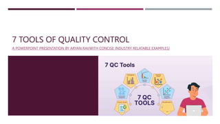
  • 1. 7 TOOLS OF QUALITY CONTROL A POWERPOINT PRESENTATION BY ARYAN RAI(WITH CONCISE INDUSTRY RELATABLE EXAMPLES)
  • 2. INTRODUCTION- Definition of Quality Control: Quality control refers to the systematic process of ensuring that products or services meet specified standards and customer requirements. Importance in Various Industries: Quality control is crucial across diverse industries such as manufacturing, healthcare, software development, construction, and service sectors. It helps organizations minimize defects, enhance customer satisfaction, and maintain competitiveness. Objective of this powerpoint: The primary objective of this presentation is to utilize the time I got in my vacation time and provide a industry relatable examples on the subject matter of quality control and problem solving in a concise manner while doing so I will also enhance my presentation skills as well as I firmly believe that learning is a journey not a a destination.
  • 3. OVERVIEW OF THE 7 TOOLS: The 7 tools of quality control, also known as the "7 QC Tools," are a set of techniques used for process improvement and problem-solving. They are: Pareto Chart Cause and Effect Diagram (Ishikawa or Fishbone Diagram) Check Sheet Control Chart Histogram Scatter Diagram Flowchart
  • 4. 1-PARETO CHART  Explanation of Pareto Principle: The Pareto Principle, also known as the 80/20 rule, suggests that roughly 80% of effects come from 20% of causes. In quality control, it means that a significant portion of problems (80%) is often caused by a few key factors (20%).  How to Construct a Pareto Chart: Steps include identifying and listing problems or causes, collecting data on their frequency or impact, arranging them in descending order, and plotting them on a bar chart. The tallest bars represent the most significant issues.  Example Application : Lets plot a pareto chart for our incrency inprocess system and find out the vital few reasons causing inprocess errors(hypothetically)
  • 5. EXAMPLE PARETO CHART-INPROCESS ERRORS Reason of error Number of errors Total Percentage Cumulative percentage Human error/mishan dling 11 50% 50% Balance fluctuation 5 23% 73% Auto capture 3 14% 86% Vernier caliper failure 2 9% 95% Actual below limits 1 5% 100% 0% 20% 40% 60% 80% 100% 120% 0 2 4 6 8 10 12 14 16 18 20 Human error/mishandling Balance fluctuation Auto capture Vernier caliper failure Actual below limits CUMULATIVE PERCENTAGE NUMBER OF ERRORS ERROR TYPE Inprocess error pareto chart
  • 6. 2-CAUSE AND EFFECT DIAGRAM (ISHIKAWA OR FISHBONE DIAGRAM) Purpose and Benefits: The Cause and Effect Diagram helps visualize the potential causes of a problem or effect. It organizes brainstormed ideas into categories, facilitating root cause analysis and solution generation. Steps to Create a Cause and Effect Diagram: Identify the problem or effect, draw a horizontal line (the "spine" of the fishbone), brainstorm potential causes categorized into branches (e.g., people, methods, machines, materials, environment), and analyze the causes. 5 Whys or Why-Why analysis can then be incorporated to fishbone diagram for better brainstormoing. Real-Life Example: In manufacturing, a cause and effect diagram can be used to investigate defects in a product by considering 5+1 M factors related to Man,Machine,Methods,Material,Measurement and Mother Nature.
  • 8. 3-CONTROL CHART  Definition and Importance: A Control Chart is a statistical tool used to monitor processes over time and detect any deviations or variations from desired performance. It helps distinguish between common cause variation (inherent to the process) and special cause variation (due to external factors).  Statistical Monitoring: Control charts are statistical tools used to monitor processes over time. They provide a visual representation of process variation and help distinguish between common cause variation (inherent to the process) and special cause variation (due to external factors).  Key Components: A control chart typically consists of a central line representing the process mean and upper and lower control limits (UCL and LCL) based on the process variation. These limits are usually set at three standard deviations from the mean and serve as boundaries for identifying significant deviations from the norm.  Types of Control Charts: There are various types of control charts depending on the nature of the data being monitored. Common examples include the X-bar and R charts for variables data (measurements), and p-chart and c-chart for attribute data (counts or proportions of nonconforming items).  Interpretation: Control charts help users interpret process behavior. When data points fall within the control limits and show a random pattern, the process is considered to be in statistical control, indicating that variations are consistent with common causes. However, if data points fall outside the control limits or exhibit non-random patterns, it suggests the presence of special causes requiring investigation and corrective action.  Continuous Improvement: Control charts are integral to the concept of continuous improvement in quality management. By providing early warning signals of process deviations, they enable timely interventions to prevent defects, reduce variability, and enhance overall process performance, thus supporting the pursuit of operational excellence.
  • 9. EXAMPLE-CONTROL CHARTS.  Lets plot a hypothetical control chart for Batch assay results.  As you can see we have given random data and set a upper Control limit and lower control limit in our excel formula bar.  After setting ucl and lcl we have freeze the limits and now I will delibratly let batch no. B329 and B334 assay result go out Of limit.  Which will be detected in our control chart in a trendline mannar Sr. No Batch no. Assay Result(%) Average/ Mean(%) Standard Deviation Upper Control Limit(+3) Lower Control Limit(-3) 1 B321 97 99.4 7.73 114.59 84.21 2 B322 94 99.4 7.73 114.59 84.21 3 B323 92 99.4 7.73 114.59 84.21 4 B324 94 99.4 7.73 114.59 84.21 5 B325 99 99.4 7.73 114.59 84.21 6 B326 98 99.4 7.73 114.59 84.21 7 B327 107 99.4 7.73 114.59 84.21 8 B328 105 99.4 7.73 114.59 84.21 9 B329 119 99.4 7.73 114.59 84.21 10 B330 107 99.4 7.73 114.59 84.21 11 B331 95 99.4 7.73 114.59 84.21 12 B332 102 99.4 7.73 114.59 84.21 13 B333 102 99.4 7.73 114.59 84.21 14 B334 81 99.4 7.73 114.59 84.21 15 B335 103 99.4 7.73 114.59 84.21 16 B336 103 99.4 7.73 114.59 84.21 17 B337 105 99.4 7.73 114.59 84.21 18 B338 100 99.4 7.73 114.59 84.21 19 B339 93 99.4 7.73 114.59 84.21 20 B340 104 99.4 7.73 114.59 84.21
  • 10. EXAMPLE-CONTROL CHARTS. 97 94 92 94 99 98 107 105 119 107 95 102 102 81 103 103 105 100 93 104 Mean(99.4) UCL(114.59) LCL(84.21) 80.00 85.00 90.00 95.00 100.00 105.00 110.00 115.00 120.00 B321 B322 B323 B324 B325 B326 B327 B328 B329 B330 B331 B332 B333 B334 B335 B336 B337 B338 B339 B340 Assay Batch Number Assay control chart
  • 11. 4-CHECK SHEETS Definition and Purpose: A Check Sheet is a simple data recording tool used to collect and organize data systematically. It helps in identifying patterns, frequencies, or trends in processes or events. Types of Data Captured: Check sheets can be used to record various types of data, such as defects, errors, occurrences, or observations, depending on the specific quality control needs. Example of Check Sheet in Action: In a service industry, a check sheet can be employed to track customer complaints by recording details such as the type of issue, time of occurrence, and frequency, enabling the organization to prioritize improvement areas.
  • 12. 4-CHECK SHEETS Structured Data Collection: Check sheets provide a structured format for collecting data, ensuring consistency and uniformity in recording observations or occurrences. Real-Time Recording: They enable real-time recording of data, allowing teams to capture information as it occurs without delay or reliance on memory. Versatility: Check sheets are versatile tools applicable across various industries and settings, from manufacturing to healthcare, customer service, and beyond. Pattern Identification: By organizing data in a systematic manner, they facilitate the identification of patterns, trends, or recurring issues, helping teams pinpoint areas for improvement. Evidence-Based Decision Making: The data collected with check sheets serves as evidence for decision making, enabling teams to prioritize improvement efforts and implement targeted interventions based on factual insights.
  • 14. 5-HISTOGRAM Definition and Purpose: A Histogram is a graphical representation of the distribution of data, showing the frequency or count of observations within predefined intervals (bins). It provides insights into the central tendency, dispersion, and shape of the data. Steps to Create a Histogram: Determine the range of data values, divide them into intervals or bins, count the number of observations falling into each bin, and plot the data as bars with heights proportional to the frequencies. Interpretation and Use in Quality Control: Histograms help identify patterns, trends, or abnormalities in data distributions, enabling informed decision-making and process improvements based on data analysis. Now lets create a hypothetical histogram in excel and paste it here.
  • 15. EXAMPLE-HISTOGRAM Batch no. Batch Yield BB001 93 BB002 89 BB003 89 BB004 96 BB005 97 BB006 91 BB007 97 BB008 89 BB009 89 BB010 95 BB011 89 BB012 91 BB013 97 BB014 96 BB015 91 BB016 98 BB017 91 BB018 97 BB019 90 BB020 96
  • 16. 6-FLOWCHART  Definition and Importance in Quality Control: A Flowchart is a visual representation of a process or workflow, depicting the sequence of steps, decisions, and interactions involved. It helps in understanding, analyzing, and improving processes.  Steps to Create a Flowchart: Identify the process to be documented, define the starting and ending points, map out the sequence of steps, decision points, and feedback loops using standard symbols, and review and refine the flowchart for accuracy.  Example of Flowchart in Process Improvement: In Pharmaceutical manufacturing, a flowchart can be used to illustrate the product journey from one process to another, identifying bottlenecks, delays, Probable root causes of inefficiencies for targeted improvements.
  • 17. EXAMPLE-FLOWCHART. Tablet hardness above limit Review compression Process Compression force within BMR limit? NO Compression force high or low? Compression force high plan of action separated and quarantined already compressed tablets Sent for destruction? Sent for destruction. Sent for reprocess? Resetted machine parameters to get optimum hardness Tablet Hardness within limit. Compression Machine RPM Optimus? Yes Temp.,RH,DP within limit Yes Blend parameters met? Yes Review compression process No Reprocess the blend
  • 18. 7-SCATTER DIAGRAM  Purpose and Benefits: A Scatter Diagram visualizes the relationship between two variables by plotting data points on a graph. It helps identify correlations, trends, or patterns in the data.  How to Create a Scatter Diagram: Plot pairs of data points representing the two variables on a Cartesian coordinate system, with one variable on the x-axis and the other on the y-axis. Analyze the pattern of points to determine the relationship.  Application in Identifying Relationships: In pharma manufacturing, a scatter diagram can be used to investigate the relationship between process parameters (e.g., temperature, pressure) and product quality characteristics (e.g., hardness, dissolution).  Now lets plot a scatter plot between compression force and average hardness achieved per batch which will show a positive correlation in the scatter plot along a trendline which will prove the conclusion that increasing compression force will increase ave. hardness.
  • 19. EXAMPLE-SCATTER PLOT DIAGRAM. Compression force(kn) Average Hardness(N) 30 89 28 88 22 82 21 82 33 91 43 110 32 89 48 113 28 86 43 103 22 79 46 108 32 90 28 85 47 111 21 79 23 85 42 103 50 118 33 88 70 75 80 85 90 95 100 105 110 115 120 20 25 30 35 40 45 50 Average Hardness(N) Compression force(kn) Scatter Plot Diagram
  • 20. CONCLUSION  In conclusion, the "7 Tools of Quality Control" offer indispensable methods for organizations striving for excellence in their processes and products. From Pareto charts pinpointing critical issues to flowcharts illustrating workflows, each tool serves as a compass for navigating the complexities of quality management. I have tried to contain this ppt as concise and practical as possible with relatable examples and anecdotes. By implementing these techniques, businesses can uncover inefficiencies, address root causes, and elevate standards to meet and exceed customer expectations. Yet, mastery of these tools is not a destination but a journey of continuous improvement. Embrace the spirit of learning, experimentation, and adaptation, for it is through these efforts that organizations truly thrive in today's competitive landscape. Let us commit to the pursuit of quality, knowing that with dedication and diligence, we can forge a path towards sustainable success. Thank you for joining me on this exploration this far with so much paitence, and may your quality endeavors be fruitful and rewarding.

Editor's Notes

  1. As you can see