1. Genre Analysis
Codes and Conventions
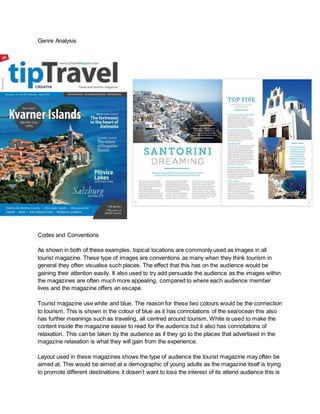
As shown in both of these examples, topical locations are commonly used as images in all
tourist magazine. These type of images are conventions as many when they think tourism in
general they often visualise such places. The effect that this has on the audience would be
gaining their attention easily. It also used to try add persuade the audience as the images within
the magazines are often much more appealing, compared to where each audience member
lives and the magazine offers an escape.
Tourist magazine use white and blue. The reason for these two colours would be the connection
to tourism. This is shown in the colour of blue as it has connotations of the sea/ocean this also
has further meanings such as traveling, all centred around tourism. White is used to make the
content inside the magazine easier to read for the audience but it also has connotations of
relaxation. This can be taken by the audience as if they go to the places that advertised in the
magazine relaxation is what they will gain from the experience.
Layout used in these magazines shows the type of audience the tourist magazine may often be
aimed at. This would be aimed at a demographic of young adults as the magazine itself is trying
to promote different destinations it dosen’t want to lose the interest of its attend audience this is
2. shown by the layout’s structure. By separating the context into short pieces of information keeps
this type of audience attention as they would prefer not to have to read large amount of text to
get the message. Another effect that the layout has is persuading the audience. As the they will
be reading secondary images are spread across the pages as a visual add which peaks their
interests.
The magazine uses formal linguistic. This type of formal writing adds professionalism this
attracts the audience as they appreciate a magazine that visually appeals to have experience.
This also helps to keep to make the magazine seem more presentable as people would take it
much more serious.
Headline a short title quickly describing the article “Kvarner Islands”. This is used in the
magazine to quickly gain the audience's attention as it one of the first they will be able to see on
the front cover.
Masthead a large title of the magazine's brand located on the front page “tipTravel”. The effect
that this has the audience would be familiarly. This being audience members who already know
the brand due to just seeing the title, will often want to buy the magazine as they've enjoyed
past issues.
The front page uses a folio beneath the masthead. This is helpful for the audience to
understand if the specific issue is in date. This can be important for a magazine such as this due
the available hold destinations and prices change over time.
Ratings are used in the double page spread rate the top five holiday destinations. The effect
that has on the audience is again persuasion. It does this by telling them what is the best
holiday destination for them. This can show how passive an audience can be as they
immediately think that the best holiday for them and want to go there without having done any
research.