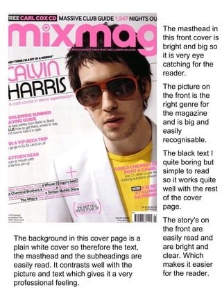
1. The masthead in this front cover is bright and big so it is very eye catching for the reader. The picture on the front is the right genre for the magazine and is big and easily recognisable. The black text I quite boring but simple to read so it works quite well with the rest of the cover page. The story's on the front are easily read and are bright and clear. Which makes it easier for the reader. The background in this cover page is a plain white cover so therefore the text, the masthead and the subheadings are easily read. It contrasts well with the picture and text which gives it a very professional feeling.
2. The masthead in this front cover has almost been completely covered up by the image in the foreground so therefore the makers of the magazine must be very confident that the magazine is a popular and well known one for this to happen. The white background contrasts very well with the picture as the picture has very bold colours which counteract against the background. The white text works as the red picture contrasts with it very well to make the text easily well read. The subheadings are very well presented and gives the magazine an overall very professional look as it has that very basic look about it.
3. The mast head in this magazine front cover is a bright white colour that is presented very well with the blue sky background. The main picture in the cover is easy to recognise which gives it its professional feel. The different coloured text at some parts does not contrast very well with the background colours and can be quite confusing at times. This magazines colour scheme is very eye catching but at sometimes a little too much. The overall feel of this magazine front cover seems a bit like its been a little rushed as there are subheadings and pictures just placed all over the front page. It looks professional but slightly rushed.