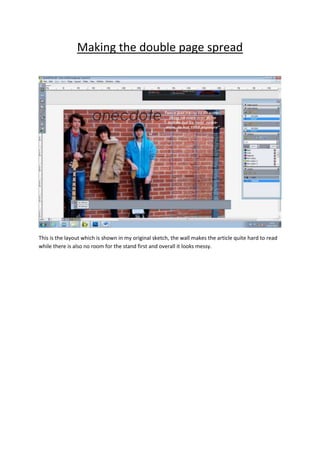
1. Making the double page spread
This is the layout which is shown in my original sketch, the wall makes the article quite hard to read
while there is also no room for the stand first and overall it looks messy.
2. I changed the image to one more portrait which can fit just over a page. There is also room to move
the quote over this image which makes it clearer. On the other page a white background makes the
writing much easier to read and also allows room for a stand first and a larger title. I changed the
title to blue as it is less plain than black and fits to my colour scheme of the magazine. By changing
the drop cap to the same colour I have created a link between the text and title.
After proof reading a few grammatical errors were changed.