Downloaded 758 times


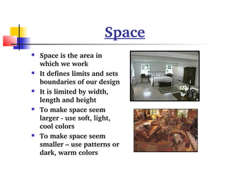
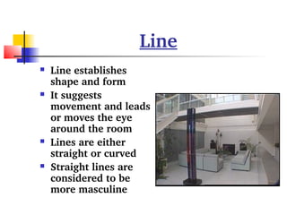

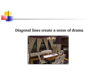


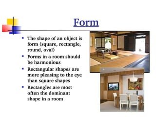

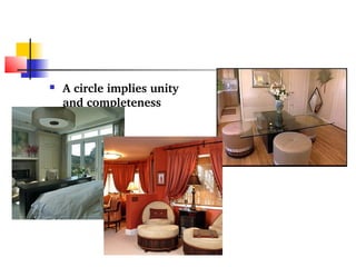

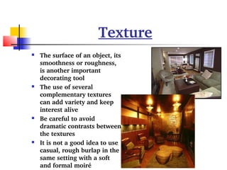
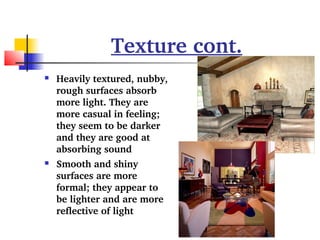
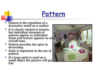

The document outlines six essential elements of interior design: space, line, form, texture, pattern, and color. It explains how each element influences design, including tips on creating visual perception and harmony in a space. Understanding these elements allows for more effective and aesthetically pleasing design choices.


