Download to read offline
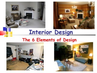
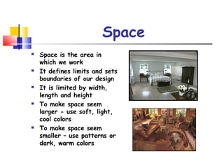
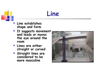

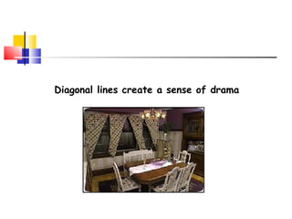
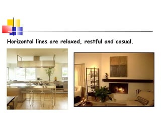
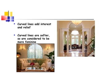
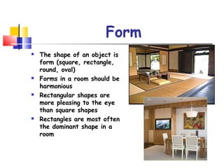
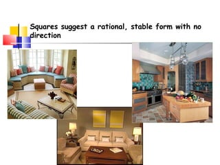
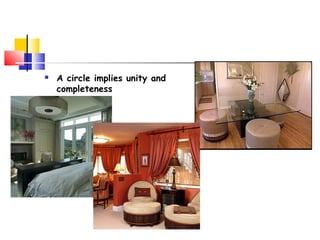

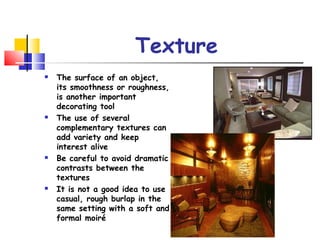
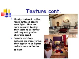
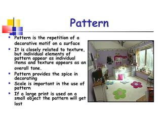
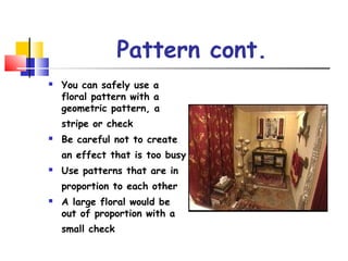
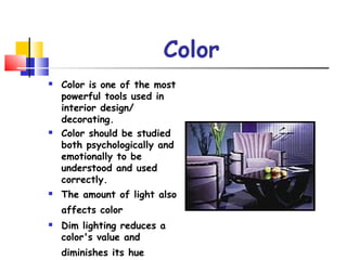
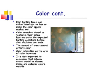


The document outlines the six elements of interior design: space, line, form, texture, pattern, and color. It provides guidance on how to utilize these elements effectively, such as using color to manipulate the perception of space and the importance of texture and pattern in creating visual interest. Additionally, it emphasizes the psychological and emotional impact of color in interior design.


