2024 04 03 AZ GOP LD4 Gen Meeting Minutes FINAL.docx
Cover analisis
1. The magazine will always feature the same
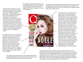
The image has had the background removed to give the subject a more
mast head and strap line in the top left hand
finished look, the image has also been taken so that the model in this
side of the page. This will help its regular
case Adele looks at her best. This is normally done on images on women
readership to locate the magazine in a see of
The puff on this front page is used to rather than on those of men.
other magazines.
advertise the fact that this is the 300th
issue of this magazine. It also shows the
fact that it is ‘introduced by Paul She has had her hair and makeup done,
McCartney’. The puff has been made so which does not normally happen on
that it is gold making it look more images taken of male artists. The hair
prestigious. It gives a sense of has been done in such a way that it looks
achievement and celebration, it was a ‘wind swept’. This makes Adele relate to
large achievement for the magazine to the main sell line that is ‘Adele blows us
have been around this long and still be away’. The make up that has been done
so successful. The fact that a person as around the eyes are done so that they
famous as Paul McCartney is introducing draw the reader in to the centre of the
the magazine is in itself shows just how page, this is in direct contrast to the
important the magazine is, as he would current colour of he skin which is a very
not put his name to a magazine that he light shade. This tells us that her music is
thought would not be good for his going to be beautiful like she herself
image. looks like in her picture. The image has
been taken so that Adele is looking
straight at the camera or the reader, this
The magazine will often use a larger font then relates to the pull quote that is
on certain words to create to draw the featured on the front page of “IF YOU
reader in. This particular issue has GOT IT FLAUNT IT”. The key point to be
decided to increase the font size of the made here is that she says you meaning
words ‘Liam‘, ‘Keith’ and ‘U2’ this will she is using a direct mode of address by
help attract more readers to the using this and the image the magazine
magazine as they are big well known makes you feel that it is speaking
names or artists. The sell line that is individually to you and you alone.
featured under Liam helps to build Helping it appeal to its target audience.
suspicions about the article as they use
the phrase ‘last request’. This makes the
reader wonder what is going to happen
to Liam Gallagher. The large text saying the word Adele is used to attract the reader as it can
instantly tell us that the magazine will feature an article on this artist. The text is
in white so that it will stand out against the colour rich background, the text has
also been been put into white as it is a clean and stylish colour emulating hoe
The magazine has positioned the bar code on the left hand third
Adele herself is put across. Also under this main piece of text there is a phrase
of the page along with most of the important information this is a
used ‘blows us away’, this mode of address makes the reader feel that they and
convention that is used in the majority of front covers.
the magazine are connected through the use of the word “us”.
2. The layout of the magazine is very conventional and does
not challenge any convention. They have made shore that The puff on this front page is used to
The magazine will always feature the same
the left hand side is the most important part of the page advertise the fact that you may be able
masthead saying NME at the top left hand
and that the masthead is at the top of the page. to win a signed limited edition stone
corner of the page to maintain the brand
roses artwork. It also shows that
identity, the magazines strap line new
information about the prize can be
musical express talks about how the music
found on page 12.The puff is in white so
that featured will be new. The font is done in
that it will stand out from the colour rich
a range of colours to allow it to stand out
scenery in the background. This puff has
from almost any background. The text is
used a large bright red font at the top
normally shown in red as this is a strong
saying the word ‘win’ to draw in the
masculine colour, which appeals to the male
reader.
readership. Having such a striking piece of
text on every issue allows the readership to
find the issue very easily even in a sea of
other magazines. The masthead is not allows
sat on top of the main image but is always
visible. This image has been taken in a more natural
The magazine will always feature the same location to allow the reader to connect with
large piece of text stating what the main sell the person more. Although it has been taken
line is. This text has been put in a golden in such a location the image has been
colour to stand out from the predominantly blurred out to create more of a focus on the
dark background, another possible reason main model. Having the model have there
that the magazine would use the gold colour image taken in a more laid back location is a
as he is a very important person in the indie trademark of the indie genre, It is not very
music world. In this particular feature the often that on the front of a indie magazine
magazine has a sell line above the main text that you will find a heavily photo shopped
with the word exclusive, this is a technique photo. This allows the reader to immediately
to try and attract the reader to this magazine identify that this is a indie magazine.
rather than another magazine. The way that
the reader is addressed on this front cover is
friendly and direct to the reader to try and
make them feel connected to the magazine.
On the front of this magazine they have listed the names of all of the artist that will
NME has also added a pull quote from Pearl Jam. The pull feature in the magazine, this is a convention that is used on all of there front
quote says “I couldn’t give a shit what Kurt thought”. This covers and other magazines front covers to try and draw in more readers as they
would help pull in readers as they would be interested in the may be interested in at least one of the artists. Underneath the list of names it
gossip. Also featured is a sell line saying “what does this mean says ‘and the most overrated bands ever’ helping this magazine appeal to more
for the strokes?” this would help to draw in readers interested people.
in this band and the possibility of a new solo artist
3. The magazine uses the same band index on the left The use of the ‘NME’ logo in big bold red text, followed by this week in
hand side on all of there magazines. This is very bold white text gives the whole page a clean and clear title. This gives the
useful for both a reader and someone who is looking reader a constant reminder of the company leading the magazine, The
into the magazine as it can tell them all of the artists font, colours and house style are all the same type which gives the
that will feature in this magazine. By calling it a band magazine a bold, but effective way of presenting their pieces, by keeping
index rather that a artist index reinforces the fat that the same font and layout for there page helps them to stick to there
it is an indie magazine rather than a pop one. The brand identity. You can see that throughout the whole page very few
colours that are used in the band index create a link colours are used and the ones that are are all taken from the title to help
between itself, this shows that this is a very create a connection between the two.
important part of the magazine.
The use of sub-headings puts each piece of
content into easier and clearer categories,
making the magazine make sense and clearer.
The heading are short and snappy to give the
The image that has been placed in the centre of reader a quick idea about the type of articles
the page, this is to show that it is going to be the that are available in the magazine. The same
centre of attention in the magazine. It is of a very article names are repeated through issues.
prominent indie band. The article is about the
return of the band from a long stay in America
this is particularly appealing to the reader as they
would like to see there new third album. The
image is of two men performing in a church, this
is a strange place for an indie band to be On the contents page there is a large picture in
performing but it odes kind of link up with the the centre to try and draw in the reader. Under
conventions associated with indie bands as they this picture there is a large piece of text that
often do have there photos taken in strange or describes a brief summary of the main story
inconspicuous locations. The way that the shot is (taster article) of the magazine, in this particular
taken not being at a photo shoot hints that there issue the main article is on Kasabian who is a
may be some behind the scenes information or large indie band. They have decided to use a
interviews in the article. slightly larger font for the name of the band
compared to the rest of the text. The magazine
The magazine will always feature the same box/ has used a convention that they have used in the
image advertising the fact that you can subscribe past of introducing the article with the phrase
to this particular magazine trying to retain the “The moment that”. This helps the magazine
reader, to draw the reader in to make this build its brand identity.
subscription they have put the fact that you will
save 45 pounds in a bright yellow colour.
4. The images on the contents page are all related to different stories in the magazine next to each of
the images is a number to help the reader navigate to the story related to the image. This is a
technique that Q magazine has tried to implement into all of there magazines. This is very good for
attracting new readers as they can just look at the image and work out what band are going to be
featured in this particular issue. This is particularly appealing to the male readership as for on there The images on the contents page are all stacked
is a picture of a beautiful women on the front cover and that it is scientifically proven that men on top of each other at strange angles to create a
react more to visual stimuli than text based stimuli. more hectic style of magazine, this is symbolic of
the hectic messed up feel of the music and
Also on the page they have also featured an array of small pieces of text related to specific headings artists that feature in its pages, allot of the time
giving you more detail about those stories. These sell lines give the reader I quick insight into what the images that are placed on this page are taken
the story will cover. so that they look like they are in dismay. Q
magazine try's to keep this as a running theme
Q magazine is one of the few magazines throughout there magazine to try and maintain
that presents there contents page across there brand identity.
to pages, this allow them to use a large
amount of images, creating a more
enticing page. This challenges the wider
used convention of having your contents
page only cover one page. The magazine will place
numbers next to there image
Also at the top of the contents page there to navigate you to the correct
is a piece of text that can tell you what page, the size of these
issue you are currently reading, this is numbers will correspond to
useful as it can tell you if you have missed how important the story is.
an issue. This also corresponds with
the size of the image used,
normally the largest Image on
the page will be one of the
artist that features on the
front cover.
The contents page will always feature the signature large Q in
the top left hand corner to help advertise the magazine. They
will also stick to there signature colour of red that will feature
heavily on most of there pages. As you can see there is very The image above features an electric guitar which is a
limited use of colour on this page and if colour is used it is convention of the indie genre as most bands will feature at least
normally re black or white this is a convention that is carried on of these. Another image on this page (top left hand corner)
across allot of indie magazines as these colours are seen to be features an electric guitar also reinforcing the convention.
more manly, appealing to the target audience.
5. The text is mostly in the centre gothic or Arial font,
The band that has been chosen to feature in this magazines feature article are the vaccines. the target and is quite small, for speech extracts and panels,
audience for this article would be people that are interested in ‘Indie rock’ or ‘pop’ music, which is the and headings (e.g. the timeline of the bands
genre that this band are active in. It could also appeal to those who are just interested in finding out history); bigger, bolder text is used to try and entice
information about new and up and coming bands. the reader into the article. Also some of the quote
and headlines are in blue, as this will make them
Like the contents page, colour is also scarcely used in this spread, colour is just splashed on the page stand out.
using small block shapes to create an enticing spread whilst keeping a sleek and modern look.
The page is laid out so that there is
a large image in the back ground
that takes up around 3/5ths of the
page and the rest is taken up by
text, this is a very common thing
to occur in a double page spread.
The page uses allot of the
conventions that are used in all
magazines for instance the
magazine has a stand first under
the title. Another thing that it
feature is a pull quote in blue to
try and draw in people.
The image on the double page spread is a full bleed. The image is
The band has had there image taken in front of a wall that has stains and dirty
of a band called the vaccines, the image contains all of the band
patches on it, this sort of location is typically used when taking photos of indie
members. The band members are laid out so that the front man is
artists. Two props have been used in this shot, the two props that where used
stood at the top of the diamond shape. This is a very common
are electric guitars these items have strong bonds with indie artists and will
convention that is used in allot of the images that era taken of a
often feature in photos. The whole band is wearing clothes in similar colours,
band as the front man is seen to be the most important In the
the colours are all dark shade and do not really stand out this give the band a
band.
more manly feel. The clothes that they are wearing are all items that people
wear or items that people could buy this helps people connect with them.
6. This is a double page spread is from an NME magazine,
The main image is a range of different colours although the main image feature a lot
introducing and interviewing 'The Teenagers'. The right
of colours they are all dark shades of colours. This is in keeping with the conventions
hand side of the page is split so that there is a section
that are set out for when taking photos of indie bands. The the main images on the
for the text that is accompanying the main article and a
left of the page conforming with the convention of having the main image on the left
section to offer some other news about different
hand side of the page. the band are positioned in laying down relaxed positions, this
bands. This helps the readers discover other bands that
gives off the laid back and young feel that the group is trying to give off. Similarly to
fall into the same music category.
the first one the band is wear clothes that an everyday person would wear, this helps
them to connect with the reader.
The spread itself follows a tricolour The sans-serif fonts stick
scheme of blue, white and black, out of the page which
with blue highlighting the heading, contrasts the laid back
subheadings and important words. images. Although they
The pull quote has had a blue stick out they have a very
background behind it to draw the edgy look to them that
reader in to that particular piece of makes them a very
text. masculine font to use.
Blue has been used as it is a very
masculine color, and the band its
self is only made up of males.
The colour blue is often featured on the
The “need to know box that features at the bottom of the
radar page and is a convention that the
page is there to show information about the band this is often
magazine try's to repeat to keep its
featured in the pages of NME. It is always featured in the radar
brand identity.
section of the music magazine as this is where all of the new
up and coming bands are featured.