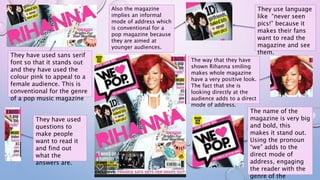
1. They use language
like “never seen
pics!” because it
makes their fans
want to read the
magazine and see
them.
Also the magazine
implies an informal
mode of address which
is conventional for a
pop magazine because
they are aimed at
younger audiences.
The way that they have
shown Rihanna smiling
makes whole magazine
have a very positive look.
The fact that she is
looking directly at the
audience adds to a direct
mode of address.
They have used sans serif
font so that it stands out
and they have used the
colour pink to appeal to a
female audience. This is
conventional for the genre
of a pop music magazine
They have used
questions to
make people
want to read it
and find out
what the
answers are.
The name of the
magazine is very big
and bold, this
makes it stand out.
Using the pronoun
“we” adds to the
direct mode of
address, engaging
the reader with the
genre of the
2. They keep the
main logo
appearing
throughout the
magazine. This
is conventional
for magazines
because they
want you to
remember that it
was that
magazine.
They have
used a
bright
colours that
contrast with
the
background.
This is very
conventional
for pop
magazines
because they
frae aimed
at a younger
audience.
They used
sans-serif
fonts to show
that it is
important and
they have used
the ellipses at
the end to
show that
there Is more
to come and
attract
attention.
They make the artist
bolder than the stories
about them because
they are what attracts
the attention. This is
conventional for a pop
magazine because they
completely focus on
drawing attention to
3. She is wearing black and
white stripy trousers, this
shows that she is bold and
rebellious, this goes with the
story.
They have used two
colours with no
specific pattern to
avoid being boring as
much as possible.
They have
included a
picture of her
where she
looks drunk
and
disorderly.
This shows
her rebellious
side.
They highlight the bits
that will draw attention
from the audience and
hopefully make them
want to read the rest.
They have a picture that clearly
shows her tattoos. This is not
typical for a pop magazine
because it is aimed at a
younger target audience and
they don't want to encourage
They have
included
as little
pink as
possible.
This
connotes
the fact
that she is
not girly
and
feminine.