SlideShare a Scribd company logo
1 of 3
Music magazine analysis 1: Kerrang
The masthead is positioned at the top of the
page therefore is made to demand
attention. The choice of font is ideal for this
type of magazine as it does relate to the
type of audience it appeals to. The bold and
solid looking capital letters empathizes the
aggression of the rock culture theme for the
magazine, the lines on the letters of the
masthead really embodies this as it creates
a cutting effect on the masthead tittle
making it look wild. The colour on the text
contrasts well with the colour of the
background and the colour of the persons
hair making it really standout, the colour of
the text and the style of the writing really
does well in suiting the audience type. In
most magazines the image occasionally
overlaps text, whereas here text overlaps
the image for a great purpose of almost
screaming out of to the page, the use of
punctuation is able to really exaggerate this
as an exclamation mark has been used.

Main cover line
The main cover line is positioned ¾ down the page of
which it is merely in the centre of the page, where it
can be seen quite easily, the slanted positioning of this
makes it look quite original. The font style of the text
makes the texture of the writing look rough and edgy
looking and goes well with the look of the rock
themed magazine. The text has been highlighted with
black but the font colour has been made white to
contrast with the colour it has been highlighted with
bringing it out more on the page.

Puff
Direct address language has been used this implies that
they magazine is directly talking to the audience trying
to grab there attention “All TIME LOW WANT YOU…”
This puff also uses persuasion in stating “BE THEIR
ROADIE FOR THWE DAY.” The hope of persuading young
readers to read the magazine and find out how to get
involved.

Demographic
The target audience for this would be above that
ages of 16 as it looks as though it is targeted towards
much older teenagers rather than the younger ones.
it would appeal to mixed genders not gender specific
as it has names of bands that are quite well known in
their society. The magazine is able to apple to those
that enjoy rock music as the cover is able to convey
the theme of rock and also able to promote well
know rock bands and concerts they can attend.
Cover lines
Only four cover lines, this gives little insights about the
content of the magazine, the colour of the writing coordinates well with the rest of the colour scheme of the
magazine.

Barcode
The barcode on the magazine is positioned
in an appropriate place as it can be easily
scanned by the shopkeepers when a
person is purchasing this merchant. It is
quite easy to be seen because of the white
background as this separates the black
coloured barcode from the colour of the
persons black coat in the image, this
prevents any disruptions when scanning
the barcode as it will be easily seen when
put on a white background .

Image
The image is the focal point of
this magazine as it is able to
attract quite a lot of attention as
a result of the contrasting colours
used with the hair, skin tone and
background colour really allowed
the image to look 3D .
Music magazine analysis 2: Status
Masthead
Image
The positioning of the of the masthead is at
The is a medium close up image, I can
the top left hand side of the magazine just
see that a special effect had been
above the optical centre. This is quite a good
made on the image to really bring out
positioning strategy as the masthead is at a
the detail of his facial features and the
point of easy observation just slightly above
tattoo work on his chest which
the optical centre the place in which people
enhances the effect of the tattoos .
naturally look at first when looking at a
The angle in which the image had been
magazine. This font choice is quite unique as
taken shows that the photographer
the style of writing is very different as a
was at a point where the camera lenses
result of the hesitant line effect around the
is looking up at the person rather than
letters, to make it look as though it had been
having a direct point straight at ‘Travis
hand sketched as the masthead. The colour
Baker.’ But however this is able to
of the masthead hasn’t fully been filled in
make him seem tough and more
leaving the out line of the lettering to
superior as he is the centre of
standout even more. The masthead does
attraction for this magazine because
overlap over the image to really show that
he is on the front cover.
where the letters have not been fully
coloured haven’t just been left colourless but
also to show that its transparent as i can see
to top of his head through the letters. No
Cover lines
punctuation symbols have been used
There are quite a few cover lines on this magazine it is promoting several types of
therefore the masthead doesn’t seem as
artists: rock artists , artist artists and graffiti artists as they all explore different
though its screaming aloud.
features of art. The choice of using primary colours did well in making the words
standing out on the front page. The colours really contrast well with the other
Demographic
colours and the black and white image. The colours are very bold and the style in font
The audience for this would be for
varies as different artists names had been written this could possibly resemble their
people with an interest of rock and
personality of how they are as a person and the style of writing is to represent this.
those with an interest of art designs
The cover lines below the to left hand corner is able to show some link with the
possible ages would be over 16 as the
image: at first I wasn’t too sure of who the image was, but with the conventions of
design of the magazine and the things
magazine layout I figured by the positioning of the of this cover line ,near the point of
it entails suggests it would allocated
the optical centre it introduces a persons name, the second was the link of the text
to this particular audience
slightly over lapping over the image showing who it was linked to.
Music magazine analysis 3: Vibe

Cover lines
On this magazine there aren’t so very many cover lines, this doesn’t give much of an insight
to what the magazine is about and it isn’t clear what it entails. This could have an effect on
the selling of the magazine as there are not cover lines to tell tem what its about. However
the image seems to be the main element of the magazine therefore the magazine could
possibly be about the artists indicating this through the images used rather than using cover
lines. Very few cover lines have been used such encouraging people to have a look at the
‘Greatest music survey ‘ and ‘The big butt theory.’ however these cover lines have been made
quite small giving me the idea it may have no relevance on the page.

Masthead
Where the masthead has been positioned
at the top of the magazine shows that
this is an area were it can easily be seen.
The letters are projected right across the
magazine page dominating the top half of
the magazine with the title itself to show
its significance of being a well know
Main cover line
magazine brand. The font choice is quite
The positioning of the main cover line is at the
an average bold and solid letter font
bottom right of the page of which it writes ‘the new
choice. However the width between the
pop music’ I feel this in some way of introducing
letters have been increased to show a
what is inside the magazine. The fact that its been
variation of the width and font size of
placed near the right hand corner of the page
most magazine masthead titles. The
suggests that the audience will easily see it as they
colour selection of the masthead shows
turn the page. The colours co-ordinate and contrast
a great contrasting effect with the image
well , the font size vary due to its significance in
and the background colour allowing the
advertisement for example the word ‘Pop’ has been
colour of the masthead to really
made bigger this is to publicize the type of music
standout, despite the layering strategy of
they make. There is no correct alignment but I think
the images (overlapping the masthead)
they have been placed like this to capture more
the colour and font choice are still able to
attention.
make it still be identified.
Barcode
Image
The barcode has been positioned in an
Here I can see multiple images had been taken separately of each individual, then
would have been photo shopped in a way to eliminate the excess background to have accessible way and can be easily seen. I have
these pop artists stand on their own, before being moulded together under a series of also observed that the blackberry scan code
has been printed on this magazine showing
layers to have them stand in this position. The standing position of the pop artists is
how modernised it as become people can
very interesting as there are three of them rather than there just being one person.
easily scan it with their blackberry and find out
Their posture in this image also allows them to come across quite tough looking, it
information about the magazine even without
looks as though the young man in the middle is being guarded by the two men on
having to purchase it. The disadvantage of this
either side. There attire is well co-ordinated the connotations of black suggest
would be that it will decrease the selling of
something haunting and possessive however in this image it used to promote
magazines in shops, because they will be able
masculinity the black leather coats do well in demonstrating this effect of using a
to read it for free on their phones.
tough but shinny material so the light can easily be projected on it .

More Related Content

What's hot

Deconstruction of magazines
Deconstruction of magazinesDeconstruction of magazines
Deconstruction of magazinesLauren Holyoak
 
Deconstruction of magazines 2
Deconstruction of magazines 2Deconstruction of magazines 2
Deconstruction of magazines 2Lauren Holyoak
 
Tasks 1 4 and hwk 2
Tasks 1 4 and hwk 2Tasks 1 4 and hwk 2
Tasks 1 4 and hwk 2charlie__97
 
Double page spread analysis
Double page spread analysisDouble page spread analysis
Double page spread analysisZaraChoudhry16
 
Media studies xxl magazine analysis pdf
Media studies xxl magazine analysis pdfMedia studies xxl magazine analysis pdf
Media studies xxl magazine analysis pdfdebbiesmediawork
 
XXL magazine analysis
XXL magazine analysis XXL magazine analysis
XXL magazine analysis zombiejuicek
 
Evaluations
EvaluationsEvaluations
EvaluationsxJacbob
 
Proposal for new music magazine
Proposal for new music magazineProposal for new music magazine
Proposal for new music magazineZaraChoudhry16
 
Analysis of music magazine one nme
Analysis of music magazine one nmeAnalysis of music magazine one nme
Analysis of music magazine one nmealishalumsden
 
Music magazine evaluation
Music magazine evaluationMusic magazine evaluation
Music magazine evaluationmeganbrown_
 
Deconstruction 2
Deconstruction 2Deconstruction 2
Deconstruction 2robynneve
 
Evaluation 1 final presentation
Evaluation 1 final presentationEvaluation 1 final presentation
Evaluation 1 final presentationhannah burton
 

What's hot (20)

Deconstruction of magazines
Deconstruction of magazinesDeconstruction of magazines
Deconstruction of magazines
 
Deconstruction of magazines 2
Deconstruction of magazines 2Deconstruction of magazines 2
Deconstruction of magazines 2
 
Tasks 1 4 and hwk 2
Tasks 1 4 and hwk 2Tasks 1 4 and hwk 2
Tasks 1 4 and hwk 2
 
Double page spread analysis
Double page spread analysisDouble page spread analysis
Double page spread analysis
 
Media studies xxl magazine analysis pdf
Media studies xxl magazine analysis pdfMedia studies xxl magazine analysis pdf
Media studies xxl magazine analysis pdf
 
Xxl magazine analysis
Xxl magazine analysisXxl magazine analysis
Xxl magazine analysis
 
XXL magazine analysis
XXL magazine analysis XXL magazine analysis
XXL magazine analysis
 
Masthead ideas
Masthead ideasMasthead ideas
Masthead ideas
 
Evaluations
EvaluationsEvaluations
Evaluations
 
Proposal for new music magazine
Proposal for new music magazineProposal for new music magazine
Proposal for new music magazine
 
Font and Colour
Font and ColourFont and Colour
Font and Colour
 
Presentation
PresentationPresentation
Presentation
 
Kerrang analysis
Kerrang analysisKerrang analysis
Kerrang analysis
 
Analysis of music magazine one nme
Analysis of music magazine one nmeAnalysis of music magazine one nme
Analysis of music magazine one nme
 
Rocksound analysis
Rocksound analysisRocksound analysis
Rocksound analysis
 
Music magazine evaluation
Music magazine evaluationMusic magazine evaluation
Music magazine evaluation
 
Magazine Analysis
Magazine AnalysisMagazine Analysis
Magazine Analysis
 
Deconstruction 2
Deconstruction 2Deconstruction 2
Deconstruction 2
 
Evaluation 1 final presentation
Evaluation 1 final presentationEvaluation 1 final presentation
Evaluation 1 final presentation
 
Cover research
Cover researchCover research
Cover research
 

Viewers also liked

Viewers also liked (18)

URLIFE.ORG.UK, By Rebecca Ross and Dionne Campbell, Central Saints Martins, C...
URLIFE.ORG.UK, By Rebecca Ross and Dionne Campbell, Central Saints Martins, C...URLIFE.ORG.UK, By Rebecca Ross and Dionne Campbell, Central Saints Martins, C...
URLIFE.ORG.UK, By Rebecca Ross and Dionne Campbell, Central Saints Martins, C...
 
Mother's Day - Humanistic Parenting
Mother's Day - Humanistic ParentingMother's Day - Humanistic Parenting
Mother's Day - Humanistic Parenting
 
finalpresentation-151213161347.pptx
finalpresentation-151213161347.pptxfinalpresentation-151213161347.pptx
finalpresentation-151213161347.pptx
 
Vivereumespetaculoimperdivel pp
Vivereumespetaculoimperdivel ppVivereumespetaculoimperdivel pp
Vivereumespetaculoimperdivel pp
 
Potencia de un número natural
Potencia de un número naturalPotencia de un número natural
Potencia de un número natural
 
Basketball 0.1
Basketball 0.1Basketball 0.1
Basketball 0.1
 
Hegel, g. cursos de estética i
Hegel, g. cursos de estética iHegel, g. cursos de estética i
Hegel, g. cursos de estética i
 
Sistema de conversión
Sistema de conversión Sistema de conversión
Sistema de conversión
 
FoundersCircle
FoundersCircleFoundersCircle
FoundersCircle
 
Week 2 of TTFL
Week 2 of TTFLWeek 2 of TTFL
Week 2 of TTFL
 
áLbum de fotografias
áLbum de fotografiasáLbum de fotografias
áLbum de fotografias
 
Ayrton silva
Ayrton silvaAyrton silva
Ayrton silva
 
Greenwood Management independent wood price report
Greenwood Management independent wood price reportGreenwood Management independent wood price report
Greenwood Management independent wood price report
 
fx week mention article
fx week mention articlefx week mention article
fx week mention article
 
Still image analysis
Still image analysisStill image analysis
Still image analysis
 
Exp.
Exp.Exp.
Exp.
 
Mercosur realidad y verdad carmen guex
Mercosur realidad y verdad carmen guexMercosur realidad y verdad carmen guex
Mercosur realidad y verdad carmen guex
 
Proyecto radiofónico. Crea, aprende y diviértete
Proyecto radiofónico. Crea, aprende y diviérteteProyecto radiofónico. Crea, aprende y diviértete
Proyecto radiofónico. Crea, aprende y diviértete
 

Similar to Vibrant pop music analysis in latest Vibe issue

Format research of music magazines
Format research of music magazinesFormat research of music magazines
Format research of music magazinesellisputnam
 
Market research
Market researchMarket research
Market researchKaris Hays
 
Magazine cover review
Magazine cover review Magazine cover review
Magazine cover review 09lakeland
 
Presentation2 (1)
Presentation2 (1)Presentation2 (1)
Presentation2 (1)dankyjosh
 
Music magazine research
Music magazine researchMusic magazine research
Music magazine researchbroganl4
 
Contents Pages
Contents PagesContents Pages
Contents PagesMugen776
 
Front cover analysis.
Front cover analysis.Front cover analysis.
Front cover analysis.AmyShields00
 
Evaluation question 1
Evaluation question 1Evaluation question 1
Evaluation question 110afrmal
 
Analysing 3 magazine covers
Analysing 3 magazine coversAnalysing 3 magazine covers
Analysing 3 magazine coversblack-bird
 
Evaluation question 5
Evaluation question 5Evaluation question 5
Evaluation question 5asmediae15
 

Similar to Vibrant pop music analysis in latest Vibe issue (20)

Format research of music magazines
Format research of music magazinesFormat research of music magazines
Format research of music magazines
 
Market research
Market researchMarket research
Market research
 
Textual analysis
Textual analysis Textual analysis
Textual analysis
 
Magazine cover review
Magazine cover review Magazine cover review
Magazine cover review
 
Presentation2 (1)
Presentation2 (1)Presentation2 (1)
Presentation2 (1)
 
Music magazine research
Music magazine researchMusic magazine research
Music magazine research
 
Contents Pages
Contents PagesContents Pages
Contents Pages
 
Front cover analysis.
Front cover analysis.Front cover analysis.
Front cover analysis.
 
Evaluation
EvaluationEvaluation
Evaluation
 
Evaluation
EvaluationEvaluation
Evaluation
 
Evaluation question 1
Evaluation question 1Evaluation question 1
Evaluation question 1
 
Analysing 3 magazine covers
Analysing 3 magazine coversAnalysing 3 magazine covers
Analysing 3 magazine covers
 
Evaluation
EvaluationEvaluation
Evaluation
 
Textual Analysis
Textual AnalysisTextual Analysis
Textual Analysis
 
Evaluation
EvaluationEvaluation
Evaluation
 
Evaluation question 5
Evaluation question 5Evaluation question 5
Evaluation question 5
 
Analysis Of NME
Analysis Of NMEAnalysis Of NME
Analysis Of NME
 
Magazine Analysis
Magazine AnalysisMagazine Analysis
Magazine Analysis
 
NME Magazine Analysis
NME Magazine AnalysisNME Magazine Analysis
NME Magazine Analysis
 
Textual Analysis
Textual AnalysisTextual Analysis
Textual Analysis
 

More from domingochristal (11)

Sound research
Sound researchSound research
Sound research
 
Sound research
Sound researchSound research
Sound research
 
Afrobeat artists
Afrobeat artistsAfrobeat artists
Afrobeat artists
 
Analysis of Contents and Double page spread
Analysis of Contents and Double page spread Analysis of Contents and Double page spread
Analysis of Contents and Double page spread
 
Mood board
Mood board Mood board
Mood board
 
Mood board
Mood board Mood board
Mood board
 
Mood board
Mood board Mood board
Mood board
 
Mood board
Mood board Mood board
Mood board
 
Mood board
Mood boardMood board
Mood board
 
Double page analysis
Double page analysisDouble page analysis
Double page analysis
 
2000s thing
2000s thing2000s thing
2000s thing
 

Vibrant pop music analysis in latest Vibe issue

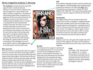
  • 1. Music magazine analysis 1: Kerrang The masthead is positioned at the top of the page therefore is made to demand attention. The choice of font is ideal for this type of magazine as it does relate to the type of audience it appeals to. The bold and solid looking capital letters empathizes the aggression of the rock culture theme for the magazine, the lines on the letters of the masthead really embodies this as it creates a cutting effect on the masthead tittle making it look wild. The colour on the text contrasts well with the colour of the background and the colour of the persons hair making it really standout, the colour of the text and the style of the writing really does well in suiting the audience type. In most magazines the image occasionally overlaps text, whereas here text overlaps the image for a great purpose of almost screaming out of to the page, the use of punctuation is able to really exaggerate this as an exclamation mark has been used. Main cover line The main cover line is positioned ¾ down the page of which it is merely in the centre of the page, where it can be seen quite easily, the slanted positioning of this makes it look quite original. The font style of the text makes the texture of the writing look rough and edgy looking and goes well with the look of the rock themed magazine. The text has been highlighted with black but the font colour has been made white to contrast with the colour it has been highlighted with bringing it out more on the page. Puff Direct address language has been used this implies that they magazine is directly talking to the audience trying to grab there attention “All TIME LOW WANT YOU…” This puff also uses persuasion in stating “BE THEIR ROADIE FOR THWE DAY.” The hope of persuading young readers to read the magazine and find out how to get involved. Demographic The target audience for this would be above that ages of 16 as it looks as though it is targeted towards much older teenagers rather than the younger ones. it would appeal to mixed genders not gender specific as it has names of bands that are quite well known in their society. The magazine is able to apple to those that enjoy rock music as the cover is able to convey the theme of rock and also able to promote well know rock bands and concerts they can attend. Cover lines Only four cover lines, this gives little insights about the content of the magazine, the colour of the writing coordinates well with the rest of the colour scheme of the magazine. Barcode The barcode on the magazine is positioned in an appropriate place as it can be easily scanned by the shopkeepers when a person is purchasing this merchant. It is quite easy to be seen because of the white background as this separates the black coloured barcode from the colour of the persons black coat in the image, this prevents any disruptions when scanning the barcode as it will be easily seen when put on a white background . Image The image is the focal point of this magazine as it is able to attract quite a lot of attention as a result of the contrasting colours used with the hair, skin tone and background colour really allowed the image to look 3D .
  • 2. Music magazine analysis 2: Status Masthead Image The positioning of the of the masthead is at The is a medium close up image, I can the top left hand side of the magazine just see that a special effect had been above the optical centre. This is quite a good made on the image to really bring out positioning strategy as the masthead is at a the detail of his facial features and the point of easy observation just slightly above tattoo work on his chest which the optical centre the place in which people enhances the effect of the tattoos . naturally look at first when looking at a The angle in which the image had been magazine. This font choice is quite unique as taken shows that the photographer the style of writing is very different as a was at a point where the camera lenses result of the hesitant line effect around the is looking up at the person rather than letters, to make it look as though it had been having a direct point straight at ‘Travis hand sketched as the masthead. The colour Baker.’ But however this is able to of the masthead hasn’t fully been filled in make him seem tough and more leaving the out line of the lettering to superior as he is the centre of standout even more. The masthead does attraction for this magazine because overlap over the image to really show that he is on the front cover. where the letters have not been fully coloured haven’t just been left colourless but also to show that its transparent as i can see to top of his head through the letters. No Cover lines punctuation symbols have been used There are quite a few cover lines on this magazine it is promoting several types of therefore the masthead doesn’t seem as artists: rock artists , artist artists and graffiti artists as they all explore different though its screaming aloud. features of art. The choice of using primary colours did well in making the words standing out on the front page. The colours really contrast well with the other Demographic colours and the black and white image. The colours are very bold and the style in font The audience for this would be for varies as different artists names had been written this could possibly resemble their people with an interest of rock and personality of how they are as a person and the style of writing is to represent this. those with an interest of art designs The cover lines below the to left hand corner is able to show some link with the possible ages would be over 16 as the image: at first I wasn’t too sure of who the image was, but with the conventions of design of the magazine and the things magazine layout I figured by the positioning of the of this cover line ,near the point of it entails suggests it would allocated the optical centre it introduces a persons name, the second was the link of the text to this particular audience slightly over lapping over the image showing who it was linked to.
  • 3. Music magazine analysis 3: Vibe Cover lines On this magazine there aren’t so very many cover lines, this doesn’t give much of an insight to what the magazine is about and it isn’t clear what it entails. This could have an effect on the selling of the magazine as there are not cover lines to tell tem what its about. However the image seems to be the main element of the magazine therefore the magazine could possibly be about the artists indicating this through the images used rather than using cover lines. Very few cover lines have been used such encouraging people to have a look at the ‘Greatest music survey ‘ and ‘The big butt theory.’ however these cover lines have been made quite small giving me the idea it may have no relevance on the page. Masthead Where the masthead has been positioned at the top of the magazine shows that this is an area were it can easily be seen. The letters are projected right across the magazine page dominating the top half of the magazine with the title itself to show its significance of being a well know Main cover line magazine brand. The font choice is quite The positioning of the main cover line is at the an average bold and solid letter font bottom right of the page of which it writes ‘the new choice. However the width between the pop music’ I feel this in some way of introducing letters have been increased to show a what is inside the magazine. The fact that its been variation of the width and font size of placed near the right hand corner of the page most magazine masthead titles. The suggests that the audience will easily see it as they colour selection of the masthead shows turn the page. The colours co-ordinate and contrast a great contrasting effect with the image well , the font size vary due to its significance in and the background colour allowing the advertisement for example the word ‘Pop’ has been colour of the masthead to really made bigger this is to publicize the type of music standout, despite the layering strategy of they make. There is no correct alignment but I think the images (overlapping the masthead) they have been placed like this to capture more the colour and font choice are still able to attention. make it still be identified. Barcode Image The barcode has been positioned in an Here I can see multiple images had been taken separately of each individual, then would have been photo shopped in a way to eliminate the excess background to have accessible way and can be easily seen. I have these pop artists stand on their own, before being moulded together under a series of also observed that the blackberry scan code has been printed on this magazine showing layers to have them stand in this position. The standing position of the pop artists is how modernised it as become people can very interesting as there are three of them rather than there just being one person. easily scan it with their blackberry and find out Their posture in this image also allows them to come across quite tough looking, it information about the magazine even without looks as though the young man in the middle is being guarded by the two men on having to purchase it. The disadvantage of this either side. There attire is well co-ordinated the connotations of black suggest would be that it will decrease the selling of something haunting and possessive however in this image it used to promote magazines in shops, because they will be able masculinity the black leather coats do well in demonstrating this effect of using a to read it for free on their phones. tough but shinny material so the light can easily be projected on it .