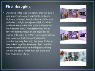
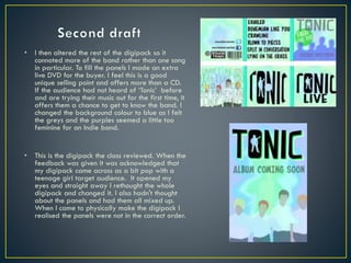
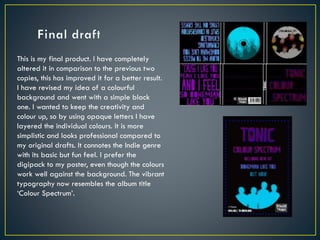
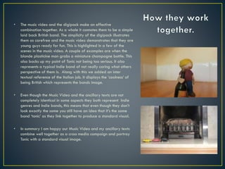
• Our music video was incredibly creative and it
used plenty of colour I wanted to make my
digipack vivid and imaginative. My idea was
to devise a bright background full of colour
and have the panels with lyrics and possibly
the Plasticine men. I was determined not to
have the bands image on the digipack as I
wanted it to seem as if they were about selling
their music not their image. I wished to
combine the arty feel with the Music Video so
they linked together however I feel that idea
was unsuccessful due to the digipack selling
just the one song rather than the band and
their music as a whole.
• I then altered the rest of the digipack so it
connoted more of the band rather than one song
in particular. To fill the panels I made an extra
live DVD for the buyer. I feel this is a good
unique selling point and offers more than a CD.
If the audience had not heard of ‘Tonic’ before
and are trying their music out for the first time, it
offers them a chance to get to know the band. I
changed the background colour to blue as I felt
the greys and the purples seemed a little too
feminine for an Indie band.
• This is the digipack the class reviewed. When the
feedback was given it was acknowledged that
my digipack came across as a bit pop with a
teenage girl target audience. It opened my
eyes and straight away I rethought the whole
digipack and changed it. I also hadn't thought
about the panels and had them all mixed up.
When I came to physically make the digipack I
realised the panels were not in the correct order.
This is my final product. I have completely
altered it in comparison to the previous two
copies, this has improved it for a better result.
I have revised my idea of a colourful
background and went with a simple black
one. I wanted to keep the creativity and
colour up, so by using opaque letters I have
layered the individual colours. It is more
simplistic and looks professional compared to
my original drafts. It connotes the Indie genre
with its basic but fun feel. I prefer the
digipack to my poster, even though the colours
work well against the background. The vibrant
typography now resembles the album title
‘Colour Spectrum’.
• When creating my digipack I took
other Indie bands as inspiration. I
found that their digipack just like mine
didn’t use the band image. It indicates
that they don’t really care for image
only quality of the music. This is
something I wanted to convey when
creating my own digipack.
• The photographs used on the digipack
do not relate to any of their songs, it
was literally random and so this links
in with mine. My digipack does not
represent the music video just Tonic.
• The music video and the digipack make an effective
combination together. As a whole it connotes them to be a simple
laid back British band. The simplicity of the digipack illustrates
them as carefree and the music video demonstrates that they are
young guys ready for fun. This is highlighted in a few of the
scenes in the music video. A couple of examples are when the
blonde plasticine man grabs a miniature champagne bottle. This
also backs up my point of Tonic not being too serious. It also
represents a typical Indie band of not really caring what others
perspective of them is. Along with this we added an inter
textual reference of the Italian job. It displays the ‘coolness’ of
being British which represents the bands image.
• Even though the Music Video and the ancillary texts are not
completely identical in some aspects they both represent Indie
genres and Indie bands, this means that even though they don’t
look exactly the same you still have an idea that it’s the same
band ‘tonic’ as they link together to produce a standard visual.
• In summary I am happy our Music Video and my ancillary texts
combine well together as a cross media campaign and portray
Tonic with a standard visual image.

Evaluation No.2

  • 2.
    • Our musicvideo was incredibly creative and it used plenty of colour I wanted to make my digipack vivid and imaginative. My idea was to devise a bright background full of colour and have the panels with lyrics and possibly the Plasticine men. I was determined not to have the bands image on the digipack as I wanted it to seem as if they were about selling their music not their image. I wished to combine the arty feel with the Music Video so they linked together however I feel that idea was unsuccessful due to the digipack selling just the one song rather than the band and their music as a whole.
  • 3.
    • I thenaltered the rest of the digipack so it connoted more of the band rather than one song in particular. To fill the panels I made an extra live DVD for the buyer. I feel this is a good unique selling point and offers more than a CD. If the audience had not heard of ‘Tonic’ before and are trying their music out for the first time, it offers them a chance to get to know the band. I changed the background colour to blue as I felt the greys and the purples seemed a little too feminine for an Indie band. • This is the digipack the class reviewed. When the feedback was given it was acknowledged that my digipack came across as a bit pop with a teenage girl target audience. It opened my eyes and straight away I rethought the whole digipack and changed it. I also hadn't thought about the panels and had them all mixed up. When I came to physically make the digipack I realised the panels were not in the correct order.
  • 4.
    This is myfinal product. I have completely altered it in comparison to the previous two copies, this has improved it for a better result. I have revised my idea of a colourful background and went with a simple black one. I wanted to keep the creativity and colour up, so by using opaque letters I have layered the individual colours. It is more simplistic and looks professional compared to my original drafts. It connotes the Indie genre with its basic but fun feel. I prefer the digipack to my poster, even though the colours work well against the background. The vibrant typography now resembles the album title ‘Colour Spectrum’.
  • 5.
    • When creatingmy digipack I took other Indie bands as inspiration. I found that their digipack just like mine didn’t use the band image. It indicates that they don’t really care for image only quality of the music. This is something I wanted to convey when creating my own digipack. • The photographs used on the digipack do not relate to any of their songs, it was literally random and so this links in with mine. My digipack does not represent the music video just Tonic.
  • 6.
    • The musicvideo and the digipack make an effective combination together. As a whole it connotes them to be a simple laid back British band. The simplicity of the digipack illustrates them as carefree and the music video demonstrates that they are young guys ready for fun. This is highlighted in a few of the scenes in the music video. A couple of examples are when the blonde plasticine man grabs a miniature champagne bottle. This also backs up my point of Tonic not being too serious. It also represents a typical Indie band of not really caring what others perspective of them is. Along with this we added an inter textual reference of the Italian job. It displays the ‘coolness’ of being British which represents the bands image. • Even though the Music Video and the ancillary texts are not completely identical in some aspects they both represent Indie genres and Indie bands, this means that even though they don’t look exactly the same you still have an idea that it’s the same band ‘tonic’ as they link together to produce a standard visual. • In summary I am happy our Music Video and my ancillary texts combine well together as a cross media campaign and portray Tonic with a standard visual image.