Kolkata Call Girl Bara Bazar 👉 8250192130 ❣️💯 Available With Room 24×7
NME magazine cover deconstructed
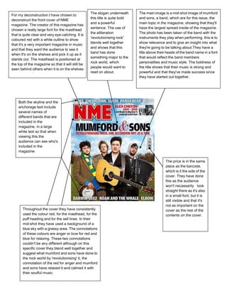
1. The slogan underneath The main image is a mid-shot image of mumford
For my deconstruction I have chosen to
this title is quite bold and sons, a band, which are for this issue, the
deconstruct the front cover of NME
and a powerful main topic in the magazine, showing that they'll
magazine. The creator of this magazine has
sentence. The use of have the largest spread inside of the magazine.
chosen a really large font for the masthead
the alliteration The photo has been taken of the band with the
that is quite clear and very eye-catching. It is
'revolutionising rock' instruments they play when performing. this is to
coloured red with a white outline to show
blends well together show relevance and to give an insight into what
that it's a very important magazine in music
and shows that this they're going to be talking about.They have a
and that they want the audience to see it
band has done title above their heads of the band name in a font
when it's on the shelves and pick it up as it
something major to the that would reflect the band members
stands out. The masthead is positioned at
rock world, which personalities and music style. The boldness of
the top of the magazine so that it will still be
people would want to the title shows that their music is strong and
seen behind others when it is on the shelves
read on about. powerful and that they've made success since
they have started out together.
Both the skyline and the
anchorage text include
several names of
different bands that are
included in the
magazine, in a large
white text so that when
viewing this the
audience can see who's
included in the
magazine.
The price is in the same
place as the barcode,
which is it the side of the
cover. They have done
this as the audience
won't necassarily look
straight there as it's also
in a small font, but it is
still visible and that it's
not as important on the
Throughout the cover they have consistently cover as the rest of the
used the colour red, for the masthead, for the contents on the cover.
puff heading and for the sell lines. In their
mid-shot they have used a background of a
blue sky with a grassy area. The connotations
of these colours are anger or love for red and
blue for relaxing. These two connotations
couldn't be any different although on this
specific cover they blend well together and
suggest what mumford and sons have done to
the rock world by 'revolutionising' it, the
connotation of the red for anger and mumford
and sons have relaxed it and calmed it with
their soulful music.