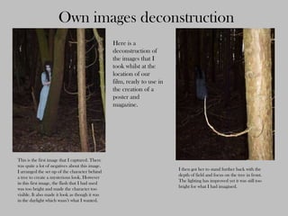
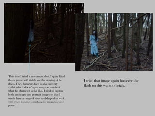
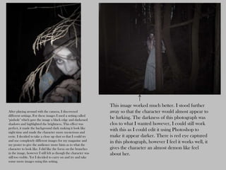
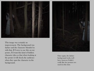
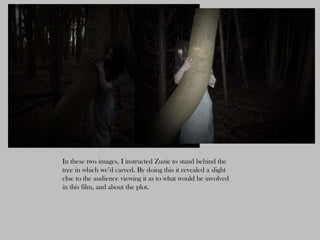
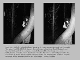
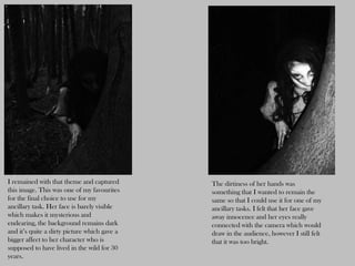
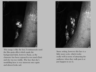
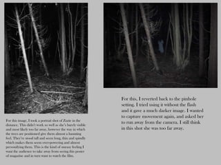
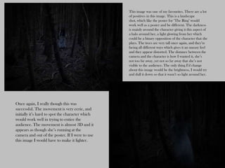
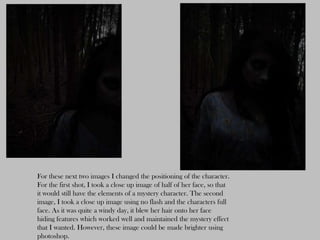
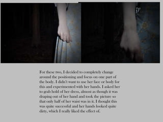
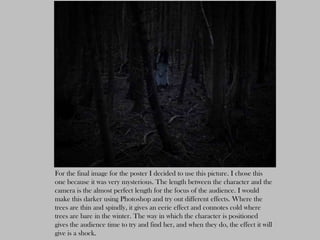
SlideShare a Scribd company logo
1 of 13
Own images deconstruction
                                                 Here is a
                                                 deconstruction of
                                                 the images that I
                                                 took whilst at the
                                                 location of our
                                                 film, ready to use in
                                                 the creation of a
                                                 poster and
                                                 magazine.


This is the first image that I captured. There
was quite a lot of negatives about this image.
                                                                         I then got her to stand further back with the
I arranged the set up of the character behind
                                                                         depth of field and focus on the tree in front.
a tree to create a mysterious look. However
                                                                         The lighting has improved yet it was still too
in this first image, the flash that I had used
                                                                         bright for what I had imagined.
was too bright and made the character too
visible. It also made it look as though it was
in the daylight which wasn’t what I wanted.
This time I tried a movement shot. I quite liked
this as you could visibly see the swaying of her    I tried that image again however the
dress. The characters face is also not very
visible which doesn’t give away too much of
                                                    flash on this was too bright.
what the character looks like. I tried to capture
both landscape and portrait images so that I
would have a range of sizes and shaped to work
with when it came to making my magazine and
poster.
This image worked much better. I stood further
After playing around with the camera, I discovered               away so that the character would almost appear to
different settings. For these images I used a setting called
‘pinhole’ which gave the image a black edge and darkened
                                                                 be lurking. The darkness of this photograph was
shadows and highlighted the brightness. This effect was          clos to what I wanted however, I could still work
perfect, it made the background dark making it look like
night time and made the character more mysterious and
                                                                 with this as I could edit it using Photoshop to
eerie. I decided to take a close up shot so that I could try     make it appear darker. There is red eye captured
and use completely different images for my magazine and          in this photograph, however I feel it works well, it
my poster to give the audience more hints as to what the
character to look like. I did like the focus on the branches     gives the character an almost demon like feel
in the image, however I still felt as though the character was   about her.
still too visible. Yet I decided to carry on and try and take
some more images using this setting.
This image was certainly an
improvement. The background was
darker and the character blended in
with that. If I were to use this on my
poster, I’d want this kind of hidden
character idea so that when looking at   Once again, the darker
the poster it will shock the audience    background works well
when they spot the character in the      here, however I didn’t
background.                              really like her posture too
                                         much in this shot.
In these two images, I instructed Zuzie to stand behind the
tree in which we’d carved. By doing this it revealed a slight
clue to the audience viewing it as to what would be involved
in this film, and about the plot.
I then went even further and explored more settings on the camera and came across this which was called
‘film grain’. I really liked this look of almost film noir footage, and that it was already black and white.
Likewise with the pinhole the background was made darker and the character appeared more
visible, however I think this worked. I positioned her so that she’s almost a distorted figure and that she
was creeping up the tree. As she was great at adapting into her role, she then pulled mysterious faces and
hid behind her hair, which worked really well and connoted a sense of creepiness.
I remained with that theme and captured       The dirtiness of her hands was
this image. This was one of my favourites     something that I wanted to remain the
for the final choice to use for my            same so that I could use it for one of my
ancillary task. Her face is barely visible    ancillary tasks. I felt that her face gave
which makes it mysterious and                 away innocence and her eyes really
endearing, the background remains dark        connected with the camera which would
and it’s quite a dirty picture which gave a   draw in the audience, however I still felt
bigger affect to her character who is         that it was too bright.
supposed to have lived in the wild for 30
years.
This image is like the last, I continuously used
the film grain affect which made the               Same setting, however this face is a
background dark, however Zuzie, as the             little more eerie, which works
character has been exposed to too much flash       really well in terms of attracting the
and she was too visible. The face that she’s       audience when they walk past it or
modelling here is very innocent once again         just happen to see it.
and almost looks sad.
For this, I reverted back to the pinhole
                                                             setting. I tried using it without the flash
                                                             and it gave a much darker image. I wanted
                                                             to capture movement again, and asked her
For this image, I took a portrait shot of Zuzie in the
distance. This didn’t work so well as she’s barely visible
                                                             to run away from the camera. I still think
and most likely too far away, however the way in which       in this shot she was too far away.
the trees are positioned give them almost a haunting
feel. They’re stood tall and seem long, thin and spindly
which makes them seem over-powering and almost
personifying them. This is the kind of uneasy feeling I
want the audience to take away from seeing this poster
of magazine and in turn want to watch the film.
This image was one of my favourites. There are a lot
                                                  of positives in this image. This is a landscape
                                                  shot, which like the poster for ‘The Ring’ would
                                                  work well as a poster and be different. The darkness
                                                  is mainly around the character giving it this aspect of
                                                  a halo around her, a light glowing from her which
                                                  could be a binary opposition of the character that she
                                                  plays. The trees are very tall once again, and they’re
                                                  facing all different ways which gives it an uneasy feel
                                                  and they appear distorted. The distance between the
                                                  camera and the character is how I wanted it, she’s
                                                  not too far away, yet not so far away that she’s not
                                                  visible to the audience. The only thing I’d change
                                                  about this image would be the brightness, I would try
                                                  and dull it down so that it wasn’t so light around her.


Once again, I really though this was
successful. The movement is very eerie, and
initially it’s hard to spot the character which
would work well in trying to entice the
audience. The movement is almost 3D and it
appears as though she’s running at the
camera and out of the poster. If I were to use
this image I would have to make it lighter.
For these next two images I changed the positioning of the character.
For the first shot, I took a close up image of half of her face, so that
it would still have the elements of a mystery character. The second
image, I took a close up image using no flash and the characters full
face. As it was quite a windy day, it blew her hair onto her face
hiding features which worked well and maintained the mystery effect
that I wanted. However, these image could be made brighter using
photoshop.
For these two, I decided to completely change
around the positioning and focus on one part of
the body. I didn’t want to use her face or body for
this and experimented with her hands. I asked her
to grab hold of her dress, almost as though it was
draping out of her hand and took the picture so
that only half of her waist was in it. I thought this
was quite successful and her hands looked quite
dirty, which I really liked the effect of.
For the final image for the poster I decided to use this picture. I chose this
one because it was very mysterious. The length between the character and the
camera is the almost perfect length for the focus of the audience. I would
make this darker using Photoshop and try out different effects. Where the
trees are thin and spindly, it gives an eerie effect and connotes cold where
trees are bare in the winter. The way in which the character is positioned
gives the audience time to try and find her, and when they do, the effect it will
give is a shock.

More Related Content

What's hot

Creative and Digital Media
Creative and Digital MediaCreative and Digital Media
Creative and Digital MediaFayeVictoria
 
aung chozan_stevebloom_research presentation
aung chozan_stevebloom_research presentationaung chozan_stevebloom_research presentation
aung chozan_stevebloom_research presentationchozan
 
Question 5 - How did you attract/address your audience?
Question 5 - How did you attract/address your audience?Question 5 - How did you attract/address your audience?
Question 5 - How did you attract/address your audience?AshleeRose21196
 
Practice photographs
Practice photographsPractice photographs
Practice photographsugnemaria
 
Magazine anaylisis almost done
Magazine anaylisis almost doneMagazine anaylisis almost done
Magazine anaylisis almost doneravensinnott
 
Digital Graphics Development pro formal
Digital Graphics Development pro formalDigital Graphics Development pro formal
Digital Graphics Development pro formalMaximLancaster12345
 
Development pro forma new version
Development pro forma new versionDevelopment pro forma new version
Development pro forma new versionMaximLancaster12345
 
Jamie's sketchbook
Jamie's sketchbookJamie's sketchbook
Jamie's sketchbookJamie Hyman
 
Manipulating images media
Manipulating images   mediaManipulating images   media
Manipulating images mediaelisedaniels94
 
Kane gibbons conventions question main
Kane gibbons   conventions question mainKane gibbons   conventions question main
Kane gibbons conventions question mainkanegibbons1
 
P is for psycho blog 2
P is for psycho blog 2P is for psycho blog 2
P is for psycho blog 2kianna1
 
Evaluation question 2
Evaluation  question 2Evaluation  question 2
Evaluation question 2chloem-w
 

What's hot (18)

Creative and Digital Media
Creative and Digital MediaCreative and Digital Media
Creative and Digital Media
 
aung chozan_stevebloom_research presentation
aung chozan_stevebloom_research presentationaung chozan_stevebloom_research presentation
aung chozan_stevebloom_research presentation
 
Question 5 - How did you attract/address your audience?
Question 5 - How did you attract/address your audience?Question 5 - How did you attract/address your audience?
Question 5 - How did you attract/address your audience?
 
Practice photographs
Practice photographsPractice photographs
Practice photographs
 
Magazine anaylisis almost done
Magazine anaylisis almost doneMagazine anaylisis almost done
Magazine anaylisis almost done
 
Digital Graphics Development pro formal
Digital Graphics Development pro formalDigital Graphics Development pro formal
Digital Graphics Development pro formal
 
Development pro forma new version
Development pro forma new versionDevelopment pro forma new version
Development pro forma new version
 
Editing
EditingEditing
Editing
 
Jamie's sketchbook
Jamie's sketchbookJamie's sketchbook
Jamie's sketchbook
 
Evaluation
EvaluationEvaluation
Evaluation
 
Manipulation
Manipulation Manipulation
Manipulation
 
Manipulating images media
Manipulating images   mediaManipulating images   media
Manipulating images media
 
Development
Development Development
Development
 
Shooting schedule (1)
Shooting schedule (1)Shooting schedule (1)
Shooting schedule (1)
 
Kane gibbons conventions question main
Kane gibbons   conventions question mainKane gibbons   conventions question main
Kane gibbons conventions question main
 
Wedding Picture Editing Process
Wedding Picture Editing Process Wedding Picture Editing Process
Wedding Picture Editing Process
 
P is for psycho blog 2
P is for psycho blog 2P is for psycho blog 2
P is for psycho blog 2
 
Evaluation question 2
Evaluation  question 2Evaluation  question 2
Evaluation question 2
 

Viewers also liked

Viewers also liked (9)

Images
ImagesImages
Images
 
Pie charts
Pie chartsPie charts
Pie charts
 
Dtz Property Times Q4 2011
Dtz Property Times Q4 2011Dtz Property Times Q4 2011
Dtz Property Times Q4 2011
 
Film magazine front cover destruction
Film magazine front cover destructionFilm magazine front cover destruction
Film magazine front cover destruction
 
Pie charts
Pie chartsPie charts
Pie charts
 
Orquideas
OrquideasOrquideas
Orquideas
 
Pie charts
Pie chartsPie charts
Pie charts
 
Pie charts
Pie chartsPie charts
Pie charts
 
Orquideas
OrquideasOrquideas
Orquideas
 

Similar to Own images

Original images
Original imagesOriginal images
Original imagesruwaydah13
 
Photo shoot and Image Manipulation
Photo shoot and Image ManipulationPhoto shoot and Image Manipulation
Photo shoot and Image Manipulationalexsimpson95
 
Evaluation question 2
Evaluation  question 2Evaluation  question 2
Evaluation question 2chloem-w
 
Analysis of movie poster for trailer
Analysis of movie poster for trailerAnalysis of movie poster for trailer
Analysis of movie poster for traileradinabredenthorpe
 
Edited photgraphy
Edited photgraphyEdited photgraphy
Edited photgraphylstafford97
 
Pictures for poster/magazine front cover
Pictures for poster/magazine front coverPictures for poster/magazine front cover
Pictures for poster/magazine front covermelaniacross
 
Techniques used in horror film openings
Techniques used in horror film openingsTechniques used in horror film openings
Techniques used in horror film openingsHannahTapscott
 
Mise en scene powerpoint
Mise en scene powerpointMise en scene powerpoint
Mise en scene powerpointsareets
 
Mise En Scene POWERPOINT
Mise En Scene POWERPOINTMise En Scene POWERPOINT
Mise En Scene POWERPOINTsareets
 
Creative Image Taking!
Creative Image Taking!Creative Image Taking!
Creative Image Taking!agatatrigox
 

Similar to Own images (20)

Own images
Own imagesOwn images
Own images
 
Original images
Original imagesOriginal images
Original images
 
Photo shoot and Image Manipulation
Photo shoot and Image ManipulationPhoto shoot and Image Manipulation
Photo shoot and Image Manipulation
 
Evaluation question 2
Evaluation  question 2Evaluation  question 2
Evaluation question 2
 
Analysis of movie poster for trailer
Analysis of movie poster for trailerAnalysis of movie poster for trailer
Analysis of movie poster for trailer
 
Photoshop
PhotoshopPhotoshop
Photoshop
 
Prelim vs Product
Prelim vs ProductPrelim vs Product
Prelim vs Product
 
Mood board analysed
Mood board analysedMood board analysed
Mood board analysed
 
Advert process
Advert processAdvert process
Advert process
 
Added back page
Added back pageAdded back page
Added back page
 
Edited photgraphy
Edited photgraphyEdited photgraphy
Edited photgraphy
 
Task 7
Task 7Task 7
Task 7
 
Pictures for poster/magazine front cover
Pictures for poster/magazine front coverPictures for poster/magazine front cover
Pictures for poster/magazine front cover
 
Task 7
Task 7Task 7
Task 7
 
Evaluation question 1
Evaluation question 1Evaluation question 1
Evaluation question 1
 
Techniques used in horror film openings
Techniques used in horror film openingsTechniques used in horror film openings
Techniques used in horror film openings
 
Mise en scene powerpoint
Mise en scene powerpointMise en scene powerpoint
Mise en scene powerpoint
 
Mise En Scene POWERPOINT
Mise En Scene POWERPOINTMise En Scene POWERPOINT
Mise En Scene POWERPOINT
 
Wedding Picture Editing Process
Wedding Picture Editing Process Wedding Picture Editing Process
Wedding Picture Editing Process
 
Creative Image Taking!
Creative Image Taking!Creative Image Taking!
Creative Image Taking!
 

More from chloeanne94

Film magazine front cover destruction
Film magazine front cover destructionFilm magazine front cover destruction
Film magazine front cover destructionchloeanne94
 
Film poster deconstruction
Film poster deconstructionFilm poster deconstruction
Film poster deconstructionchloeanne94
 
Film magazine front cover destruction
Film magazine front cover destructionFilm magazine front cover destruction
Film magazine front cover destructionchloeanne94
 
Film poster deconstruction
Film poster deconstructionFilm poster deconstruction
Film poster deconstructionchloeanne94
 
Film poster deconstruction
Film poster deconstructionFilm poster deconstruction
Film poster deconstructionchloeanne94
 
Photoshop run through latest
Photoshop run through latestPhotoshop run through latest
Photoshop run through latestchloeanne94
 
Photoshop print screens
Photoshop print screensPhotoshop print screens
Photoshop print screenschloeanne94
 
Titles for my magazine
Titles for my magazineTitles for my magazine
Titles for my magazinechloeanne94
 
Music magazine photoshoot
Music magazine photoshootMusic magazine photoshoot
Music magazine photoshootchloeanne94
 
Billboard magazine
Billboard magazineBillboard magazine
Billboard magazinechloeanne94
 
Billboard magazine
Billboard magazineBillboard magazine
Billboard magazinechloeanne94
 
Music magazine questionnaire results pie chart
Music magazine questionnaire results pie chartMusic magazine questionnaire results pie chart
Music magazine questionnaire results pie chartchloeanne94
 
Magazine deconstruction
Magazine deconstructionMagazine deconstruction
Magazine deconstructionchloeanne94
 
Front cover slideshare
Front cover slideshareFront cover slideshare
Front cover slidesharechloeanne94
 
Nme magazine deconstruction
Nme magazine deconstructionNme magazine deconstruction
Nme magazine deconstructionchloeanne94
 

More from chloeanne94 (20)

Film magazine front cover destruction
Film magazine front cover destructionFilm magazine front cover destruction
Film magazine front cover destruction
 
Film poster deconstruction
Film poster deconstructionFilm poster deconstruction
Film poster deconstruction
 
Film magazine front cover destruction
Film magazine front cover destructionFilm magazine front cover destruction
Film magazine front cover destruction
 
Film poster deconstruction
Film poster deconstructionFilm poster deconstruction
Film poster deconstruction
 
Film poster deconstruction
Film poster deconstructionFilm poster deconstruction
Film poster deconstruction
 
Wight noise
Wight noiseWight noise
Wight noise
 
Pie charts
Pie chartsPie charts
Pie charts
 
Photoshop run through latest
Photoshop run through latestPhotoshop run through latest
Photoshop run through latest
 
Photoshop print screens
Photoshop print screensPhotoshop print screens
Photoshop print screens
 
Media titles
Media titlesMedia titles
Media titles
 
Titles for my magazine
Titles for my magazineTitles for my magazine
Titles for my magazine
 
Music magazine photoshoot
Music magazine photoshootMusic magazine photoshoot
Music magazine photoshoot
 
Billboard magazine
Billboard magazineBillboard magazine
Billboard magazine
 
Pie charts
Pie chartsPie charts
Pie charts
 
Billboard magazine
Billboard magazineBillboard magazine
Billboard magazine
 
Q magazine
Q magazineQ magazine
Q magazine
 
Music magazine questionnaire results pie chart
Music magazine questionnaire results pie chartMusic magazine questionnaire results pie chart
Music magazine questionnaire results pie chart
 
Magazine deconstruction
Magazine deconstructionMagazine deconstruction
Magazine deconstruction
 
Front cover slideshare
Front cover slideshareFront cover slideshare
Front cover slideshare
 
Nme magazine deconstruction
Nme magazine deconstructionNme magazine deconstruction
Nme magazine deconstruction
 

Own images

  • 1. Own images deconstruction Here is a deconstruction of the images that I took whilst at the location of our film, ready to use in the creation of a poster and magazine. This is the first image that I captured. There was quite a lot of negatives about this image. I then got her to stand further back with the I arranged the set up of the character behind depth of field and focus on the tree in front. a tree to create a mysterious look. However The lighting has improved yet it was still too in this first image, the flash that I had used bright for what I had imagined. was too bright and made the character too visible. It also made it look as though it was in the daylight which wasn’t what I wanted.
  • 2. This time I tried a movement shot. I quite liked this as you could visibly see the swaying of her I tried that image again however the dress. The characters face is also not very visible which doesn’t give away too much of flash on this was too bright. what the character looks like. I tried to capture both landscape and portrait images so that I would have a range of sizes and shaped to work with when it came to making my magazine and poster.
  • 3. This image worked much better. I stood further After playing around with the camera, I discovered away so that the character would almost appear to different settings. For these images I used a setting called ‘pinhole’ which gave the image a black edge and darkened be lurking. The darkness of this photograph was shadows and highlighted the brightness. This effect was clos to what I wanted however, I could still work perfect, it made the background dark making it look like night time and made the character more mysterious and with this as I could edit it using Photoshop to eerie. I decided to take a close up shot so that I could try make it appear darker. There is red eye captured and use completely different images for my magazine and in this photograph, however I feel it works well, it my poster to give the audience more hints as to what the character to look like. I did like the focus on the branches gives the character an almost demon like feel in the image, however I still felt as though the character was about her. still too visible. Yet I decided to carry on and try and take some more images using this setting.
  • 4. This image was certainly an improvement. The background was darker and the character blended in with that. If I were to use this on my poster, I’d want this kind of hidden character idea so that when looking at Once again, the darker the poster it will shock the audience background works well when they spot the character in the here, however I didn’t background. really like her posture too much in this shot.
  • 5. In these two images, I instructed Zuzie to stand behind the tree in which we’d carved. By doing this it revealed a slight clue to the audience viewing it as to what would be involved in this film, and about the plot.
  • 6. I then went even further and explored more settings on the camera and came across this which was called ‘film grain’. I really liked this look of almost film noir footage, and that it was already black and white. Likewise with the pinhole the background was made darker and the character appeared more visible, however I think this worked. I positioned her so that she’s almost a distorted figure and that she was creeping up the tree. As she was great at adapting into her role, she then pulled mysterious faces and hid behind her hair, which worked really well and connoted a sense of creepiness.
  • 7. I remained with that theme and captured The dirtiness of her hands was this image. This was one of my favourites something that I wanted to remain the for the final choice to use for my same so that I could use it for one of my ancillary task. Her face is barely visible ancillary tasks. I felt that her face gave which makes it mysterious and away innocence and her eyes really endearing, the background remains dark connected with the camera which would and it’s quite a dirty picture which gave a draw in the audience, however I still felt bigger affect to her character who is that it was too bright. supposed to have lived in the wild for 30 years.
  • 8. This image is like the last, I continuously used the film grain affect which made the Same setting, however this face is a background dark, however Zuzie, as the little more eerie, which works character has been exposed to too much flash really well in terms of attracting the and she was too visible. The face that she’s audience when they walk past it or modelling here is very innocent once again just happen to see it. and almost looks sad.
  • 9. For this, I reverted back to the pinhole setting. I tried using it without the flash and it gave a much darker image. I wanted to capture movement again, and asked her For this image, I took a portrait shot of Zuzie in the distance. This didn’t work so well as she’s barely visible to run away from the camera. I still think and most likely too far away, however the way in which in this shot she was too far away. the trees are positioned give them almost a haunting feel. They’re stood tall and seem long, thin and spindly which makes them seem over-powering and almost personifying them. This is the kind of uneasy feeling I want the audience to take away from seeing this poster of magazine and in turn want to watch the film.
  • 10. This image was one of my favourites. There are a lot of positives in this image. This is a landscape shot, which like the poster for ‘The Ring’ would work well as a poster and be different. The darkness is mainly around the character giving it this aspect of a halo around her, a light glowing from her which could be a binary opposition of the character that she plays. The trees are very tall once again, and they’re facing all different ways which gives it an uneasy feel and they appear distorted. The distance between the camera and the character is how I wanted it, she’s not too far away, yet not so far away that she’s not visible to the audience. The only thing I’d change about this image would be the brightness, I would try and dull it down so that it wasn’t so light around her. Once again, I really though this was successful. The movement is very eerie, and initially it’s hard to spot the character which would work well in trying to entice the audience. The movement is almost 3D and it appears as though she’s running at the camera and out of the poster. If I were to use this image I would have to make it lighter.
  • 11. For these next two images I changed the positioning of the character. For the first shot, I took a close up image of half of her face, so that it would still have the elements of a mystery character. The second image, I took a close up image using no flash and the characters full face. As it was quite a windy day, it blew her hair onto her face hiding features which worked well and maintained the mystery effect that I wanted. However, these image could be made brighter using photoshop.
  • 12. For these two, I decided to completely change around the positioning and focus on one part of the body. I didn’t want to use her face or body for this and experimented with her hands. I asked her to grab hold of her dress, almost as though it was draping out of her hand and took the picture so that only half of her waist was in it. I thought this was quite successful and her hands looked quite dirty, which I really liked the effect of.
  • 13. For the final image for the poster I decided to use this picture. I chose this one because it was very mysterious. The length between the character and the camera is the almost perfect length for the focus of the audience. I would make this darker using Photoshop and try out different effects. Where the trees are thin and spindly, it gives an eerie effect and connotes cold where trees are bare in the winter. The way in which the character is positioned gives the audience time to try and find her, and when they do, the effect it will give is a shock.