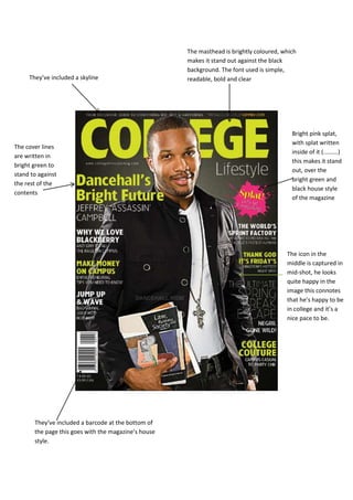
1. The masthead is brightly coloured, which
makes it stand out against the black
background. The font used is simple,
They’ve included a skyline readable, bold and clear
Bright pink splat,
with splat written
The cover lines
inside of it (.........)
are written in
this makes it stand
bright green to
out, over the
stand to against
bright green and
the rest of the
black house style
contents
of the magazine
The icon in the
middle is captured in
mid-shot, he looks
quite happy in the
image this connotes
that he’s happy to be
in college and it’s a
nice pace to be.
They’ve included a barcode at the bottom of
the page this goes with the magazine’s house
style.
2. Masthead: They’ve used a bold
font this connotes………………
They’ve used the colour blue, Mid-shot: shows the subject in
blue symbolises health and more detail without actually
Language: “FALL” this
tranquillity. showing the whole frame.
denotes that it’s an
American magazine.
They’ve
highlighted the
cover lines in
another colour to
make it stand out
Language: Informal They’ve made it clear that it’s free, by
language creates a writing “100%”, this emphasises that it’s
relaxed atmosphere for students as they would not have a
lot of disposable income to spend on
things like magazines.
3. It is clearly shown that
this is a contents
page, making it easier
for the user to
The angle at which the
navigate their way
images are at and the
around
text go well together.
The slants fit into place
However the image
in the corner looks
out of place, it
makes the page
look less
professional, as the
image is half cut off