2. I used four columns throughout my article, with the same lengths to make it
seem neat and ordered. For the body text of the article I gave the paragraphs a
leading of 11pt with 2mm spacing – to keep them even and give the article
breathing space to make it seem more inviting to read.
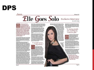
I used one image on my article which is of the artist ‘Elle’, who the article is
about. With these photo I put a work path around it to allow a ‘clipping path’;
this then allowed me to set a text wrap around the image which mean the text
would fall around it.
The main headline of my DPS has been given the same font of the masthead of
the magazine; to connect the two and make it clear they’re from the same
magazine. I used the colours black and red on the headline to match the colour
scheme given throughout the magazine and then put the copied the text with
the colour grey underneath this, to the side – this then creates a shadow effect
for the headline.
To separate different sections of the article I used a background with the
starting letter being bigger then the ordinary font of the rest of the text. The
background has a flowery, authentic format that sits around the letter whilst
having a dark red colouring – which also relates to the colour scheme.
3. I included my masthead symbol in the left hand corner, at the start of my DPS
so its clear that it’s part of my magazine. I also put a dark red underneath it
that ran across the two pages to show a further link between the two pages and
used it below the masthead symbol to separate it from the headline and article.
Furthermore, I used a different style to text at the start and finishing of my
DPS to summarize the article. It helps to seperate the text and draw attention
to the important parts of the articles.
I also included two quotes in the layout of my article to help break up the text.
These quotes are in a text used for the starting letters of the headline in a dark
red; I used a different font for these to draw attention to them.