
Recommended
More Related Content
What's hot
What's hot (18)
Viewers also liked
Viewers also liked (14)
Similar to Double Page Spread Of NME
Similar to Double Page Spread Of NME (20)
Recently uploaded
Recently uploaded (20)
Double Page Spread Of NME
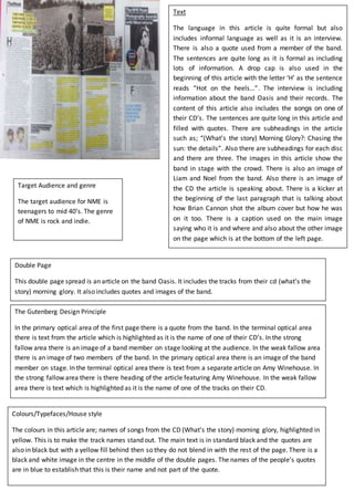
- 1. Target Audience and genre The target audience for NME is teenagers to mid 40’s. The genre of NME is rock and indie. Double Page This double page spread is an article on the band Oasis. It includes the tracks from their cd (what’s the story) morning glory. It also includes quotes and images of the band. Colours/Typefaces/House style The colours in this article are; names of songs from the CD (What’s the story) morning glory, highlighted in yellow. This is to make the track names stand out. The main text is in standard black and the quotes are also in black but with a yellow fill behind then so they do not blend in with the rest of the page. There is a black and white image in the centre in the middle of the double pages. The names of the people’s quotes are in blue to establish that this is their name and not part of the quote. Text The language in this article is quite formal but also includes informal language as well as it is an interview. There is also a quote used from a member of the band. The sentences are quite long as it is formal as including lots of information. A drop cap is also used in the beginning of this article with the letter ‘H’ as the sentence reads “Hot on the heels…”. The interview is including information about the band Oasis and their records. The content of this article also includes the songs on one of their CD’s. The sentences are quite long in this article and filled with quotes. There are subheadings in the article such as; “(What’s the story) Morning Glory?: Chasing the sun: the details”. Also there are subheadings for each disc and there are three. The images in this article show the band in stage with the crowd. There is also an image of Liam and Noel from the band. Also there is an image of the CD the article is speaking about. There is a kicker at the beginning of the last paragraph that is talking about how Brian Cannon shot the album cover but how he was on it too. There is a caption used on the main image saying who it is and where and also about the other image on the page which is at the bottom of the left page. The Gutenberg Design Principle In the primary optical area of the first page there is a quote from the band. In the terminal optical area there is text from the article which is highlighted as it is the name of one of their CD’s. In the strong fallow area there is an image of a band member on stage looking at the audience. In the weak fallow area there is an image of two members of the band. In the primary optical area there is an image of the band member on stage. In the terminal optical area there is text from a separate article on Amy Winehouse. In the strong fallow area there is there heading of the article featuring Amy Winehouse. In the weak fallow area there is text which is highlighted as it is the name of one of the tracks on their CD.