1. How does your media product represent particular social groups?
My media product shows both males and females as being the typical music loving teenager between the ages
of 15 and 19. My product avoids the stereotype of troublesome teenagers, by not using any images that give a
‘rough’ feel to the product, the language used is chatty yet no foul language is used and no ‘indecent’ images.
This creates a more innocent feel and I think this makes the readers feel more respected, avoiding the
stereotype that is given to teenagers.
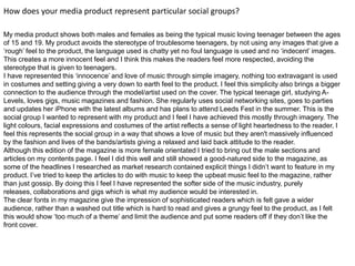
I have represented this ‘innocence’ and love of music through simple imagery, nothing too extravagant is used
in costumes and setting giving a very down to earth feel to the product. I feel this simplicity also brings a bigger
connection to the audience through the model/artist used on the cover. The typical teenage girl, studying A-
Levels, loves gigs, music magazines and fashion. She regularly uses social networking sites, goes to parties
and updates her iPhone with the latest albums and has plans to attend Leeds Fest in the summer. This is the
social group I wanted to represent with my product and I feel I have achieved this mostly through imagery. The
light colours, facial expressions and costumes of the artist reflects a sense of light heartedness to the reader, I
feel this represents the social group in a way that shows a love of music but they aren't massively influenced
by the fashion and lives of the bands/artists giving a relaxed and laid back attitude to the reader.
Although this edition of the magazine is more female orientated I tried to bring out the male sections and
articles on my contents page. I feel I did this well and still showed a good-natured side to the magazine, as
some of the headlines I researched as market research contained explicit things I didn’t want to feature in my
product. I’ve tried to keep the articles to do with music to keep the upbeat music feel to the magazine, rather
than just gossip. By doing this I feel I have represented the softer side of the music industry, purely
releases, collaborations and gigs which is what my audience would be interested in.
The clear fonts in my magazine give the impression of sophisticated readers which is felt gave a wider
audience, rather than a washed out title which is hard to read and gives a grungy feel to the product, as I felt
this would show ‘too much of a theme’ and limit the audience and put some readers off if they don’t like the
front cover.