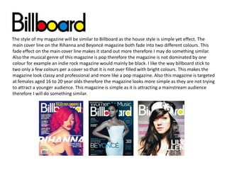
1. The style of my magazine will be similar to Billboard as the house style is simple yet effect. The
main cover line on the Rihanna and Beyoncé magazine both fade into two different colours. This
fade effect on the main cover line makes it stand out more therefore I may do something similar.
Also the musical genre of this magazine is pop therefore the magazine is not dominated by one
colour for example an indie rock magazine would mainly be black. I like the way billboard stick to
two only a few colours per a cover so that it is not over filled with bright colours. This makes the
magazine look classy and professional and more like a pop magazine. Also this magazine is targeted
at females aged 16 to 20 year olds therefore the magazine looks more simple as they are not trying
to attract a younger audience. This magazine is simple as it is attracting a mainstream audience
therefore I will do something similar.
2. The genre of this magazine is pop however it is aimed at a young target audience therefore I
won’t do something like this magazine as it is aimed at 10 to 16 year olds. They have used bright
colours like hot pink and yellow which makes the magazine look very busy which would attract a
younger audience. Also they have filled the page with information but mainly pictures which I
personally think makes the page look messy. However I may have my masthead in the top left
third like this magazine as it is clear and when the magazine is stacked on the shelve you will still
be able to see what magazine it is.
4. Artists give out advice on how to
make your music dreams come true
New artists/ bands
Tour dates
Festivals
Posters
Ideas for music
magazine-contents
Competitions
Top 40- most popular
songs of the week
Exclusive interviews
with artists and bands
Music awards- E.g.
Best female artist