
Recommended
More Related Content
What's hot
What's hot (19)
Similar to Media Magazine Evaluation
Similar to Media Magazine Evaluation (20)
Recently uploaded
Recently uploaded (20)
Media Magazine Evaluation
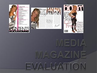
- 2. In what ways does your media product use, develop, change or challenge forms and conventions of real media products? I HAVE USED 3 DIFFERENT SECTIONS ON MY CONTENTS PAGE TO SPLIT EVERYTHING UP, THIS IS CONVENTIONAL TO OTHER MAGAZINES. I HAVE PUT SOME STORIES IN THE BOTTOM RIGHT CORNER, WHICH IS CALLED THE TERMINAL OPTICAL AREA. I HAVE UNDERLINED SOME OF THE MAIN STORIES IN THE MAGAZINE WHICH IS USED IN OTHER MAGAZINES. I HAVE MADE THE PAGE BALANCED, SO THAT THE TEXT, PICTURES AND HEADINGS ARE EVENED OUT ON THE PAGE.
- 3. How does your magazine represent particular social groups? THE PINK TEXT SUGGESTS IT’S A WOMANS MAGAZINE, ALSO THE HEADLINES AND R&B THEMED TOPICS ON THE COVER WILL ONLY ATTACT CERTAIN SOCIAL GROUPS, TEENAGERS AND YOUNG ADULTS. THE CLOTHING WORN BY THE MODEL ON THE FRONT IS QUITE GENERAL AND TARGETS NO PARTICULAR SOCIAL GROUP, HOWEVER IT WOULD NOT APPEAL TO PEOPLE WHO LISTEN TO DIFFERENT GENRES OF MUSIC SUCH AS INDIE AND ROCK.
- 4. What type of media institution might distribute your magazine? The distributors of Vibe magazine would distribute my magazine, as they as the same style and appeal to the same audience. The music in both magazines in R&B
- 5. The audience for my magazine would be teenagers and young adults who like listening to R&B music, as it contains images and text about upcoming and already famous artists. The images and text I have used look more feminine so girls would probably buy this magazine as it would appeal to them more than it would a male, however the text itself is suitable for both. Who would be the audience for your media magazine? I have used a lot of pink throughout my presentation which does make it look girly.
- 6. How did you attract/address your audience? I have used a large bold masthead which attracts the eye because of the contrast in colour. I have used a striking image of a young attractive girl which widens the audience, as it appeals to males as well as females. The colour scheme I have used is Pink Black and White, these colours all contrast with each other which looks attractive to the eye. I have used some buzz words and also used big names in R&B to make people pick the magazine up. I have used a large cover lines, this looks attractive and attracts the eye.
- 7. What have you learnt about technologies from the process of constructing this product? I have learnt about different angles and shots to make the picture look more effective and what makes a better picture. I have also learnt how to do different things on Photoshop, such as removing red eye, and spots, I used this skill to edit my photographs for my magazine. Also how to plan and construct time to make sure my product is finished in time. If I could change something about my media product it would be how I spent my time working on it. I would have planned it out on paper first to see what it really would have looked like, and how I needed to take my pictures. Using other technologies helped to achieve a professional standard, such as using a blog site to book mark certain things you may want to refer to later in the project. Having a blog also means you can plan and show certain aspects of the project to a greater detail.
- 8. Looking back at your preliminary task, what do you feel you have learnt in the progression from it to the full product? My preliminary task has a huge difference to my magazine now, it is of a much lower standard. The preliminary task was a practice run and I learnt how to use Photoshop properly before making my main magazine. My preliminary magazine was not that good. I can see where I have improved from cutting people out to there I put my text and the font I use. Now I understand all the photo shop tools and how to use them, whereas I didn't know all of them in my preliminary task so I didn't use a range of techniques, however the preliminary task helped me to understand what I am expected to achieve for final product.