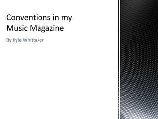
3. Masthead
House Style: The Masthead in my Format: My magazine’s masthead
magazine cover presents the entire follows the conventional format of
house style of my magazine a lot like having the title on the left in the
how the masthead in NME magazine primary optical area and having
is used. The house style font is additional information to the right
chosen and carried through each of that including price issue number
page in the page numbers and the and date, this is sometimes used for
IMM in the corner of each of them. the area to present the cover story
This gives the audience a sense of but also this key information.
order and professionalism.
Colour: The use of colour in my masthead is very minimal
which is conventional of the indie genre. The use of two
main colours has been used in a variety of pre-existing indie
magazines as shown in the example above. NME uses this
simple colour scheme to appeal to it target audience of
indie music fans by reflecting the style of the artists, in the
same way I have in my magazine masthead.
4. Image
Band Image: The main image used in my Camerawork and effects: Another reason
front cover is conventional of the indie my image is conventional is because of the
genre showing a featured band posing camerawork and effects used in its
to extenuate their style as musicians. construction. The low angle shot of the
They are posing in a casual style leaning band is something used very often to
against a wall identifying them as laid present them as being more powerful
back and a little bit anti social being people to look up to and respect for their
shown the opposite of societies view of musical talents which would make the
the sensible person standing up straight potential reader want to learn more about
and being seen as a respectable person. them and buy the magazine, it is a
They are all looking in different technique used in the indie genre a lot and
directions showing them as unorganised is very conventional of band images. The
and being individuals despite being in effects used on the image of a black and
the same band, this is very conventional white filter is also very conventional being
of indie bands showing each member well known in the indie genre to present a
differently to show off how unique they band differently from the mainstream pop
are. Other conventional main images artists to appeal to a wider audience who
are either solo artists or a symbol that are looking for an alternative style of
connotes a certain band but the most music. The example below mine shows an
common is the band image as I have NME magazine with a band image with a
used. The setting of the image is also faded filter making the band look more
very conventional being different from moody and emotional than other artists
the mainstream camera shoots most connoting their music as being more
pop artists are used to this image shows meaningful and worth listening to and
the band outside against a brick wall in making the magazine seem worth reading
a slightly amateur style which is for music fans.
conventional of the style to appeal to its
target audience.
5. Font
The fonts used in my magazine are all very conventional of the indie genre and of music
publications in general. San serif fonts are used mainly to make the reading of the
magazine as easy as possible for my target audience reading for leisure.
The first font noticed on my magazine cover is the name of the magazine I.M.M
presented in a big bold font starting the house style font which is used on every page of
the magazine in the page numbers and headings of certain articles. The boldest font
being used for the magazine name is very conventional of any magazine as it allows any
potential reader’s attention to be instantly drawn to the magazine name and recognise it
which would make them want to buy the magazine with any prior knowledge of it if
they’re a fan of the indie genre.
The cover story of my magazine is made up of two fonts, the first being the font used for
the featured band’s name at every mention of them in the serif font which makes it
stand out against the variety of other fonts which makes it draw attention to the feature
article of the magazine to get the audience interested. The second font is a very plain
san serif which helps make the band name stand out even more next to it but also
allows it to be very easily read by the potential audience.
The cover line above the cover story is set out in a similar way with a bold font
introducing other featured bands which are shown in their own individual fonts, this is
very conventional of the genre presenting each band in their own fonts to make them
stand out against the rest and reflect the band’s image from just their name.
6. Layout
Rule of thirds: on the front cover of my Route of the eye: the route of the eye shown on
magazine the rule of thirds technique is my magazine cover crosses every important
used to make certain points stand out in aspect of the design. Starting in the primary
the brain more than others, the top two optical area with the magazine name making it
points focus on the two main members the first thing noticed about the magazine it
of the featured band in the band continues to the issue number date and price all
image, the lead guitarist and the bass important information presented very clearly to
guitarist/vocalist. These focus points are the audience. It then goes down across the main
very important to be shown standing out image of the featured band taking up most of the
against the rest as the featured band and cover to the cover story and across to the
two main members are conventionally terminal area after reading the cover story being
seen as more important than the rest of the last thing seen about the magazine. This
the items on the cover. The lower two method of presenting the magazine is
focus points are focusing half on the conventional as is shows the most important
instruments the band member on the features very quickly and easily.
left is holding showing them as a
conventional indie band and half on the
cover story and band logo making the
target audience focus more on the band
and giving a clearer idea of what’s going
to be inside the magazine.
8. Images
The images I have used are very similar to the one used on the front cover of
the featured band, I have used artist images to present the articles about them
in a clearer way showing them as the main points to look out for in this
magazine.
The image on the left is presenting an unusual artist the type conventional of
indie music magazines to cover showing off the conventions of the genre as
unusual, different and unique individuals. The image presenting her is using a
vintage filter and is in a film strip style border which shows the style as being
reflective of an age before digital film giving it a more vintage look fans of the
genre enjoy. The camera angle used in this image shows the female artist at a
slightly high angle shot as she plays her instrument, this is conventional as
showing her as less powerful than other artists playing more on the unique
factor making her more appealing to her audience. The instrument in the image
used, the double bass, is an instrument used very rarely in the industry which
shows instantly the unique artist and appeals to its audience. The setting of a
storeroom inside is also conventional being scattered with instruments
appealing to music fans and indie genre lovers.
The image on the right is showing another artist with an unusual instument, the
ukelele, this image presents the male artist as being a confident musician
posing with his instument, conventional of the genre. The camera angle uses a
slightly low angle shot showing him as being confident in his work and his
music and showing him against a grey brick wall in a blue hoody makes him
stand out against his background symbolic of the message the magazine is
trying to present.
9. Font
The heading of the contents page uses the return of the house style font in the
IMM to create a sense of uniform between the pages, this is conventional of
the genre and many magazines in the field and others to create a more
professional feel to the publication. The other font used for the contents page is
unusual using a combination of different heights in the font along with the
curvature of the letters giving it a very unique style this is conventional and
reflects the indie genre shown on a page as important as the contents makes it
seen by all readers no matter why they bought the magazine.
The menu down the right side of the page also uses the unusual font used in
the heading of the page to again create a uniform professional sense and not
over clog the page with too many different fonts. The items on the menu are
however used in a different more san serif font in bold to make them stand out
against the paragraphs of writing on the page and make it quicker and easier to
read this is conventional as the smaller fonts on the page aren’t as big and
stylistic as the bigger fonts.
The main body copy uses the same font but emboldened as the audience isn’t
expected to read it as much as the other main sections of the page. The quotes
however are the only part of the body copy shown in a different font to present
them as easier to find as they give an insight into the article without finding it in
the magazine.
10. Layout
The main layout to this contents page positions the heading at the top in any conventional way, the main menu of contents to
the right column and the main features in the centre of the page in two columns with another underneath. This layout is very
similar to the layout presented in NME and other music magazines. The heading at the top of the page welcomes the reader
to the magazine’s contents page, the first seen thing is the images and show what the editor thinks will be the most popular
features depending on the artists being shown and their predicted popularity with the target audience this makes them very
easy to see and gives them a large part of the page to be filled with a brief description of the article and what it is showing
hopefully persuading the reader to read that article. The third part of the page is the right contents column which shows the
magazine contents in its simplest form showing the main parts of the magazine to make it easier for the reader to navigate
around it.
12. Image
The images I have used for my double page spread are very
conventional as they present the band being written about in the
style the band is created as. The examples on the left are all from
various music magazines mainly in the indie genre, They all
present the band/artist in a conventional way. The first shows a
band posing in the usual format of four in casual clothes the front
man looking unshaven and slightly rebellious. The middle image is
of a female artist presented to extenuate the sex appeal in her
pose and costume chosen for the article. The bottom image
shows a very amateur looking shot of an artist in a casual setting
of a pub holding drinks looking very relaxed in the indie style of
not caring. My images present my chosen band as a conventional
band but with the individuality of each member shown. The
largest image shows the band leaning over a balcony all looking
into the distance holding their instruments with an
inspired/emotional expression each conventional of the style an
indie group would want to reflect on their meaningful music they
wish to produce. The bottom left image presents the band in an
action shot posing with their instruments all three guitarists
strumming and the drummer in the back, the conventional place
for the drummer. This presents the band as a conventional format
in the diamond shape famous from bands such as The Beatles and
Queen. The bottom right image is one I’m particularly proud
of, showing the bands drummer in his action shot about to hit the
drum in an aggressive way with an aggressive expression on his
face. The image used low key lighting to show more the
angry, aggressive style of the drummer which is very conventional
in any genre of music’s band.
13. Font
The fonts I’ve used for my headline vary from the
band font/logo to the san serif headline of the
“Exclusive Interview” to the newspaper style layout
of the by-line which uses the literary device the rule
of three separated by lines to make each part stand
out even more. The band name being presented in
every part of the magazine in the same font is a
convention of many bands/artists not only in
magazines but throughout their albums and
mentions in many publications. I have followed this
convention with this band. The headline being
shown in the most easily readable font is a
convention of many magazines as shown in 2 out of
three of the example articles as the serif headline
matches the style of the whole article whereas my
article is stylised in a way which can use the san serif
font. There is also the IMM logo in the top left
corner of the article to again present the house style
on all pages of the magazine.
The body copy of my article uses a similar
san serif font to the headline conventional
in style to many magazine articles in the
indie music genre or not. The exception
being with serif headlines as a serif font
for the body copy would be far too hard to
read for a casual magazine this is
marketed as. Another convention of my
body copy is the kicker used which can be
seen in all three of the example articles
which gives mine a more professional and
conventional look.
14. Layout
The layout of my double page spread follows the convention for
music articles very well. The typical format being an image taking
up the whole of or more than one page, a headline on the clear
page with the article below it. I have followed this convention as
my audience would already be very familiar with it and it is the
simplest way of laying my magazine out. The first part of the article
which would attract the attention of a reader would be the images
on the right as their eyes skip over the article then go back to read
the headline and on to read the article this gives the reader a very
clear picture of what the article is about and who the featured
band are before reading.