This PowerPoint helps students to consider the concept of infinity.
Contents page construction plan
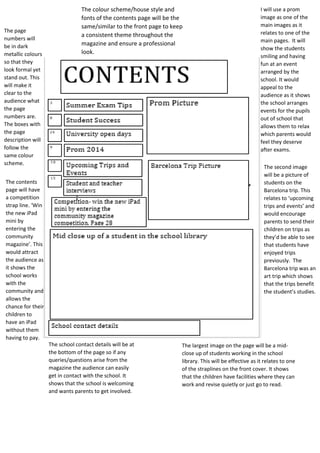
1. The colour scheme/house style and
fonts of the contents page will be the
same/similar to the front page to keep
a consistent theme throughout the
magazine and ensure a professional
look.
I will use a prom
image as one of the
main images as it
relates to one of the
main pages. It will
show the students
smiling and having
fun at an event
arranged by the
school. It would
appeal to the
audience as it shows
the school arranges
events for the pupils
out of school that
allows them to relax
which parents would
feel they deserve
after exams.
The second image
will be a picture of
students on the
Barcelona trip. This
relates to ‘upcoming
trips and events’ and
would encourage
parents to send their
children on trips as
they’d be able to see
that students have
enjoyed trips
previously. The
Barcelona trip was an
art trip which shows
that the trips benefit
the student’s studies.
The page
numbers will
be in dark
metallic colours
so that they
look formal yet
stand out. This
will make it
clear to the
audience what
the page
numbers are.
The boxes with
the page
description will
follow the
same colour
scheme.
The contents
page will have
a competition
strap line. ‘Win
the new iPad
mini by
entering the
community
magazine’. This
would attract
the audience as
it shows the
school works
with the
community and
allows the
chance for their
children to
have an iPad
without them
having to pay.
The largest image on the page will be a mid-close
up of students working in the school
library. This will be effective as it relates to one
of the straplines on the front cover. It shows
that the children have facilities where they can
work and revise quietly or just go to read.
The school contact details will be at
the bottom of the page so if any
queries/questions arise from the
magazine the audience can easily
get in contact with the school. It
shows that the school is welcoming
and wants parents to get involved.