
Recommended
More Related Content
What's hot
What's hot (17)
Viewers also liked
Viewers also liked (20)
Similar to i-D mag front cover
Similar to i-D mag front cover (20)
More from annabellehussey
More from annabellehussey (20)
Recently uploaded
Recently uploaded (20)
i-D mag front cover
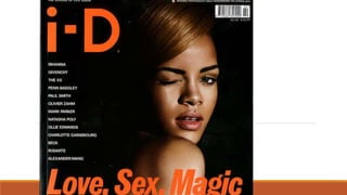
- 2. Masthead- The masthead of the magazine is iconic to the brand identity of i-D Magazine. The ‘i-D’ is to represent a winking smiley face which is often used by young people when texting. This immediately shows that the magazine is aimed at a younger audience. The cover model/artist of the magazine is usually has their right eye closed to depict a smiley face, which is shown by Rihanna on the front cover of this issue. However, the ‘i-D’ can also represent a young person trying to find their inner identity within the magazine. It is in a bold orange font at the top right hand corner of the page which makes it stand out against the black background. The colour orange has connotations of fire and power which could suggest that the magazine will feature a story representing Rihanna as powerful and strong. The masthead is different to other magazines as it is a different colour in every issue. This would again appeal to a younger audience who would like the regular change in the magazine that keeps it modern and updated. Colour scheme- The colour scheme of the magazine consists of a black background, orange masthead and headline and white sell lines. The black background has connotations of darkness and mystery whilst the orange text stands out and has connotations of warmth, fire , power and success. This suggests that the magazine is mysterious to those who don’t read it but those who are shown secrets and revelations about artists and their success. By having the headline of the magazine in an orange font in front of the image of Rihanna, it suggests that the magazine it will reveal how Rihanna manages the success of her career. This is also emphasised by the dark lighting surrounding Rihanna and the high key lighting used on her face. This would excite the audience as it suggests that the magazine will reveal Rihanna's ‘darkest secrets.’ The white font used for the sell lines has connotations of innocence and purity which contradicts the headline. This could show that the magazine appeals to a wide audience. The colour scheme also challenges conventions of music magazines who typically have a white background and black text, i-D magazine does the complete opposite to this which suggests that the magazine is aimed at a niche young audience who are attracted to the different ‘vibe’ that i-D magazine creates.
- 3. Main Image- The main image of the magazine is a mid close up of the popular and successful artist, Rihanna. She is shown winking and facing the camera with her lips slightly open. This represents her as quite provocative as she’s posing quite ‘seductively’ which suggests that this issue of the magazine is aimed at a younger male audience. However, it could be aimed at a young female audience who admire Rihanna’s courage in posing like that and aspire to have her confidence and talent. She is shown wearing minimal make-up and her hair is styled back, this represents her as quite stripped back which would appeal to the audience who would be intrigued to find out more about her. She is also shown wearing minimal clothing other than a strapless top which almost looks like a corset. This further adds to the sexualised representation of Rihanna. Headline- The headline of the magazine says ‘Love, Sex, Magic’ which suggests that the magazine will feature an article with Rihanna based on these topics. This would appeal to a younger audience of 18- 27 year olds who would be fans of Rihanna and would be enticed by the headline. The headline also relates to the ‘sexualised’ image of Rihanna showing that the magazine is consistent. The font used in the headline is bold and italic which shows that the magazine will be aimed at young people who want to have fun and don’t take themselves too seriously as the font is relaxed and not very formal. This is also reinforced with the text in top left hand corner of the page ‘the lovers of life issue’ showing that the magazine is aimed at creative young people who enjoy going out and experiencing new things. Barcode and price- The magazine has the barcode and price at the top of the page which is a typical convention of music magazines. The price is in a very small white font ‘£5.00/ $10.99’. This is a very expensive price for a magazine which suggests that the magazine would be released monthly in order to make it affordable for its target audience.
- 4. Sell lines- The right hand side of the page features a list of sell lines of big celebrity/artists/fashion designer names such as ‘Rihanna’, ‘Penn Badley’, ‘The XX’ and ‘Givenchy’. This shows that the magazine is not only based on music but it also covers fashion and films, allowing the magazine to be aimed at a wide audience. It’s target audience would be interested in actors, fashion designers and musicians therefore these sell lines entice them to read the magazine. Conventions- Unlike most magazine front covers, i-D’s front cover doesn’t consist of any pull quotes or straplines. This suggests that the magazine relies on it’s target audience who would already know the big fashion designer names, actors and artists. It suggests that these names are enough to entice the audience. Layout- The layout of the magazine is very simplistic and stripped back, this would appeal to the audience who wouldn't want to be overwhelmed with content. The magazine looks aesthetically pleasing which would further appeal to the audience who would be interested in fashion, therefore if the magazine looks attractive they’d be more likely to buy it.