Kolkata Call Girl Bara Bazar 👉 8250192130 ❣️💯 Available With Room 24×7
Music magazine progress
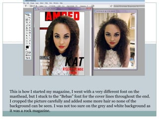
1. This is how I started my magazine, I went with a very different font on the
masthead, but I stuck to the “Bebas” font for the cover lines throughout the end.
I cropped the picture carefully and added some more hair so none of the
background can be seen. I was not too sure on the grey and white background as
it was a rock magazine.
2. I decided to blow up the picture as I was unsure of the background
colour and I really liked it. I also changed the masthead font as it was
more appropriate for the genre and stood out more.
3. This is a major change, i gave the masthead an outline or red and
black I also added in the date, a simple puff and barcode. I also
played around with the lighting and contrast of the picture to make
her stand out and look more vampire-like with the pale skin and red
lips I also made her eye makeup darker and airbrushed the face.
4. This was the final look of my front cover where I added a little “Win
something” at the top to make readers want to buy this magazine I also
did the WIN in yellow so it is one of the first things they see. I also
added in the additional artists for the coverlines.
5. Here is how I started my contents page, i was also unsure of the
background colour here so I decided to leave it white and cover most
the page with artists, I covered these with some pictures I took of my
friends.
6. I decided to stretch the AMPED cover the top of the page and I
decided to give a black border like how I did to the “Features” on my
front cover. I also added a large picture I took of my sisters boyfriend
playing at a gig when I went.
7. This is my complete contents page, which is set out clearly with
numbers and artists name written in larger letters with some
information.
8. These are the two pictures I used for my double page spread to show
that the artist has two sides like she has quoted in the interview. I
manipulated the image with the colours and gradient and airbrushed
them to give a professional look to them.
9. I decided to position the pictures this way so when you open the
magazine the picture will be on one side and the text will be on the
other I also decided to put the opaque A to add more of an effect
and so it doesn’t look too plain.
10. This is how it looked after adding all the text and interview, as you
can see I followed the black white and red colour scheme even the
artist and the clothes.
11. This is the final look of my double page spread after adding the quote
in the middle which fit perfect and I did that in a different font and
in capital letters so its one of the first things they read after seeing
the picture as it related to the picture.