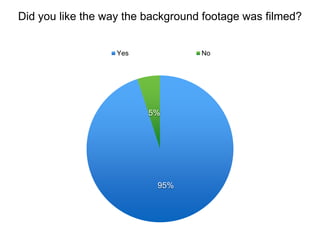
2. In terms of the background
footage, I feel it is
interesting and vital to
providing context. 95% of
people liked the way it was
filmed which I am very
please with as I think we
used a varied range of
angles, zooms and pull
focus to make it interesting.
However personally I think
some of the footage is
slightly shaky and could be
refined to give us a more
professional result and that
is possibly why 5% didn’t
like it and that is a valid
reason that I agree with.
Overall, however, i’m proud
of our footage
4. As mentioned before, we
decided that red and white
were the 2 colours that we
wanted to be the primary
house colours of our
documentary and brand.
We tried to incorporate
these throughout by
capturing these colours
throughout our background
footage and vox-pops and I
am glad the audience
understand our brand as
represented by these
colours as that is important
to our identity and ability to
combine our main
documentary and ancillary
products.
6. The Vox Pops, although
they have good content, i
feel are the weakest aspect
of our documentary mostly
due to the sound levels.
These are something we
struggled throughout as we
filmed in different locations
and struggled to balance
the sound. In one vox-pop
there is a large amount of
wind. Were I to do this
again I would test different
equipment in different
places to see what would
work best. I think the sound
levels reduce the quality of
our documentary and that is
reflected by this audience
feedback.
7. 0 5 10 15 20 25
YES
NO
Do you think the topic is relevant in today’s society?
8. Personally I think the topic
is relevant in today’s society
and it affects everyone yet it
is not something that is
talked about very often as it
is seen as the social norm. I
am very pleased that
everyone we asked felt that
the topic was relevant as
that means we have
succeeded in drawing their
attention to something that
they didn’t realise had an
impact on them. As they
feel this way, I hope we will
have had an impact on
some of their more
materialistic values and
made them think more
about what they really need.
10. As a presenter, we wanted
Corey to come across as
engaging yet also clear and
easy to understand. I think
his delivery of the topic
achieved this really well and
the audience feedback is
really reflective of this. he
spoke at a reasonable pace
with very good expression
and so we achieved our
goal of communicating
clearly with the audience
whilst keeping them
interested in what we had to
say.
12. The archival Sky News clip
was added to include a
different perspective on the
issue and also to highlight
the severity of the issue. I
feel it is very relevant and
increases the pace of the
documentary, thus, making
it more interesting.
However, this clip I feel is
slightly too long and begins
to lose its serious impact as
a result of the length of it. I
think this plays an important
role in our documentary
however we could’ve
integrated it better and
therefore I agree with the
feedback we were given.
14. I’m really pleased with the
feedback for this question
as I think the bold text that
we used for statistics is
clear and also modern as
well as looking quite young
so targeting our audience. I
think all the statistics are
easy to read due to the size
and i’m glad the audience
agree as these facts our
vital to supporting our point
about the reliance on
technology. I do think the
font we used for our title,
however, could've been
different to represent our
theme more and look more
modern but it is still very
clear and easy to read.