FULL ENJOY Call Girls In kashmiri gate (Delhi) Call Us 9953056974
Question 3
1. 1.) Would you watch the rest of the documentary?
100%
From our questionnaire and focus group, it was a clear indication of
the success of our 5 minute opening due to the fact we found 100%
of the people that watched it said that they would be interested in
wasting the rest of the documentary. As we asked people who were
part of our ideal target audience 13-21, shows us that we have
created a documentary that is suitable for our target audience.
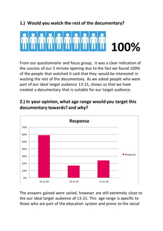
2.) In your opinion, what age range would you target this
documentary towards? and why?
The answers gained were varied, however are still extremely close to
the our ideal target audience of 13-21. This age range is specific to
those who are part of the education system and prone to the social
0%
10%
20%
30%
40%
50%
60%
70%
16 to 20 16 to 24 11 to 18
Response
Response
2. stereotypes. When asked why, viewers gave the responses that they
made their decision based on the age of people interviewed and also
the choice in archive footage. We are pleased with this, as it was our
goal to chose archive footage that would fairly represent that target
audience.
3.) Did the documentarychange your ideas about the way
we use social labels?
In our documentary, we tried to shine a light on the fact that we use
social labels inappropriately based upon the persons image. From
our questionnaire, we found that 58% of the people changed their
opinions about social labels and said they would think twice before
using them. One comment said that the way we presented how
appearance can change what we think using the makeup video
comparison. However, 42% said that our documentary didn’t change
their view of social labels as they believe them to be true, due to
what they have heard in the media. Even though the response is
split, it still shows us the ways in which our documentary has showed
why social stereotyping is wrong and brings attention to this fact.
However, the response indicates to us that to increase the amount of
changed opinion, we could add more shocking statistics and maybe
58%
42%
Social labelling
YES
NO
3. even get personal with the documentary with a true, and shocking
story.
4.) Did you think our documentary looked professional?and
why?
There was an overwhelming response of 100% with the fact that
they though our documentary looked professional. When asking why
they felt this way, they gave us comments such as the fact, 'Good
quality footage' , 'Use of the makeup video was clever and creative',
and also 'the use of archive footage supports ideas'. We were
pleased with this response due to the amount of effort we put in to
make our documentary look as professional and authentic as
possible. By following the codes and conventions of a documentary, I
feel has successful lead us to creating a professional documentary.
5.) How would you rate the sound levels?
Again, with this response was varied. Although 50% of the people
who watched the documentary felt that we had good sound quality,
there were some who did not. The main reason they gave for the low
quality score was they felt that our voiceover was too quiet
compared to the other sound levels. However, when played through
the iMac the sound levels appeared to be consistent and of a great
quality. As we presented the documentary to the class through the
• GOOD QUALITY
50%
• OKAY QUALITY
50%
4. projector and different speaker, could have had an effect on the
sound quality.
6.) How informative was the documentary?
Our feedback revealed that all of our views felt our documentary was
somewhat informative. 41.8% said the documentary was very
informative and 33.4% found it to be extremely informative. This
was due to our extensive research into the topic which we filtered
through the information given by the voice over in the documentary
and also the statistics shown on the screen. The pleased us as a
group as this result shows our documentary is effective at being an
expository mode documentary. Our documentary is actually teaching
the audience about a topic which they should be aware of and if not,
teach.
7.) What three things did you like about our documentary?
From this, we gained a lot of positive feedback which helped us to
understand which parts of the documentary our audience liked and
stood out to them. The main aspect that the audience repeatedly
said the liked was the demonstration clip. In this, we used our own
member of the group, Beth, filmed her transformation into a Goth,
geek and hipster. The part that stood out the most was the close up
shot make up video where we use the power of makeup and Goth
stereotypes to transform her image from normal to Goth. The
audience felt this was an effective way of representing the message
of the documentary. In addition, a common part our viewers
enjoyed was the use of archive footage. We decided to use popular
films Mean Girls and St Trinians as they were two films that we know
our audience would have seen. Re watching the well known clips
0.00% 5.00% 10.00% 15.00% 20.00% 25.00% 30.00% 35.00% 40.00% 45.00%
Extremly Informative
Very Informative
Quite Informative
Not Informative
Column1
5. selected and highlight the social labels would again inform and
challenge the use of social labels. Other parts that were mentioned
in some answers were the use of Vox pop and expert interviews and
the creative link between the beginning and the end, reinforcing a
powerful message that everyone is just themselves.
8.) Is there something that we could improve on/change in
our documentary?
We gained a very positive 75% no answer from viewers and a 25%
yes. However, the 25% stated that the only thing they thought we
needed to improve upon was the voice over. In order to improve
this, we should make it louder to balance it out with the other sound
levels.
•NO75%
•YES25%
7. Happily, the question gave back a positive response as 80% of people
believed that the main image was clear to notice in our article. This
was fantastic as we tried as hard as possible to stick to the
conventions of a double page spread, the main image being one of
them. We found that in our research, Radio Times placed their main
image on the left side of the page, taking up slightly more on the
right. As the main image is the face of our documentary, it is vital
that it is clear to the audience that this image is the main audience as
it shows it stands out.
Q2.) Is the article fun and interesting?
27% of our target audience replied no to this question. However, we
aren't going to worry too much about this as it isn't possible for
everybody to have the same taste. It was unlikely, that the article
would appeal to every member of our target audience. However,
73% said yes to this. We are happy to see that it is a majority who
found it fun and interesting.
YES
NO
8. Q3.) Does the layout represent existing media products?
The result from this was an overwhelming majority. 93% of the
people we asked said that this article was a good representation of
existing products. This shows the extent of research that we put in
to finding out the conventions of a Radio Times magazine. The fact
that our audience can see it looking authentic signifies how well we
have succeeded in the creation of a double page spread.
Q4.) Would you watch the documentary based upon the
article?
0% 10% 20% 30% 40% 50% 60% 70% 80% 90% 100%
YES
NO
•YES75%
•NO25%
9. 75% response said that they would watch the documentary based
upon the double page spread that we created. Throughout the
article, we kept referring back to the main problems of social
stereotyping. The audience felt that the article was engaging and
expressive of the subject of social labels.
Q5.) Does the colour scheme appeal to you?
The result from this doesn’t have a very high majority. 40% felt that
the colour scheme did not appeal to them while it did to 60%. In
order to select a colour scheme that is suitable for the audience is
quite hard. We tried our very best to chose a colour that wasn’t too
gender bias. The final colour we decided on was a baby blue. We felt
that even though the colour may not be liked by everyone, it is
however, very bright. I believe bright colours are more appealing to
our target audience and do aid to make certain aspects of the article
pop.
Sales
YES
NO
10. Q6.) Do the images link to the article?
100%
There was an extremely positive response as 100% felt as though
there was a strong connection between the images chosen and the
article. Our main image is the face of our documentary. The image
itself sums up the point we are trying to make in the documentary.
Q7.) is the article informative?
The huge majority of our audience have found our article to be
informative. This again shows how much research we have done into
the topic of social labels and the way they can affect people's lives.
Key information such as date, channels and times in which they can
see our documentary.
0
2
4
6
8
10
12
14
YES NO
Series 1
11. Q8.) What age group do you think the article is best aimed
towards?
The main target audience we tried to target was 13 - 21 as we
thought they were most affected by this topic. The fact that our
responses gave an age range well with/near ours shows how well we
have targeted our audience.
•512-16
•1016-25
12. RADIO TRAILER
Q1.) How informative was the radio trailer
Overall, there was a majority of a positive response from this
question. We found that 60% for the radio trailer very informative
and the other 40% found it quite informative. This response supports
the response gained from the documentary. As the radio trailer used
audio clips from the documentary shows how both products are
equally informative. Also, we made sure at the very end of the radio
trailer to mention the time, date and channel the documentary was
Q2.) Does the radio trailer make you want to watch the
actual documentary?
100%
VERY
INFORMATIVE
60%
QUITE
INFORMATIVE
40%
13. There was an outstanding response as 100% of the people we
questioned said that they would go and watch the documentary. As
the radio trailer is only 30 seconds long shows how successful it is at
capitulating the audience's attention enough to interest them into
watch the rest of the documentary.
Q3.) What similarities between the documentary and radio
trailer can you notice? Are they effective?
The response from this question has indicated how successfully we
have been able to create an image for our documentary. The fact
that the audience were able to make strong connection between the
documentary and radio trailer shows how well we have crafted the
ancillary text.
MUSIC
PACE
FOOTAGE
INTRO
QUOTES
VOICE OVER
14. Q4.) How clearly can the house style be identified
throughout the trailer?
This follow up question from the previous again reflects how
noticeable the house style was throughout our products. This also
shows how are building up our image. By being able to see the link
between texts, shows that there must be a clear representation of
aim and brand throughout all of our products.
Q5.) What are the best/worst aspects of the radio trailer?
BEST: Clever use of quotes selected for the trailer. The
intro is effective and fit well with the documentary. There is a clear
link between trailer and documentary
WORST:Sound levels were not loud enough.
0 1 2 3 4 5 6 7
VERY CLEAR
QUITE CLEAR
CLEAR
15. Q6.) How professionalis the radio trailer?
This positive response really shows how much we have followed the
conventions of a radio trailer. In doing so we have been able to
create an authentic radio trailer which really promotes and sells the
documentary.
0
1
2
3
4
5
6
7
8
VERY PROFESSIONAL PROFESSIONAL