
Recommended
More Related Content
What's hot
What's hot (18)
Viewers also liked
Viewers also liked (20)
Similar to Digipak analysis 7
Similar to Digipak analysis 7 (20)
More from SirAtko
Recently uploaded
Recently uploaded (20)
Digipak analysis 7
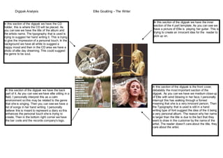
- 1. Digipak Analysis Ellie Goulding - The Writer In this section of the digipak we have the CD holder, this is where the CD will be placed. As you can see we have the title of the album and the artists name. The typography that is used is trying to suggest her hand writing it. This is trying to give the impression of a personal touch. In the background we have all white to suggest a happy mood and then in the CD area we have a photo of ellie day dreaming. This could suggest the genre to be soul. In this section of the digipak we have the back part of it. As you can see we have ellie sitting in a field, I personally interpret this as a calm environment so this may be related to the genre that she is singing. Then you can see we have a list of songs in her hand writing. I personally believe this is meant to represent a diary so this enhances the personal touch she is trying to create, Then in the bottom right corner we have the bar code and the records company’s logo. In this section of the digipak we have the inner section of the 4 part template. As you can see we have a picture of Ellie is playing her guitar. This is trying to create an innocent idea for the reader to pick up on. In this section of the digipak is the front cover, debatably the most important section of the digipak. As you can we have we medium close up of Ellie with wind blowing in her face, I personally interrupt this has walking through a forrest meaning that she is a very innocent person. Then the Typography that is used is still in a hand writing type of font suggest the idea of the it being a very personal album. The reason why her name is larger than the title is due to the fact that they want to draw in the customer by the name of the artist. The reader doesn't care about the title, they care about the artist.