Beyond the EU: DORA and NIS 2 Directive's Global Impact
Describe the design of the title
1. Describe the design of the title, colour font placement and size?
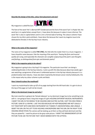
My magazine is called‘the lyric.
The font of the word ‘the’ is Bernard MT Condensed and the font of the word ‘lyric’ is Poplar Std. the
word lyic is in capital letters except from I, I have done this because it makes it more informal. The
word ‘the’ is also in capital letters and it is imn a formal style of writing. The colours scheme I have
chosen for my title is pink and black, I have done this because the I want my magzine issue to be
dedicated to females in the hip hop music industry.
What is the name of the magazine?
The name of my magazine is called THE LYRIC, the title tells the reader that it is a music magazine . I
have chosethis name because I like the meaning of the word lyric “having the form and musical
quality of a song, and especially the character of a songlike outpouring of the poet's own thoughts
and feelings, as distinguished from epic and dramatic poetry”
What is the magazine going to be about?
My magazine is going to be a hip hop/r’n’b magazine. The particular issue that I am doing is
celebrating females in the hip hop industry, I came up with this idea because about two weeks ago I
was watching a programme of bet were it celebrated women in the hip hop industry because it is a
predominately male industry. I have also been inspired by the breast cancer charity tickled pink, this
is the reason why my colour scheme is pink and black.
How I intend to place the masthead?
I want my masterhead to take up 4/5 of my page starting from the left hand side. It is goin to be at
the top of the page so It will not be missed.
What is the dominant image be and why ?
My main coverline is going to be ‘female takeover’ so my dominant image has to be something to do
with it. I am going to have a long shot image of 3 girls HOLDING DIFFERENT MUSICAL INSTRUMENTS.
I WANT THE GIRL IN THE MIDDLE TO BE HOLDING AND ELECTRIC GUITAR; I GOT THIS IDEA FROM A
PICTURE I SAW OF LIL WAYNE. I LIKE THIS IDEA BECAUSE HIP HOP MAGAZINES ARE NOT USAULLY
PUT TOGETHERT WITH AND ROCK INSTRUMENT SO IT MAKES IT UNCOVENTIONAL AND UNIQUE. I
WANT THE GIRL ON THE LEFT TO BE HOLDING A MICROPHONE AND THE GIRL ON THE RIGHT TO BE
HOLDING DRUM STICKS.The camera will be looking up at them so they will look dominant and like
they are powerful. I want he picture to be grey scale picture. I WANT THE ARRANGEMENTS OF MY
PICTURE TO BE LIKE THE PICTURE THAT I WAVE MARKED WITH THE LETTER B.
2. A B
What does the image tell your potential target audience?
The picture looks dominant an
Will your target audience find your front page appealing and why? And why not ?
Would you be including any other image on the front cover?
How is the potential target audience and how do I know that?
What articles will be found in my magazine?
How do these articles relate to the title of the music magazine?
How many different fonts am I going to use, what colour and what size and style?
Will your target audience find this appealing? Why?
Will your chosen font, depict the genre of the music magazine?