
Recommended
More Related Content
What's hot
Viewers also liked
Viewers also liked (19)
Similar to Our updated digipak features coordinated colors and imagery linking the front and back
Similar to Our updated digipak features coordinated colors and imagery linking the front and back (20)
More from _xalizax_
Recently uploaded
Recently uploaded (20)
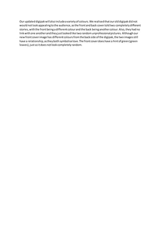
Our updated digipak features coordinated colors and imagery linking the front and back
- 1. Our updateddigipakwillalsoincludeavarietyof colours.We realisedthatourolddigipakdidnot wouldnotlookappealingtothe audience,asthe frontandback covertoldtwo completelydifferent stories,withthe frontbeingadifferentcolourand the back beinganothercolour.Also,theyhadno linkwithone anotherandtheyjustlookedlike tworandomunprofessionalpictures. Althoughour newfrontcoverimage has differentcoloursfromthe backside of the digipak,the twoimagesstill have a relationship,astheybothsymboliselove.The frontcoverdoeshave a hintof green(green leaves),justsoitdoesnotlookcompletelyrandom.
- 2. Here is the digipakwe createdbefore,andthe one we re-createdafterrealisingourerrors: Front cover: We have decidedtouse the same frontcoveras we did in our original digipak.Thisisbecause the coloursstandout and theycan easilyattractthe audience because of its eye-catchingfeatures.The hue effectaddstothis. His facial expressionsshowthathe isnottoo happy,justlike hissonglyricsshow.However,hisbody language showsthathe is quite laid-back. We have keptthe backgroundplaingreen,asitwouldbe too over-poweringif we addedmore detailsatthe back,whichwouldnotlooktooattractive. We have typedthe artist’sname onthe frontina large,white-colouredfont,because there isnotmuch goingon,and it isimportantforthe audience tosee the artist’sname asthe veryfirstthing,so that theyknowwhose musicthisis.
- 3. Back side (before): We realisedthatthe boldwritingwaslookingquite oddand “cartoonish”for our digipak.The textdidn’t needtobe bold,sothat itcouldfit inwiththe image and background naturallyandeffortlessly.
- 4. Back side (after): The new back side’sfonthasbeenchangedas well asthe size.Itis notas starkand boldas the oldone was. Furthermore,there are extras includedinthis,whereasthe oldone didn’t have any extraswrittenonit.
- 5. The inside of ourdigipak(before): the inside of ourdigipakhadno relationtothe musicwhatsoever.Itlookedrandomandan image of treeswas not verypleasingorexciting to lookat. We thenreplacedourideawith somethingelse.
- 6. The inside of ourdigipak(after): The torn rose representsthe “tornup” feelingsof the male performer,andhisgiven-uphopes.It symboliseshisstate of mind,ashe is clearlyobsessedwiththe girl he claimshe usedtolove,buthis constantrepetitionof hershowshowhe still isobsessedoverher.Thisshowshow damagedhe is fromthe inside,ashe istryingto forgetthose feelingsbymovingon.the roseshave beenplacedon a black floordeliberately,tocontrastitscoloursandto make it standout. We thenaddeda filteron it from“Instagram”called“Slumber”. We wentintothe studioandswitchedoff all the lightsandusedthe special effectslighting.We turnedon twospotlights,sothattheywouldfocusonthe centre of the floor,where the rose was placed.Thiswouldbringattentiontothe coloursof the rose,and itwouldcontrastwithits background,the blackfloor.