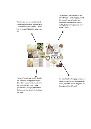
1. These imagesare conventionaland
elegantbeingcollaged togetherwith
a pastel tonedcolourtheme.Ireally
like thisandwill be takingideasfrom
this.
These imagesare fragmentedand
cut out like the contents page,Ifind
thisunprofessional lookingand
unconventional althoughitworks
slightlybetterinthiscontextIdon’t
actuallylike it.
There isn’tmuchtexton thisdouble
pge whichcan be a goodthingbut I
thinkthere isverylimitedtextinthis
one.I like the wayithas a back
groundcolourto highlightsome of
the textand that itvariesinfontsize
and style.
The mastheadfor thispage isneat and
conventional althoughnotina pastel
colour,itstill fitsinwiththe genre and
the page makingitfitwell.