
Recommended
More Related Content
What's hot
What's hot (19)
Viewers also liked
Viewers also liked (16)
Similar to Research and Design of Music Magazines
Similar to Research and Design of Music Magazines (20)
Research and Design of Music Magazines
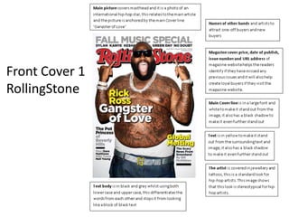
- 4. Masthead – The masthead of the contents page is a pull quote from the interview with the featured artist ‘Jadakiss’. I like this idea as it Contents draws more attention to the main article of the magazine and it also maintains the house style of bold text and structured positioning. XXL Main Image – The main and only image on the contents page is the featured artist ‘Jadakiss’. The clothing of the artist is also relative to the colour of the text used, this makes the image match the magazine style even further. I like this idea as again it draws more attention to the main article and maintain the house style of the magazine and greater embeds the feeling of a hip-hop magazine due to its structure. However I dislike the use of only one image being featured on the page. Page Number Listings – The page numbers of each of the articles are listed just below the masthead and on the right of the page, again it maintains the Text and Colour – The colours featured on this page are black and red. structured house style and The colour of the text matches the colour of the clothes of the featured makes the contents page look artist. Red and black is a good choice of colour for a white background as clean and tidy. these 3 colours allow the editor to put focus on desired items with ease.
- 5. Double Page Spread Vibe Pull Quote – The pull quote from the article is extremely long and takes up half of the page. This was chosen as when the reader is flicking through the magazine it will catch the eye of the reader and entice him to read the rest of the magazine. The pull quote is in a block like bold font which again draws more attention to it. Main Image – The main image on the double page spread feature two artists in a long shot. The image also takes up Main Text – the main text of the the whole page. The article is in a block like black two artists featured font with a font background. in the image are also The structure of the text is also dressed to fit the very block like and is structured music genre of the like the house style of the magazine which is magazine. hip-hop. It also gives further structure to Main Image – The main image on the double page spread feature two artists in a long shot. the two pages as the The image also takes up the whole page. The two artists featured in the image are also image does not fit dressed to fit the music genre of the magazine which is hip-hop. It also gives further structure around text and does to the two pages as the image does not fit around text and does not cover or overlap any of not cover or overlap the text. any of the text.