1. ANALYSIS OF ARTICLES- DOUBLE PAGE SPREAD 1
NME
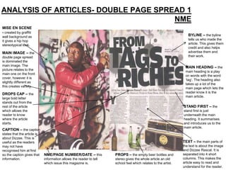
MISE EN SCENE
- created by graffiti
wall background as BYLINE – the byline
it gives a hip hop tells us who made the
stereotypical look. article. This gives them
credit and also helps
MAIN IMAGE – the advertise them and
double page spread their work.
is dominated the
main image. The
MAIN HEADING – the
picture relates to the
main heading is a play
main one on the front
on words with the word
cover, however it is
‘tag’. The heading also
slightly different as
takes up a lot of the
this creates variety.
main page which lets the
reader know it is the
DROPS CAP – the
main article.
large bold letter
stands out from the
rest of the article STAND FIRST – the
which allows the stand first is just
reader to know underneath the main
where the article heading. It summarises
starts. and introduces us to the
main article.
CAPTION – the caption
states that the article is
about Dizzee. This is
useful as the readers TEXT – the main parts of
may not have the text is about the image
recognised him at first and Dizzee Rascal. It is
so the caption gives that NME/PAGE NUMBER/DATE – this PROPS – the empty beer bottles and separated into 4 short
information. information allows the reader to tell stereo gives the whole article an old columns. This makes the
which issue this magazine is. school feel which relates to the artist. article easy to read and
understand for the reader.
2. ANALYSIS OF ARTICLES- DOUBLE PAGE SPREAD
MAIN IMAGE – the MAIN HEADING
main image takes over – the main heading
the majority of the features one of the
double page spread. artists well-known
This is done so you songs. This relates
know who the article is to her and the
about and the main audience are more
focus is on her. likely to recognise
her from her music.
COLOUR SCHEME
– the colour scheme TEXT – the main
is simple (red, black text is about the
and white) which artist featured on
keeps the article the other page. It
organised and not too is separated into
in-your-face or over- columns which
the-top. makes it easier to
read for the
audience.
DROPS CAP – the use of the drops
cap shows the reader where the actual
article starts so they know to read it
from there.