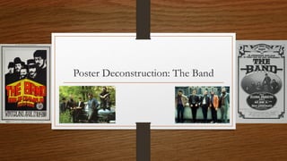
2. Large, stylistic presentation of the
Band’s name. Helps accentuate
notion of icono-graphological
attachment and branding.
Representation as a classic
circus-esque banner gives credence
to synergized reflection of rural
American 19th century culture and
style.
Star Image at header of poster
promotes the group as the crux of the
entire presentation. Stylistic and
illustrative representations of the group
synergize with the archaic and classical
nature of the lyrics and instruments.
Producer credit contains all elements
of subsequent promotional material –
signifies importance of production.
Archaic font continue to accentuate
mid-19th century style and themes.
The implications of written text within
a 19th century design suggest literacy
and importance, against the illiteracy
of the general public. This gives venue
information the significance,
composition-wise, that it requires.
Technical information small,
yet significant against the backdrop
of a cream coloring.
Logo represents motif of venue,
And acts as a “seal of approval” to
the performers.
3. Large, stylistic presentation of the
header suggests element of
reflection of 19th century variety
shows; giving the band a larger
significance aside from just music,
yet also stylized.
Star Image dominates central sector of
the poster; emphasizes visual
significance of the Band, themselves.
Venue takes key “presenting” banner –
signifies importance of production as
as marketing the performance as
“their” show.
Supporting acts gain large space upon
the poster’s façade to provide them a
Sense of equal importance.
Archaic logo continues 19th century
visual monicker, as well as surrounding
borders; a variety show.
Lower ticket information is separated,
illustrating importance of ancillary
information to wider performance.