
Recommended
More Related Content
What's hot
What's hot (19)
Similar to Katy Perry digipak advert analysis
Similar to Katy Perry digipak advert analysis (20)
Recently uploaded
Recently uploaded (20)
Katy Perry digipak advert analysis
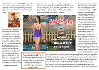
- 1. Thisdigipakadverthasa very1940-1950’s feel toit- the use of colourand texture conveystothe audience an advertisingposterfromthisera,despitethe musician beingfromthisera.It providesaverydifferentlookto Katy as mostotherartistshave a muchmore ‘modern’ style. For thisadvert,the artistand hername are featuredonopposite sides;the layoutcanbe dividedinhalf,withthe artist’sbodyonone half and the textonthe other.Thismakesitobviouswhothe artistis and alsowhattheylooklike- it’sincreasingKaty’s“starimage”for the benefitof fanswhoknowandlike herworkbut alsofor the passer-bywhohappentobe exposedtothisadvert. The albumtitle couldhave a linkto Katy’schoice of pose- “One of the Boys” couldbe consideredabit ‘monotone’,asif Katy’sviewingall boysthe same way. Thiscouldbe conveyedbyherunamusedyet “seductive”pose,despitethe overall lookof the advertbeinga 1950’s style,the clothesshe’s wearingdoesnotreflectthe fashionof that time (although, in some ways,itcould be considered close). The choice of fontclosely matchesthe vintage posterfeel to the advertand generallystandsout againstthe background,even thoughthe blue colourof the albumtitle isdifficulttoread properlyfroma distance.The advertalsofeaturesthe product beingadvertised,the digipakitself, whichissetin the same place (a suburbanAmericanbackyard) but, insteadof a paddlingpool andKaty stoodup, she’sona sunbed. The settingitself isinterestingasin 1950 (where Iam assumingthis advertissupposedtobe set),this image of Katy wasmost likelythe “ideal”girl.She’sinaback garden witha beautiful view, implyingthat she wouldbe rich,and herposture impliesasense of a“bad girl”style, as if she’shidingsomethingbehind herback that temptsthe male audience tosee whatitis.This, therefore,featuresvoyeuristic featuresasthe advertusesKaty’s bodyto lure ina male audience and alsocomplieswithcertain aspectsof Laura Mulvey’s“Male Gaze” theory(it’snota video,but still issetoutto make the consumerviewthisadvertfroma heterosexual male’spointof view). The textitself standsoutfromthe background,drawingthe readerin.It’salsoshort andsnappy, makingiteasyand quickto read if the passer-byisina rush.It enticesthe audience,tellingthem that it“Includesthe #1 smashhit”,lettingthemknowthatthisalbumincludessome songsthat theywill know,whetherornottheyare fansof Katy’swork.Ina way,thisadvertassumesthat the readerdoeslike KatyPerry,asI personallydon’tknowhersong“Ikisseda girl”- the audience nowknowwhenitwill be released,whatit’scalledandwhatitincludes.The image for the front of the digipakisincludedasit’sdifferenttothatof the advert,allowingfans(and anyone else) tolookoutforthe albumin shopsandpossiblypickitup(the pointof thisadvert!). The website is included in case audiences want to research into Katy further or buy her product online. Overall, I think that this digipak advert design is very effective as it has a different look to what normal modern artistsare doing. It also sets Katy up with an individual style for this album, which audiences can find easily as it’s a recurring theme and stands out as different from what other artists are trying to achieve. By Amelia Sommer