
Recommended
More Related Content
What's hot
What's hot (19)
Viewers also liked
Viewers also liked (15)
Similar to Making My Ident
Similar to Making My Ident (20)
More from SrahOlivo
More from SrahOlivo (18)
Recently uploaded
Recently uploaded (20)
Making My Ident
- 2. Other Idents • I looked at the idents of other companies within the film industry to observe codes and conventions.
- 3. Analysis • All feature text – none rely on picture alone. • Two feature an image, one does not. • Universal’s ident is very colourful – however, on promotional material, it is usually black and white as not to draw attention from the actual product. • Dreamworks animation is one block colour. Momentum Pictures’ two fonts are different colours.
- 4. Making My Ident • Taking these other idents into consideration, I made my own. • I wanted it to feature a picture that would stand out and be memorable as well as reflect the dark nature of the film I am producing (much like the picture on the Dreamworks Animation ident is rather whimsical – like animation). • The text would be chosen to stand out and draw attention. Taking inspiration from Momentum Pictures, one line would be lower case, the other upper case.
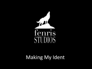
- 6. Analysis • My ident denotes a silhouette of a wolf standing on a rock, howling. The words ‘fenris STUDIOS’ are beneath this pictures. • I made the ident on Photoshop as this program offers the best editing software, in my opinion. • The silhouette was taken from a free clipart website, meaning there is no copyright attatched to it.
- 7. Analysis • I chose to use a wolf howling as it is a dark, serious image. It also links to my studio name, as Fenris was a monstrous wolf in Norse mythology. • I chose the name Fenris Studios as it is short and easy to remember – it also sounds mature and serious, like the films it would produce.