SlideShare a Scribd company logo
1 of 7
Front cover before and after improvements
Masthead
The mast head of the magazine was titled what it was with the imagination of somebody of that of regional saying it in the Northern British accent, while at the same time I
wanted it to be that of memorable in a way which the title itself is motivational, this was an element which I did not see any other magazine companies of the same genre
doing, such examples would be "Men's Health" and "Men's fitness" while these titles are direct they don’t have you questioning anything at all whereas I believe that a title
such as "Fit not quit" makes the viewer think every time about quitting instead they think about working out, the design of the front covers masthead that surrounds the title
was created in a way that makes it clear for the viewer while at the same time the use of the colour red was used to cause the viewer to think of blood and the heart meaning
that even if the viewer glances at the masthead for one second they already begin to think about their health.
Dominant image
The dominant image was the main feature that changed or was changed when improving the front cover the rest was simple minor shifts in movements when it came to the
modifying of other elements, on the subject of the improved image the reason for this being the dominant image is when it overall come to the dominant image I wanted it to
be something that showed influence from other official companies (when it came to the pose of the model) however I wanted it to at the same time look regional and at the
same time look as though it was not made to be published worldwide, to achieve this look I simply asked the model to come in as themselves and to not where any make up
or anything that would modified there look if you like, this is an aspect which I believe will appeal to the regional area as it something which will motivate them as people who
pick up the magazine have the idea that potentially they could end up on the cover just like the model from the area.
The front cover however has an element that makes it stand out as oppose to that of its competitors and that is the fact it does not have any sub images, the reason for this is
because I believe that the front cover was of a high standard without them, meaning to a degree I didn’t want to over complicate the front cover as I believed it would have
been too much for the viewer to take in for the first time being introduced to the product, at the same time I also was unable to find sub images that worked well with the
dominant image without looking that of out of place.
The main cover line/ cover lines
The main cover line of "Turn your life around and your body with it" came from a simple point of that of the masthead where it was created in an attempt to make the
magazine influential/motivational as possible, while at the same time this cover line was also created with the idea the placement of the main cover line to the left of the
model was done where there was no space in use, this as a result means that I am making the most use of the space on the front cover, another reason being that I decided
upon these words when it came to a cover line as well was the sense of almost brutal honest as I want the magazine to come across as real as possible, the reason being is
that I believe that it is this which will speak to the viewer the most while at the same time I also believe that it is this that will almost connect with the viewers emotions the
most giving the viewer the impression that the magazine is not false and the words are coming from people who are passionate about their product.
The cover lines while I wanted them to also be motivational I wanted them at the same time to also be informative as to what the magazine has to other, I wrote them with
the idea in mind that the magazine is almost presenting itself to somebody, almost as though the magazine wants the viewer to know not only that it has the most to offer but
also that you are almost privileged if you do decide to pick it up and read it.
Barcode
The barcode was placed on the bottom right of the magazine in the same location of that of where official magazine companies place there's, at the same time the magazine
shows a price as well as the name of the website the reason being for this was due to the magazine looking official as well as when it comes to competition giving the
magazine a fair chance, the reason for the price which I have chosen for the magazine is this is the same price of that of health magazines in the UK while at the same time I
believe that for where the magazine will be selling at the same time makes it that of a fair price.
Content page before and after improvement
Masthead
The masthead was kept simple purposely so that the viewer instantly knew what to expect from the page while at the same time the masthead was
also designed to fit in with a continues theme throughout the magazine, when it came to the influence it more or less came from the attitude what
are other brands not doing in the sense it was drew to my attention that other brands didn’t have the content words as large as that of my magazine
meaning unless you’ve studied media product layouts you would not know if this was a content page besides the large word at the masthead.
Dominant image
The dominant image was take in the same shoot as the front cover, this I believe gives the content page a strong point as it results in the content
page not seeming out of place while at the same time also showing the influence from other companies, the pose was also intended to strive for not
only uniques but also a sense of advertisement as well as to create curiosity in the viewers mind, in the sense it was taken with in mind that the
viewer questions what the model is drinking, this as a result would lead to the viewer to read and dive more into the product to attempt to find out,
at the same time I also took this photo as I wanted it to be something that pose wise that I had not seen a model do in a health magazine before.
Sub headings
The content page consists of seven sub headings to the left side with numbers as well as each covering a different subject, the smallest of these
numbers being 10 with the largest 42, the reason being for this page number is so that it matches up to the price which I intend to charge for the
product so that the viewer does not feel as though they are being ripped off and that they are getting their money's worth, at the same time I believe
that this will give the magazine an officiant reputation for not ripping of its viewers, this is also the same amount of pages on average that the other
magazines have to offer in terms of the health/fitness genre.
The placement of the sub headings to the right side of the page was much like the front cover a position that I believed was not in a large amount of
use, it was not due to influence or formula.
Page number
The page number was placed to the left side of the page in the bottom right corner, it shows that the page is the second one providing evidence that
this is a content page, at the same time it is not large to not draw away the viewers' attention from what the page has to offer.
Billboard before and after improvement
The masthead
The masthead is the same as that of the magazine in font as well as title (fit not quit) the reason being for this design decision is in an attempt to make the
masthead title that of almost iconic in the sense you would recognize it anywhere you saw it and know the brands reputation, as for the location of the
masthead, this is an aspect that I do not agree with however it was done to provide space for the slogan of "opening soon!" this in itself however was only done
to make it more obvious to the viewer that this product is a billboard and not that of a double page spread, giving the product a dominant identity, the masthead
was also placed in the high left corner, due to the dominant image, the reason being for this is I simply wanted the dominant image to receive the attention I
believed it deserved, this was why I placed it in the top corner to the left side where it is not in the way of the models facial expression.
Dominant image
The dominant image was taken up close in the models face, and unlike that of other companies billboards my billboard does not consist of any white and at the
same time uses the whole image as the billboard, the reason being for this was I wanted for my billboard to be different but not only different but also I wanted
my billboard for my billboard to seem full and to not be almost ignorable if you like, at the same time I wanted for the viewer to get an idea that the billboard
almost looks up to its model and wants to push them forward, this is why the whole billboard is the dominant image or made on it if you like.
Essential information
The essential information of this product consist of a quote by the model, the reason being that I decided to include this is it is something that I have seen
multiple products do of the same genre, at the same time it is also a feature that I believed much like the magazine products would give the viewer the ability to
connect with the product, at the same time I visioned the product as though somebody simply glances at the product, the aftermath of that simple glance due to
the quote being the only form of writing on the page would be that it would cause the viewer to ask themselves what the models is thinking and whether or not
it relates to them.
Double page spread before and after improvement
Dominant image
The dominant image much like the billboard I
wanted it done in a way so that you as the
viewer where almost forced to look at it in the
sense the double page spread is made on top
of the image, at the same time the
photograph itself shows a model looking into
a mirror the reason for this is the meaning
behind it is "self-refectory" the reason being
for this is I wanted the photograph to have a
metaphoric meaning behind it something that
I thought and felt would give it more depth
than if it had just been a photograph of a
model for the simple purpose of filling in a
check list if you like.
On top of this I wanted to make the image as
meaningful as I could as well to compete
against other brands in the sense this was
something I had not seen before in that of
magazines in my genre, the double page
spread also consist of no sub images as I did
not want the attention to be drawn away
from the dominant image, on top of this I also
felt as though the dominant image was
powerful enough on its own and as though if
there was any sub images it would simply be
out of place.
Quote/ columns
The columns on the double page spread are
only consistent of quotes by the model, the
reason for this is I wanted to give the viewer
as much insight as possible about the model
to the point they know there story and at the
same time almost feel emotion themselves, to
insure almost that I hinted this level of
emotion I filled the double page spread with
two columns to the right of them two columns
is the model them self looking into a mirror.
Masthead
The masthead also does something that I
myself believe I have not seen another double
page spread do and that have a masthead
that goes across the two pages, the reason
being that I decided to place this at the top as
well as have it as large as it is was due to the
use of the pun in "mass-ter" referring to mass
as in body size as oppose to that of the word
"master" someone of that of control showing
a level of thought put into the element.
Colour scheme
The colour scheme of the double page spread is that of standard the main image was not edited and was left natural as possible so that the product came
across as real and not as though it was something that had been highly photoshoped and modified for the one use, I also believe that by not cropping the
model out of the photo and placing them in front of a white or black background that have I challenged myself more by almost breaking the laws of
tradition and working around the photo and other elements of the photograph to make it appeal.
Page numbers
The page numbers where placed to both corners of the page indicating that it is a double page spread being always the 3rd and 4th pages of any magazine
they do not serve any other purpose than that and are simply there to indicate the viewers direction.
Website main page
Slogan/masthead
The slogan as well as masthead was inspired by the way which men's health presents there slogans at the top of their website
page, however unlike men's health I wanted for my website to be more memorable and almost that of humorous in the way
which the slogan has an element of almost cheesiness to it, this as a result I believe will make new viewers feel almost more
welcomed as they will have an impression and almost sense that this website as well as company to not take themselves so
seriously.
Images/background image
The images used show food as well as the same model from the magazine only this time fully working out, this is to almost
comfort the viewer and give them the sense that they know where they are due to the recognition that the model will receive, at
the same time there is also the design aspect, the reason being I decided upon only two food images is I wanted the model to
receive more attention and at the same time the theme is more fitness than it is healthy eating, there was also the idea behind
this that this would be an almost treat/discovery for the viewers that do wish to acquire more knowledge than simply what the
magazine has to offer, this is something that I believe other brands do wrong in the sense they do not make the viewer feel as
though they are getting something out of it.
On the subject however of the background image, this shows an up close of the model from the ground looking up at them
working out, the reason being I thought this would be a fitting background image is the idea as well as meaning that the viewer is
almost looking up to the products as well as the website, almost as though they are trying to rise to its standards giving the model
a goal.
Links/sub headings
The sub headings above each image are designed to also be links to separate pages, the reason for the number that there is (6) is
that I wanted the viewer to have plenty of knowledge to take in as well as to be under the impression that as a business as well as
brand the products know what they are talking about, the easiest of ways which to insure that image for the brand is met is by
including knowledge that the viewer does not know.
The main links however are at the bottom they lead to the other pages of the website, the reason they are placed at the bottom
is so that they do not influence the viewer to quickly view the website and then click of, if anything it’s a tactic to insure that the
viewer puts time into the website and spends time on each of the pages.
Slogan/masthead
The masthead remains the same only without the slogan, this as a result leaves the page almost looking more empty at the top
however at the same time I believe that this as a result give the websites main page a larger sense of identity almost acting as a form
of navigation for the viewer, at the same time there is also not a need for the slogan as if the viewer has progressed beyond the main
page point then they are almost already welcomed in.
Images/background image
The page focuses on the fitness aspect of the product, to fit with this theme the background image is that of a gym, while I feel as
though the page is strong on the images aspect I do believe that perhaps the page would have benefited more from images with
meaning behind them as I believe that the images lack any deep meaning with dominant power to draw the viewer in.
An element of the images however is that I used some of the same images as I did that of my magazine purposely, the reason being
for this is to almost tie in with what I said about the masthead in the sense it makes the viewer feel more welcomed if they are that
of new.
Links/sub headings
The links are that of the same location of the main page however the difference here is simply in the title, what I mean by this is how
unlike the main page the first sub page deals with only fitness and not the healthy eating aspect.
Adverts
Unlike the main website page the subpage includes that of an advert the reason for this being included was simply to add variety to
the website pages, at the same time I wanted to advertise something which I believed would contribute to the viewer in the sense I
wanted it be something they could use besides fitness, this as a result I believe will draw the attention of the viewer regardless if
they are interested in the website or not.
Social media
Both of the subpages include that of social media links, placed at the bottom of the page, the reason for this placement is so that
when the viewer is finished on the page and they have read it from top to bottom they see the social media links to find out that
there is only more knowledge that they can gather as well as this it only sparks curiosity as to what the social media pages have to
offer to the viewer.
Website subpage one
Slogan/masthead
Much like the first subpage the slogan is not present, however the masthead remains the same it was decided to not be changed to
remain true to the brand as well as much like the magazines masthead to make it that of recognizable/iconic if you like.
Images/background image
The background image shows the vegan café in the city of Sunderland, this was something which I thought was not only fitting but
clever as it is not only regional but it is also making my product appeal to that of a different audience, that audience being that of
vegans and vegetarians, this results in the brand bringing in a larger audience than that of those who chose to not attempt to adapt
and appeal to as big as audience as possible, on top of this to almost go hand in hand with the background image the images them
self's show no meat this as a result means that the website is less likely to offend members of that audience as well.
Links/sub headings
There is less links on this page as oppose to that of the other two pages, the reasoning for this is due to as I expressed before the
theme is fitness and that the only reason I have decided to include healthy eating into the products is to appeal to that of a larger
audience.
Page links
The pages links remain the same of that as the other two website pages in the sense there at the bottom however due to there not
being as much content on this pages as oppose to that of the other two this results in the links being almost higher up if you like, at
the same time this results in more of the background image being revealed to the viewer almost giving a an atmosphere of that the
page is floating.
Adverts
The pages does not feature a full on advert like that of the other subpage however what it does include is a link to a page about the
vegan café, why I would not label this as full advertisement is due to myself not labeling it as that on the page however it is
advertisement in the sense it is drawing more attention to the location.
Social media
The page does include links to social media much like the other subpage, the links are also in the same location to keep the layout simple and easy for
the viewer to follow.
Website subpage two

More Related Content

What's hot

7. evaluation(2) reallllll
7. evaluation(2) reallllll7. evaluation(2) reallllll
7. evaluation(2) reallllllbrettcollins26
 
Question one of magazine analysis
Question one of magazine analysisQuestion one of magazine analysis
Question one of magazine analysis812455
 
Factual proposal blank
Factual proposal blankFactual proposal blank
Factual proposal blankbrettcollins26
 
Question one to my A-level magazine analysis
Question one to my A-level magazine analysisQuestion one to my A-level magazine analysis
Question one to my A-level magazine analysis812455
 
EThompson - Unit 14: LO1 Powerpoint
EThompson - Unit 14: LO1 PowerpointEThompson - Unit 14: LO1 Powerpoint
EThompson - Unit 14: LO1 Powerpointethompson6107
 
Finished evaluation
Finished evaluationFinished evaluation
Finished evaluationRian Doherty
 
Magazine deconstruction
Magazine deconstructionMagazine deconstruction
Magazine deconstructionSionyTatey
 
1st question powerpoint[1]
1st question powerpoint[1]1st question powerpoint[1]
1st question powerpoint[1]RyanGourley
 
QUESTION ONE
QUESTION ONEQUESTION ONE
QUESTION ONEwaheda96
 
Question 1
Question 1Question 1
Question 1tspink27
 
As Media Studies Evaluation
As Media Studies EvaluationAs Media Studies Evaluation
As Media Studies Evaluationchloeparsons
 

What's hot (20)

7. evaluation(2) reallllll
7. evaluation(2) reallllll7. evaluation(2) reallllll
7. evaluation(2) reallllll
 
Question one of magazine analysis
Question one of magazine analysisQuestion one of magazine analysis
Question one of magazine analysis
 
Factual proposal blank
Factual proposal blankFactual proposal blank
Factual proposal blank
 
Question one to my A-level magazine analysis
Question one to my A-level magazine analysisQuestion one to my A-level magazine analysis
Question one to my A-level magazine analysis
 
4. pre production
4. pre production4. pre production
4. pre production
 
Evaluation
EvaluationEvaluation
Evaluation
 
EThompson - Unit 14: LO1 Powerpoint
EThompson - Unit 14: LO1 PowerpointEThompson - Unit 14: LO1 Powerpoint
EThompson - Unit 14: LO1 Powerpoint
 
Evaluation
EvaluationEvaluation
Evaluation
 
Evaluation Powerpoint
Evaluation PowerpointEvaluation Powerpoint
Evaluation Powerpoint
 
Finished evaluation
Finished evaluationFinished evaluation
Finished evaluation
 
Magazine deconstruction
Magazine deconstructionMagazine deconstruction
Magazine deconstruction
 
1st question powerpoint[1]
1st question powerpoint[1]1st question powerpoint[1]
1st question powerpoint[1]
 
QUESTION ONE
QUESTION ONEQUESTION ONE
QUESTION ONE
 
Question 1
Question 1Question 1
Question 1
 
As Media Studies Evaluation
As Media Studies EvaluationAs Media Studies Evaluation
As Media Studies Evaluation
 
Evaluation Q1
Evaluation Q1Evaluation Q1
Evaluation Q1
 
Evaluation q1
Evaluation q1Evaluation q1
Evaluation q1
 
Eval q3
Eval q3Eval q3
Eval q3
 
Evaluation
EvaluationEvaluation
Evaluation
 
Evaluation
EvaluationEvaluation
Evaluation
 

Similar to Question 1 of evaluation question slide two complete

Similar to Question 1 of evaluation question slide two complete (20)

Evaluation Question 1
Evaluation Question 1Evaluation Question 1
Evaluation Question 1
 
Ben mantell
Ben mantellBen mantell
Ben mantell
 
Ben mantell
Ben mantellBen mantell
Ben mantell
 
Evaluation
EvaluationEvaluation
Evaluation
 
Analysis questions
Analysis questions Analysis questions
Analysis questions
 
Music magazine evaluation
Music magazine evaluationMusic magazine evaluation
Music magazine evaluation
 
Music magazine evaluation
Music magazine evaluationMusic magazine evaluation
Music magazine evaluation
 
Jim Lewis AS Media Evaluation
Jim Lewis AS Media EvaluationJim Lewis AS Media Evaluation
Jim Lewis AS Media Evaluation
 
Actual evaluation
Actual evaluationActual evaluation
Actual evaluation
 
Contents page
Contents pageContents page
Contents page
 
3 research
3 research3 research
3 research
 
3 research
3 research3 research
3 research
 
3 research
3 research3 research
3 research
 
Evaluation (1)
Evaluation (1)Evaluation (1)
Evaluation (1)
 
Evaluation: Question 1
Evaluation: Question 1 Evaluation: Question 1
Evaluation: Question 1
 
Evaluation question 1
Evaluation question 1Evaluation question 1
Evaluation question 1
 
Daniel jay
Daniel jayDaniel jay
Daniel jay
 
Question 2
Question 2Question 2
Question 2
 
Evaluation
EvaluationEvaluation
Evaluation
 
Question One Evaluation
Question One Evaluation Question One Evaluation
Question One Evaluation
 

More from SionyTatey

Evaluation question 3
Evaluation question 3Evaluation question 3
Evaluation question 3SionyTatey
 
Models profiles
Models profilesModels profiles
Models profilesSionyTatey
 
Billboard rationale
Billboard rationaleBillboard rationale
Billboard rationaleSionyTatey
 
Website link page rationale two
Website link page rationale twoWebsite link page rationale two
Website link page rationale twoSionyTatey
 
Website main page rationale
Website main page rationaleWebsite main page rationale
Website main page rationaleSionyTatey
 
Website link page one
Website link page oneWebsite link page one
Website link page oneSionyTatey
 
Article rationale
Article rationaleArticle rationale
Article rationaleSionyTatey
 
Advert rationale
Advert rationaleAdvert rationale
Advert rationaleSionyTatey
 
Content page rationale
Content page rationaleContent page rationale
Content page rationaleSionyTatey
 
Front cover rationale
Front cover rationaleFront cover rationale
Front cover rationaleSionyTatey
 
Rationals media one
Rationals media oneRationals media one
Rationals media oneSionyTatey
 
Evaluation question 4
Evaluation question 4Evaluation question 4
Evaluation question 4SionyTatey
 
Inspirations research media
Inspirations research mediaInspirations research media
Inspirations research mediaSionyTatey
 
Inspirations research media
Inspirations research mediaInspirations research media
Inspirations research mediaSionyTatey
 
Deconstruction reserach media
Deconstruction reserach mediaDeconstruction reserach media
Deconstruction reserach mediaSionyTatey
 

More from SionyTatey (17)

Evaluation question 3
Evaluation question 3Evaluation question 3
Evaluation question 3
 
Calander
CalanderCalander
Calander
 
Calander
CalanderCalander
Calander
 
Models profiles
Models profilesModels profiles
Models profiles
 
Billboard rationale
Billboard rationaleBillboard rationale
Billboard rationale
 
Website link page rationale two
Website link page rationale twoWebsite link page rationale two
Website link page rationale two
 
Website main page rationale
Website main page rationaleWebsite main page rationale
Website main page rationale
 
Website link page one
Website link page oneWebsite link page one
Website link page one
 
Article rationale
Article rationaleArticle rationale
Article rationale
 
Advert rationale
Advert rationaleAdvert rationale
Advert rationale
 
Content page rationale
Content page rationaleContent page rationale
Content page rationale
 
Front cover rationale
Front cover rationaleFront cover rationale
Front cover rationale
 
Rationals media one
Rationals media oneRationals media one
Rationals media one
 
Evaluation question 4
Evaluation question 4Evaluation question 4
Evaluation question 4
 
Inspirations research media
Inspirations research mediaInspirations research media
Inspirations research media
 
Inspirations research media
Inspirations research mediaInspirations research media
Inspirations research media
 
Deconstruction reserach media
Deconstruction reserach mediaDeconstruction reserach media
Deconstruction reserach media
 

Recently uploaded

Catalogue ONG NUOC PPR DE NHAT .pdf
Catalogue ONG NUOC PPR DE NHAT      .pdfCatalogue ONG NUOC PPR DE NHAT      .pdf
Catalogue ONG NUOC PPR DE NHAT .pdfOrient Homes
 
Call Girls In ⇛⇛Chhatarpur⇚⇚. Brings Offer Delhi Contact Us 8377877756
Call Girls In ⇛⇛Chhatarpur⇚⇚. Brings Offer Delhi Contact Us 8377877756Call Girls In ⇛⇛Chhatarpur⇚⇚. Brings Offer Delhi Contact Us 8377877756
Call Girls In ⇛⇛Chhatarpur⇚⇚. Brings Offer Delhi Contact Us 8377877756dollysharma2066
 
Keppel Ltd. 1Q 2024 Business Update Presentation Slides
Keppel Ltd. 1Q 2024 Business Update  Presentation SlidesKeppel Ltd. 1Q 2024 Business Update  Presentation Slides
Keppel Ltd. 1Q 2024 Business Update Presentation SlidesKeppelCorporation
 
Investment analysis and portfolio management
Investment analysis and portfolio managementInvestment analysis and portfolio management
Investment analysis and portfolio managementJunaidKhan750825
 
Banana Powder Manufacturing Plant Project Report 2024 Edition.pptx
Banana Powder Manufacturing Plant Project Report 2024 Edition.pptxBanana Powder Manufacturing Plant Project Report 2024 Edition.pptx
Banana Powder Manufacturing Plant Project Report 2024 Edition.pptxgeorgebrinton95
 
Call Girls In Sikandarpur Gurgaon ❤️8860477959_Russian 100% Genuine Escorts I...
Call Girls In Sikandarpur Gurgaon ❤️8860477959_Russian 100% Genuine Escorts I...Call Girls In Sikandarpur Gurgaon ❤️8860477959_Russian 100% Genuine Escorts I...
Call Girls In Sikandarpur Gurgaon ❤️8860477959_Russian 100% Genuine Escorts I...lizamodels9
 
FULL ENJOY - 9953040155 Call Girls in Chhatarpur | Delhi
FULL ENJOY - 9953040155 Call Girls in Chhatarpur | DelhiFULL ENJOY - 9953040155 Call Girls in Chhatarpur | Delhi
FULL ENJOY - 9953040155 Call Girls in Chhatarpur | DelhiMalviyaNagarCallGirl
 
Call Girls In Radisson Blu Hotel New Delhi Paschim Vihar ❤️8860477959 Escorts...
Call Girls In Radisson Blu Hotel New Delhi Paschim Vihar ❤️8860477959 Escorts...Call Girls In Radisson Blu Hotel New Delhi Paschim Vihar ❤️8860477959 Escorts...
Call Girls In Radisson Blu Hotel New Delhi Paschim Vihar ❤️8860477959 Escorts...lizamodels9
 
rishikeshgirls.in- Rishikesh call girl.pdf
rishikeshgirls.in- Rishikesh call girl.pdfrishikeshgirls.in- Rishikesh call girl.pdf
rishikeshgirls.in- Rishikesh call girl.pdfmuskan1121w
 
Call Girls Miyapur 7001305949 all area service COD available Any Time
Call Girls Miyapur 7001305949 all area service COD available Any TimeCall Girls Miyapur 7001305949 all area service COD available Any Time
Call Girls Miyapur 7001305949 all area service COD available Any Timedelhimodelshub1
 
Pitch Deck Teardown: NOQX's $200k Pre-seed deck
Pitch Deck Teardown: NOQX's $200k Pre-seed deckPitch Deck Teardown: NOQX's $200k Pre-seed deck
Pitch Deck Teardown: NOQX's $200k Pre-seed deckHajeJanKamps
 
(8264348440) 🔝 Call Girls In Keshav Puram 🔝 Delhi NCR
(8264348440) 🔝 Call Girls In Keshav Puram 🔝 Delhi NCR(8264348440) 🔝 Call Girls In Keshav Puram 🔝 Delhi NCR
(8264348440) 🔝 Call Girls In Keshav Puram 🔝 Delhi NCRsoniya singh
 
Marketing Management Business Plan_My Sweet Creations
Marketing Management Business Plan_My Sweet CreationsMarketing Management Business Plan_My Sweet Creations
Marketing Management Business Plan_My Sweet Creationsnakalysalcedo61
 
Tech Startup Growth Hacking 101 - Basics on Growth Marketing
Tech Startup Growth Hacking 101  - Basics on Growth MarketingTech Startup Growth Hacking 101  - Basics on Growth Marketing
Tech Startup Growth Hacking 101 - Basics on Growth MarketingShawn Pang
 
Catalogue ONG NƯỚC uPVC - HDPE DE NHAT.pdf
Catalogue ONG NƯỚC uPVC - HDPE DE NHAT.pdfCatalogue ONG NƯỚC uPVC - HDPE DE NHAT.pdf
Catalogue ONG NƯỚC uPVC - HDPE DE NHAT.pdfOrient Homes
 
Call Girls In Connaught Place Delhi ❤️88604**77959_Russian 100% Genuine Escor...
Call Girls In Connaught Place Delhi ❤️88604**77959_Russian 100% Genuine Escor...Call Girls In Connaught Place Delhi ❤️88604**77959_Russian 100% Genuine Escor...
Call Girls In Connaught Place Delhi ❤️88604**77959_Russian 100% Genuine Escor...lizamodels9
 
Cash Payment 9602870969 Escort Service in Udaipur Call Girls
Cash Payment 9602870969 Escort Service in Udaipur Call GirlsCash Payment 9602870969 Escort Service in Udaipur Call Girls
Cash Payment 9602870969 Escort Service in Udaipur Call GirlsApsara Of India
 
CATALOG cáp điện Goldcup (bảng giá) 1.4.2024.PDF
CATALOG cáp điện Goldcup (bảng giá) 1.4.2024.PDFCATALOG cáp điện Goldcup (bảng giá) 1.4.2024.PDF
CATALOG cáp điện Goldcup (bảng giá) 1.4.2024.PDFOrient Homes
 
A.I. Bot Summit 3 Opening Keynote - Perry Belcher
A.I. Bot Summit 3 Opening Keynote - Perry BelcherA.I. Bot Summit 3 Opening Keynote - Perry Belcher
A.I. Bot Summit 3 Opening Keynote - Perry BelcherPerry Belcher
 

Recently uploaded (20)

Catalogue ONG NUOC PPR DE NHAT .pdf
Catalogue ONG NUOC PPR DE NHAT      .pdfCatalogue ONG NUOC PPR DE NHAT      .pdf
Catalogue ONG NUOC PPR DE NHAT .pdf
 
Call Girls In ⇛⇛Chhatarpur⇚⇚. Brings Offer Delhi Contact Us 8377877756
Call Girls In ⇛⇛Chhatarpur⇚⇚. Brings Offer Delhi Contact Us 8377877756Call Girls In ⇛⇛Chhatarpur⇚⇚. Brings Offer Delhi Contact Us 8377877756
Call Girls In ⇛⇛Chhatarpur⇚⇚. Brings Offer Delhi Contact Us 8377877756
 
Keppel Ltd. 1Q 2024 Business Update Presentation Slides
Keppel Ltd. 1Q 2024 Business Update  Presentation SlidesKeppel Ltd. 1Q 2024 Business Update  Presentation Slides
Keppel Ltd. 1Q 2024 Business Update Presentation Slides
 
Investment analysis and portfolio management
Investment analysis and portfolio managementInvestment analysis and portfolio management
Investment analysis and portfolio management
 
Banana Powder Manufacturing Plant Project Report 2024 Edition.pptx
Banana Powder Manufacturing Plant Project Report 2024 Edition.pptxBanana Powder Manufacturing Plant Project Report 2024 Edition.pptx
Banana Powder Manufacturing Plant Project Report 2024 Edition.pptx
 
Call Girls In Sikandarpur Gurgaon ❤️8860477959_Russian 100% Genuine Escorts I...
Call Girls In Sikandarpur Gurgaon ❤️8860477959_Russian 100% Genuine Escorts I...Call Girls In Sikandarpur Gurgaon ❤️8860477959_Russian 100% Genuine Escorts I...
Call Girls In Sikandarpur Gurgaon ❤️8860477959_Russian 100% Genuine Escorts I...
 
FULL ENJOY - 9953040155 Call Girls in Chhatarpur | Delhi
FULL ENJOY - 9953040155 Call Girls in Chhatarpur | DelhiFULL ENJOY - 9953040155 Call Girls in Chhatarpur | Delhi
FULL ENJOY - 9953040155 Call Girls in Chhatarpur | Delhi
 
Call Girls In Radisson Blu Hotel New Delhi Paschim Vihar ❤️8860477959 Escorts...
Call Girls In Radisson Blu Hotel New Delhi Paschim Vihar ❤️8860477959 Escorts...Call Girls In Radisson Blu Hotel New Delhi Paschim Vihar ❤️8860477959 Escorts...
Call Girls In Radisson Blu Hotel New Delhi Paschim Vihar ❤️8860477959 Escorts...
 
rishikeshgirls.in- Rishikesh call girl.pdf
rishikeshgirls.in- Rishikesh call girl.pdfrishikeshgirls.in- Rishikesh call girl.pdf
rishikeshgirls.in- Rishikesh call girl.pdf
 
Call Girls Miyapur 7001305949 all area service COD available Any Time
Call Girls Miyapur 7001305949 all area service COD available Any TimeCall Girls Miyapur 7001305949 all area service COD available Any Time
Call Girls Miyapur 7001305949 all area service COD available Any Time
 
Pitch Deck Teardown: NOQX's $200k Pre-seed deck
Pitch Deck Teardown: NOQX's $200k Pre-seed deckPitch Deck Teardown: NOQX's $200k Pre-seed deck
Pitch Deck Teardown: NOQX's $200k Pre-seed deck
 
(8264348440) 🔝 Call Girls In Keshav Puram 🔝 Delhi NCR
(8264348440) 🔝 Call Girls In Keshav Puram 🔝 Delhi NCR(8264348440) 🔝 Call Girls In Keshav Puram 🔝 Delhi NCR
(8264348440) 🔝 Call Girls In Keshav Puram 🔝 Delhi NCR
 
Marketing Management Business Plan_My Sweet Creations
Marketing Management Business Plan_My Sweet CreationsMarketing Management Business Plan_My Sweet Creations
Marketing Management Business Plan_My Sweet Creations
 
Tech Startup Growth Hacking 101 - Basics on Growth Marketing
Tech Startup Growth Hacking 101  - Basics on Growth MarketingTech Startup Growth Hacking 101  - Basics on Growth Marketing
Tech Startup Growth Hacking 101 - Basics on Growth Marketing
 
Catalogue ONG NƯỚC uPVC - HDPE DE NHAT.pdf
Catalogue ONG NƯỚC uPVC - HDPE DE NHAT.pdfCatalogue ONG NƯỚC uPVC - HDPE DE NHAT.pdf
Catalogue ONG NƯỚC uPVC - HDPE DE NHAT.pdf
 
Call Girls In Connaught Place Delhi ❤️88604**77959_Russian 100% Genuine Escor...
Call Girls In Connaught Place Delhi ❤️88604**77959_Russian 100% Genuine Escor...Call Girls In Connaught Place Delhi ❤️88604**77959_Russian 100% Genuine Escor...
Call Girls In Connaught Place Delhi ❤️88604**77959_Russian 100% Genuine Escor...
 
KestrelPro Flyer Japan IT Week 2024 (English)
KestrelPro Flyer Japan IT Week 2024 (English)KestrelPro Flyer Japan IT Week 2024 (English)
KestrelPro Flyer Japan IT Week 2024 (English)
 
Cash Payment 9602870969 Escort Service in Udaipur Call Girls
Cash Payment 9602870969 Escort Service in Udaipur Call GirlsCash Payment 9602870969 Escort Service in Udaipur Call Girls
Cash Payment 9602870969 Escort Service in Udaipur Call Girls
 
CATALOG cáp điện Goldcup (bảng giá) 1.4.2024.PDF
CATALOG cáp điện Goldcup (bảng giá) 1.4.2024.PDFCATALOG cáp điện Goldcup (bảng giá) 1.4.2024.PDF
CATALOG cáp điện Goldcup (bảng giá) 1.4.2024.PDF
 
A.I. Bot Summit 3 Opening Keynote - Perry Belcher
A.I. Bot Summit 3 Opening Keynote - Perry BelcherA.I. Bot Summit 3 Opening Keynote - Perry Belcher
A.I. Bot Summit 3 Opening Keynote - Perry Belcher
 

Question 1 of evaluation question slide two complete

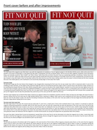
  • 1. Front cover before and after improvements Masthead The mast head of the magazine was titled what it was with the imagination of somebody of that of regional saying it in the Northern British accent, while at the same time I wanted it to be that of memorable in a way which the title itself is motivational, this was an element which I did not see any other magazine companies of the same genre doing, such examples would be "Men's Health" and "Men's fitness" while these titles are direct they don’t have you questioning anything at all whereas I believe that a title such as "Fit not quit" makes the viewer think every time about quitting instead they think about working out, the design of the front covers masthead that surrounds the title was created in a way that makes it clear for the viewer while at the same time the use of the colour red was used to cause the viewer to think of blood and the heart meaning that even if the viewer glances at the masthead for one second they already begin to think about their health. Dominant image The dominant image was the main feature that changed or was changed when improving the front cover the rest was simple minor shifts in movements when it came to the modifying of other elements, on the subject of the improved image the reason for this being the dominant image is when it overall come to the dominant image I wanted it to be something that showed influence from other official companies (when it came to the pose of the model) however I wanted it to at the same time look regional and at the same time look as though it was not made to be published worldwide, to achieve this look I simply asked the model to come in as themselves and to not where any make up or anything that would modified there look if you like, this is an aspect which I believe will appeal to the regional area as it something which will motivate them as people who pick up the magazine have the idea that potentially they could end up on the cover just like the model from the area. The front cover however has an element that makes it stand out as oppose to that of its competitors and that is the fact it does not have any sub images, the reason for this is because I believe that the front cover was of a high standard without them, meaning to a degree I didn’t want to over complicate the front cover as I believed it would have been too much for the viewer to take in for the first time being introduced to the product, at the same time I also was unable to find sub images that worked well with the dominant image without looking that of out of place. The main cover line/ cover lines The main cover line of "Turn your life around and your body with it" came from a simple point of that of the masthead where it was created in an attempt to make the magazine influential/motivational as possible, while at the same time this cover line was also created with the idea the placement of the main cover line to the left of the model was done where there was no space in use, this as a result means that I am making the most use of the space on the front cover, another reason being that I decided upon these words when it came to a cover line as well was the sense of almost brutal honest as I want the magazine to come across as real as possible, the reason being is that I believe that it is this which will speak to the viewer the most while at the same time I also believe that it is this that will almost connect with the viewers emotions the most giving the viewer the impression that the magazine is not false and the words are coming from people who are passionate about their product. The cover lines while I wanted them to also be motivational I wanted them at the same time to also be informative as to what the magazine has to other, I wrote them with the idea in mind that the magazine is almost presenting itself to somebody, almost as though the magazine wants the viewer to know not only that it has the most to offer but also that you are almost privileged if you do decide to pick it up and read it. Barcode The barcode was placed on the bottom right of the magazine in the same location of that of where official magazine companies place there's, at the same time the magazine shows a price as well as the name of the website the reason being for this was due to the magazine looking official as well as when it comes to competition giving the magazine a fair chance, the reason for the price which I have chosen for the magazine is this is the same price of that of health magazines in the UK while at the same time I believe that for where the magazine will be selling at the same time makes it that of a fair price.
  • 2. Content page before and after improvement Masthead The masthead was kept simple purposely so that the viewer instantly knew what to expect from the page while at the same time the masthead was also designed to fit in with a continues theme throughout the magazine, when it came to the influence it more or less came from the attitude what are other brands not doing in the sense it was drew to my attention that other brands didn’t have the content words as large as that of my magazine meaning unless you’ve studied media product layouts you would not know if this was a content page besides the large word at the masthead. Dominant image The dominant image was take in the same shoot as the front cover, this I believe gives the content page a strong point as it results in the content page not seeming out of place while at the same time also showing the influence from other companies, the pose was also intended to strive for not only uniques but also a sense of advertisement as well as to create curiosity in the viewers mind, in the sense it was taken with in mind that the viewer questions what the model is drinking, this as a result would lead to the viewer to read and dive more into the product to attempt to find out, at the same time I also took this photo as I wanted it to be something that pose wise that I had not seen a model do in a health magazine before. Sub headings The content page consists of seven sub headings to the left side with numbers as well as each covering a different subject, the smallest of these numbers being 10 with the largest 42, the reason being for this page number is so that it matches up to the price which I intend to charge for the product so that the viewer does not feel as though they are being ripped off and that they are getting their money's worth, at the same time I believe that this will give the magazine an officiant reputation for not ripping of its viewers, this is also the same amount of pages on average that the other magazines have to offer in terms of the health/fitness genre. The placement of the sub headings to the right side of the page was much like the front cover a position that I believed was not in a large amount of use, it was not due to influence or formula. Page number The page number was placed to the left side of the page in the bottom right corner, it shows that the page is the second one providing evidence that this is a content page, at the same time it is not large to not draw away the viewers' attention from what the page has to offer.
  • 3. Billboard before and after improvement The masthead The masthead is the same as that of the magazine in font as well as title (fit not quit) the reason being for this design decision is in an attempt to make the masthead title that of almost iconic in the sense you would recognize it anywhere you saw it and know the brands reputation, as for the location of the masthead, this is an aspect that I do not agree with however it was done to provide space for the slogan of "opening soon!" this in itself however was only done to make it more obvious to the viewer that this product is a billboard and not that of a double page spread, giving the product a dominant identity, the masthead was also placed in the high left corner, due to the dominant image, the reason being for this is I simply wanted the dominant image to receive the attention I believed it deserved, this was why I placed it in the top corner to the left side where it is not in the way of the models facial expression. Dominant image The dominant image was taken up close in the models face, and unlike that of other companies billboards my billboard does not consist of any white and at the same time uses the whole image as the billboard, the reason being for this was I wanted for my billboard to be different but not only different but also I wanted my billboard for my billboard to seem full and to not be almost ignorable if you like, at the same time I wanted for the viewer to get an idea that the billboard almost looks up to its model and wants to push them forward, this is why the whole billboard is the dominant image or made on it if you like. Essential information The essential information of this product consist of a quote by the model, the reason being that I decided to include this is it is something that I have seen multiple products do of the same genre, at the same time it is also a feature that I believed much like the magazine products would give the viewer the ability to connect with the product, at the same time I visioned the product as though somebody simply glances at the product, the aftermath of that simple glance due to the quote being the only form of writing on the page would be that it would cause the viewer to ask themselves what the models is thinking and whether or not it relates to them.
  • 4. Double page spread before and after improvement Dominant image The dominant image much like the billboard I wanted it done in a way so that you as the viewer where almost forced to look at it in the sense the double page spread is made on top of the image, at the same time the photograph itself shows a model looking into a mirror the reason for this is the meaning behind it is "self-refectory" the reason being for this is I wanted the photograph to have a metaphoric meaning behind it something that I thought and felt would give it more depth than if it had just been a photograph of a model for the simple purpose of filling in a check list if you like. On top of this I wanted to make the image as meaningful as I could as well to compete against other brands in the sense this was something I had not seen before in that of magazines in my genre, the double page spread also consist of no sub images as I did not want the attention to be drawn away from the dominant image, on top of this I also felt as though the dominant image was powerful enough on its own and as though if there was any sub images it would simply be out of place. Quote/ columns The columns on the double page spread are only consistent of quotes by the model, the reason for this is I wanted to give the viewer as much insight as possible about the model to the point they know there story and at the same time almost feel emotion themselves, to insure almost that I hinted this level of emotion I filled the double page spread with two columns to the right of them two columns is the model them self looking into a mirror. Masthead The masthead also does something that I myself believe I have not seen another double page spread do and that have a masthead that goes across the two pages, the reason being that I decided to place this at the top as well as have it as large as it is was due to the use of the pun in "mass-ter" referring to mass as in body size as oppose to that of the word "master" someone of that of control showing a level of thought put into the element. Colour scheme The colour scheme of the double page spread is that of standard the main image was not edited and was left natural as possible so that the product came across as real and not as though it was something that had been highly photoshoped and modified for the one use, I also believe that by not cropping the model out of the photo and placing them in front of a white or black background that have I challenged myself more by almost breaking the laws of tradition and working around the photo and other elements of the photograph to make it appeal. Page numbers The page numbers where placed to both corners of the page indicating that it is a double page spread being always the 3rd and 4th pages of any magazine they do not serve any other purpose than that and are simply there to indicate the viewers direction.
  • 5. Website main page Slogan/masthead The slogan as well as masthead was inspired by the way which men's health presents there slogans at the top of their website page, however unlike men's health I wanted for my website to be more memorable and almost that of humorous in the way which the slogan has an element of almost cheesiness to it, this as a result I believe will make new viewers feel almost more welcomed as they will have an impression and almost sense that this website as well as company to not take themselves so seriously. Images/background image The images used show food as well as the same model from the magazine only this time fully working out, this is to almost comfort the viewer and give them the sense that they know where they are due to the recognition that the model will receive, at the same time there is also the design aspect, the reason being I decided upon only two food images is I wanted the model to receive more attention and at the same time the theme is more fitness than it is healthy eating, there was also the idea behind this that this would be an almost treat/discovery for the viewers that do wish to acquire more knowledge than simply what the magazine has to offer, this is something that I believe other brands do wrong in the sense they do not make the viewer feel as though they are getting something out of it. On the subject however of the background image, this shows an up close of the model from the ground looking up at them working out, the reason being I thought this would be a fitting background image is the idea as well as meaning that the viewer is almost looking up to the products as well as the website, almost as though they are trying to rise to its standards giving the model a goal. Links/sub headings The sub headings above each image are designed to also be links to separate pages, the reason for the number that there is (6) is that I wanted the viewer to have plenty of knowledge to take in as well as to be under the impression that as a business as well as brand the products know what they are talking about, the easiest of ways which to insure that image for the brand is met is by including knowledge that the viewer does not know. The main links however are at the bottom they lead to the other pages of the website, the reason they are placed at the bottom is so that they do not influence the viewer to quickly view the website and then click of, if anything it’s a tactic to insure that the viewer puts time into the website and spends time on each of the pages.
  • 6. Slogan/masthead The masthead remains the same only without the slogan, this as a result leaves the page almost looking more empty at the top however at the same time I believe that this as a result give the websites main page a larger sense of identity almost acting as a form of navigation for the viewer, at the same time there is also not a need for the slogan as if the viewer has progressed beyond the main page point then they are almost already welcomed in. Images/background image The page focuses on the fitness aspect of the product, to fit with this theme the background image is that of a gym, while I feel as though the page is strong on the images aspect I do believe that perhaps the page would have benefited more from images with meaning behind them as I believe that the images lack any deep meaning with dominant power to draw the viewer in. An element of the images however is that I used some of the same images as I did that of my magazine purposely, the reason being for this is to almost tie in with what I said about the masthead in the sense it makes the viewer feel more welcomed if they are that of new. Links/sub headings The links are that of the same location of the main page however the difference here is simply in the title, what I mean by this is how unlike the main page the first sub page deals with only fitness and not the healthy eating aspect. Adverts Unlike the main website page the subpage includes that of an advert the reason for this being included was simply to add variety to the website pages, at the same time I wanted to advertise something which I believed would contribute to the viewer in the sense I wanted it be something they could use besides fitness, this as a result I believe will draw the attention of the viewer regardless if they are interested in the website or not. Social media Both of the subpages include that of social media links, placed at the bottom of the page, the reason for this placement is so that when the viewer is finished on the page and they have read it from top to bottom they see the social media links to find out that there is only more knowledge that they can gather as well as this it only sparks curiosity as to what the social media pages have to offer to the viewer. Website subpage one
  • 7. Slogan/masthead Much like the first subpage the slogan is not present, however the masthead remains the same it was decided to not be changed to remain true to the brand as well as much like the magazines masthead to make it that of recognizable/iconic if you like. Images/background image The background image shows the vegan café in the city of Sunderland, this was something which I thought was not only fitting but clever as it is not only regional but it is also making my product appeal to that of a different audience, that audience being that of vegans and vegetarians, this results in the brand bringing in a larger audience than that of those who chose to not attempt to adapt and appeal to as big as audience as possible, on top of this to almost go hand in hand with the background image the images them self's show no meat this as a result means that the website is less likely to offend members of that audience as well. Links/sub headings There is less links on this page as oppose to that of the other two pages, the reasoning for this is due to as I expressed before the theme is fitness and that the only reason I have decided to include healthy eating into the products is to appeal to that of a larger audience. Page links The pages links remain the same of that as the other two website pages in the sense there at the bottom however due to there not being as much content on this pages as oppose to that of the other two this results in the links being almost higher up if you like, at the same time this results in more of the background image being revealed to the viewer almost giving a an atmosphere of that the page is floating. Adverts The pages does not feature a full on advert like that of the other subpage however what it does include is a link to a page about the vegan café, why I would not label this as full advertisement is due to myself not labeling it as that on the page however it is advertisement in the sense it is drawing more attention to the location. Social media The page does include links to social media much like the other subpage, the links are also in the same location to keep the layout simple and easy for the viewer to follow. Website subpage two