Russian⚡ Call Girls In Sector 39 Noida✨8375860717⚡Escorts Service
Women's Health
1. Women’s Health Magazine
In 2005, the publishing company Rodale decided to make a sister version of Men’s Health
magazine and produce Women’s Health magazine. This magazine was produced so the
audience felt ‘like they are getting advice from an honest and trusted friend’
.. (2011). Magazine Analysis: Women’s Health Magazine. Available:
https://ashleynowicki.wordpress.com/2011/02/14/magazine-analysis-womens-health-magazine/
. Last accessed 10/01/18.
There are numerous different models and celebrities. In the magazine, they have used the
famous philanthropist, Katie Piper, who was attacked in 2005 by her ex-boyfriend. He purposely
threw acid on to her face causing major damage and blindness in one of her eyes. This meant
having several operations. They have used Piper to show that it doesn’t matter what you look
like, you can still wear what you want. This also shows body confidence. They made this choice
to used Katie Piper as it will increase their sales and create a greater appeal from the target
audience. The main image is very seducing as she is basically naked.
The women who read this magazine, enjoy reading it as it has everything they want in it. It has
information on how they can look better and how they can go to the gym and look good and
how to eat well. There is also a section on sexual relationships and how to stay stylish. If
women feel like they are lacking something in their life, they will most like want to read a
magazine that will pick them back up.
The demographic for this magazine is women aged 45 who are middle class and have active
families. The psychographic of this magazine is natural leaders, fashion forward, healthy and
tech-savvy as this magazine is also an app and online.
There were many disastrous issues going on in October 2018, however one thing I found
relating to this magazine piece was about the vegan junk food issue. At the bottom of the
cover, the words ‘The Truth About Vegan Junk Food’ in capitals showing there is a big issue on
this. From research, there are many articles but nothing serious enough to impact the magazine
or to change their content. After, reading an article on vegan junk food, I have found ‘63% were
females’ and ‘almost were in the 15-34 category.’
Dan Hancox. (2018). The unstoppable rise of veganism: how a fringe movement went
mainstream. Available: https://www.theguardian.com/lifeandstyle/2018/apr/01/vegans-are-
coming-millennials-health-climate-change-animal-welfare. Last accessed 10/01/18.
This could be the issues that Women’s Health magazine were going to highlight.
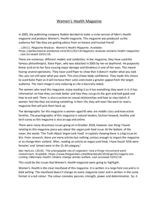
Women’s Health is the clear masthead of this magazine. It is written in a large font size and is in
bold writing. The masthead doesn’t change on every magazine cover and is written in the same
format in a red colour. The colour connotes passion, strength, power and determination. So, it
2. 2
matches the content of the magazine and represents its female target audience. In addition,
red is one of the most successful colours to encourage people to take quick decisions, so the
use of it in the masthead will contribute even more to get the reader to buy the magazine. The
main image covers a small part of the mast head but magazines like ‘Women’s Health’ can carry
out this technique and still be very well recognized and chosen by consumers because of their
huge and well-established brand identity. The use of upper-case letters and a serif style font
gives the magazine an elegant and sophisticated touch as well as making it more emphatic.
Also, the masthead is in the centre of the cover and is from edge to edge.
The slogan of the magazine fitted into the masthead, between the ‘W’ and the apostrophe. It is
a very effective one because it creates meaning. ‘We crown 2018’s tastiest healthy foods’ lets
women knows the new and latest recipes they can use to lose weight.
Lastly, the issue date is written under the masthead, on the right side of the magazine and is
extremely small because it isn’t a vital part of the design and is more formal. I believe they have
made the date and price text small as it isn’t a vital part of the design.
The main image on this Women’s Health magazine is Katie Piper who is standing with her hip
out to show off her body. This is a mid-shot to show off her figure. The image is homoerotic
imagery and she is smiling and is a non-threatening model, so they look friendly. As the
magazine is about women’s health, Katie Piper is wearing a grey sports bra and red underwear.
The colour connotation for grey is neutral and balance showing tranquility and is comfortable.
For the colour red, it connotes to strength and passion. The red underwear is showing
confidence and is perceived to be more sexually appealing than they are when wearing other
colours.
Also, the background of the magazine is white which is even more eye catching and grabs the
audience’s attention immediately. The image is in direct mode of address where Katie Piper is
looking straight at the reader, the direct address helps interact with the audience. It is carefully
picked to be something that the reader wants to be, so they can be a better version of the
reader but not so much that they are unachievable. It reinforces the idea into the readers mind
that this could be them but only if they buy this magazine.
All the cover lines are in bold in either black or red coloured text. The selling line at the top of
the magazine is advertising ‘automated orgasms’. This magazine will then be interesting for
those women that cannot orgasm as they will learn something from it to make their sex life
more fun. The colours are bold and stand out to the reader.
The pug is telling the audience that this issue is about nutrition. The cover lines are possibly
linked to Katie Piper’s injuries. Her cover line is ‘how fitness helped me reclaim my body’ which
I’m guessing this could be a while after her accident. Another of the cover lines is ‘the anti-
depression diet decoded’.
3. 3
The main sell line clearly appeals to what the target audience want. ’96 new seasons fit kit buys’
and because they have used a large number it means it will catch the attention of the reader
even more. At the bottom where the barcode is there is no website address as Women’s Health
is such a well-known magazine and has such a large brand identity that it is always in the back
of the target audience’s mind and even in the readers who are not regular buyers.
I have chosen a double page spread from the same magazine which is all about fitness. They
have given different types of exercises that women can do. The mast head is all in capitals and
‘get’ is in bold font and in sans serif. The word ‘low’ is lower than ‘get’ in more of a feminine
colour, pink. On the other page, the model is wearing black shorts and a pink top, this carries on
with the colour scheme of the mast head. Even the model’s shoes are white and pink. When
you put two colours such as pink and black together it adds strength and sophistication to the
pink as you are combining it with a darker colour. The only other colour is at the bottom and is
green. However, I cannot read what it says but I am presuming that is about the type of
exercise that the model is doing and is explained fully for the audience. The angles they have
positioned the model are full length and waist down for the image on the main page. The
model is using a gym equipment and an exercise ball which is in a smaller image at the bottom,
this is to show how to do the exercises much better. This double page spread was created on
21st February and is all about sports and fitness. The sports model is called Katie and the
photographer is called Ty Milford. He is a well-known photographer who takes photographs of
news, cars, motion and more. This double page spread is positive as many women may not
know how to do certain exercises so it explains to them properly. The age of this will be the
same as the magazine but might target a younger audience too that might be too scared to go
to the gym. The models face is happy and is smiling showing she is comfortable. The model is
wearing these gym clothes to show the audience that they can be comfortable wearing
whatever they want either at the gym or in general. This links back to the front cover as it’s all
about being confident about your body. The heading underneath the mast head is letting you
know that the article is about keeping injuries alright whilst exercising and without injuring
yourself more. They have also used a section title at the top of the page. This indicates for the
audience what kind of section this article is about.