Download to read offline

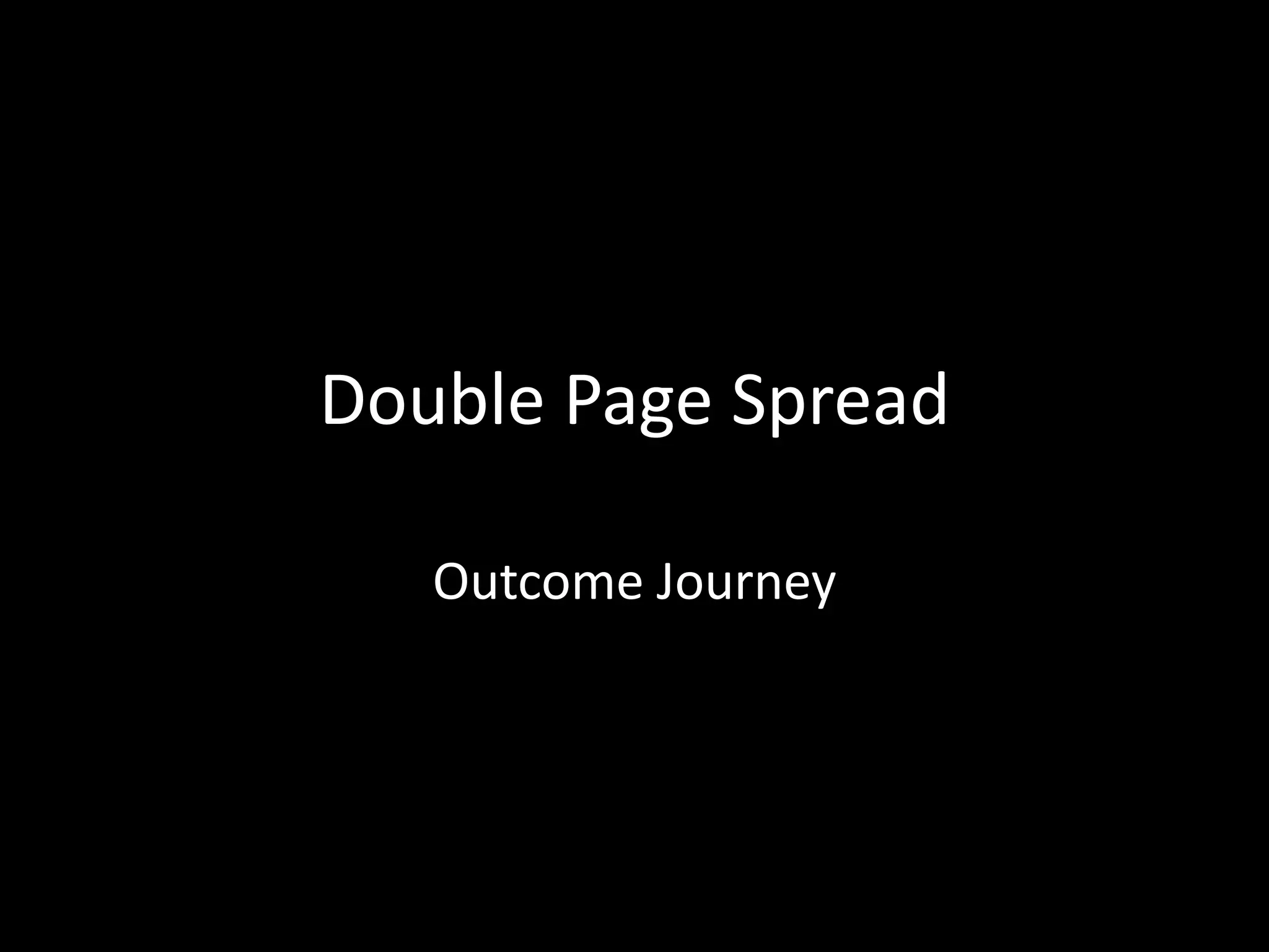
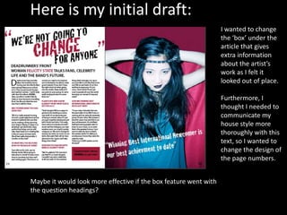
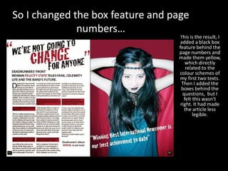
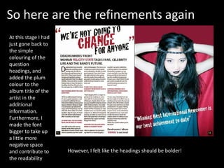
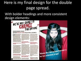

The author wanted to improve the design of a double page spread in their publication. They initially changed the box feature and page numbers to better reflect their house style. However, this made the article less readable. They then simplified the design by only coloring the question headings and adding plum color to the artist's album title. To further improve readability, they made the font bigger. In their final design, they bolded the headings and made the design elements more consistent.


