
Recommended
More Related Content
What's hot
What's hot (20)
Viewers also liked
Viewers also liked (20)
Similar to Magazine analysis 1
Similar to Magazine analysis 1 (20)
More from Shauna-Mullen
Recently uploaded
Recently uploaded (20)
Magazine analysis 1
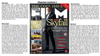
- 1. Magazine Analysis 1:Masthead: The masthead (title - ‘Total Film’) of this magazine front cover is written in a display font, making it large, bold and evident to the audience that this is the title of the magazine. This is heightened by the fact that is is the largest textual font on the page. It is written in a white font which connates with ideas of fresh, new and original, with could relate to the films that they are featuring within the magazine are all of those things. The word total is inside the ‘F’ of film, this reduces the overall size of the masthead, allowing for more sell lines to fit in. Main Sell Line: The main sell like is “Skyfall: Bond gets his swagger back” This sell line is enticing to the audience as they will be excited to see what is written about Daniel in his new role. Because the Bond series is largely watched and loved, both the image and main sell line will attract a large quantity of people to purchase the magazine. “Skyfall” is written in gold, suggesting wealth, which could relate to the idea the film is about to premier on the red carpet. Additionally, the film itself is very classy and fits in nicely with the general mise-en-scene of the front cover. Main Image: A convention of the main image on a front cover of a magazine, is to fill the frame. I think that total film have successfully achieve this, despite the image being a long shot. The actor presented on the front of the magazine is Daniel Craig, who is famous for playing the 007 agent James Bond. It is evident he is in character in this still shot, as he is wearing a suave suit, just like he would in the movie and has the prop of a gun down by his right side. His facial expression also gives this away as he is looking fairly serious. The colours of his suit is black and white, which is classic and traditional, just like the movie he is starring in. His body positioning reflects that he is confident in what he is doing, which is exactly what we would expect from an agent. It is conventional for person featuring on the front of the magazine to be presented as the character they are playing rather than the actor as it is effectively promoting the film more and will create symbiosis with the magazine front cover to the movies own promotional package. Sell-lines: Sell lines are used in order to further influence and entice an audience to purchase the magazine. In this particular edition of Total Film, the sell lines are placed in the bottom right hand corner, making them the last thing the audience see. Well known and popular actors such as ‘Ben Affleck’ are used in order to further draw the audience in. Additionally to this, on the right hand side of the frame, there is five feature article photo’s further enticing them to want to purchase the magazine. Above the photo’s is a sell line that says “The Ten Coolest Movies Being Made Right Now!” This will allow the audience to be aware and up to date on all the new films coming out, by having this sell line, it will make them want to read into this sell line in order to discover the other five movies being made! Another sell line that is present is “The World’s Best Movie Reviews” - in a puff on the left hand side. This suggests that the reviews that they give are accurate and the audience should trust whatever they read in this magazine. Furthermore, the puff is presented with stars, further reflecting the “review” idea and films are rated from 1-5 star.
- 2. Layout: The layout of this particular edition of Total Film has a few differences to the usual layout, such as the placement of the sell lines. Despite this, it is not the first time a layout like this has been used. I believe it is presented like this based on the image being a long shot, so there is more plain background to cover up. Nonetheless, I still believe it is effect in drawing in the audience's attention. Colours: The colours on this front cover fit in well with the James Bond theme of the magazine. Black, white, red and gold are all classy and sophisticated colours. The black and white match with the classic tux look Daniel Craig is wearing in the main image. Gold, gives connotations to wealth as well as class. The colour red can relate to the film itself, as in the premier, wear Daniel Craig himself will be in the spotlight walking down the red carpet. Lastly, the background colour is a silvery grey which looks technological and futuristic, which connotes with James Bond. Rule of Thirds: Rule of thirds is when the front cover of the magazine is further divided, which it will be into nine smaller squares - as I have present on the image to the right. As you can see Daniel Craig is positioned right in the middle of the page. This is effective as it means he is the centre of the focus of the magazine and is the thing that will draw the audience in the most. The sell lines are presented in both the left and the right third creating a clear structure for the audience to follow and making the page look more structured and attractive. The title of the magazine takes up the majority of the top third of the page, indicating its importance. Anchorage: The image is anchored by some textual features on this front cover. For example, James Bond looks cool, suave and evidently male readers would want to be like him. Examples of text that anchor these ideas is “swagger”, and “cool”. Furthermore this text is representing the idea of James Bond and is therefore anchoring the image and the film. Mode of Address: Mode of address can be described as “the ways in which relations between addressor and addressee are constructed in a text. The mode of address itself is not personal, there is not form of direct address. Suggesting that the magazine does not need this type of relationship to draw readers in, they are already. However, the language used can be described as colloquial as “slang” words are used such as “cool” and “swagger” this also suggests a young audience who will be familiar with these terms. Overall, the general conventions of magazine front covers are followed. All aspect that you would expect to see are shown for example; a masthead, a main image, feature article photos, a main sell line and sell lines.