Download as PDF, PPTX


![Getting Started
<!DOCTYPE html>
<html lang="en">
<head>
<meta charset="utf-8">
<meta http-equiv="X-UA-Compatible" content="IE=edge">
<meta name="viewport" content="width=device-width, initial-scale=1">
<!-- The above 3 meta tags *must* come first in the head; any other head content must come *after* these tags -->
<!-- Bootstrap -->
<link href="css/bootstrap.min.css" rel="stylesheet">
<!-- HTML5 shim and Respond.js for IE8 support of HTML5 elements and media queries -->
<!-- WARNING: Respond.js doesn't work if you view the page via file:// -->
<!--[if lt IE 9]> <script src="https://oss.maxcdn.com/html5shiv/3.7.2/html5shiv.min.js"></script>
<script src="https://oss.maxcdn.com/respond/1.4.2/respond.min.js"></script> <![endif]-->
</head>
<body>
<h1>Hello, world!</h1> <!-- jQuery (necessary for Bootstrap's JavaScript plugins) -->
<script src="https://ajax.googleapis.com/ajax/libs/jquery/1.11.3/jquery.min.js"></script>
<!-- Include all compiled plugins (below), or include individual files as needed --> <script
src="js/bootstrap.min.js"></script>
</body>
</html>
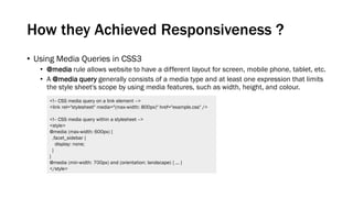
Take the latest version of IE, and don’t make us cry.
Render the content acc. to physical width of device.
At first load no zoom. Enable zooming using “user-
scalable” , “maximum-scale”.](https://image.slidesharecdn.com/bootstrap-150705164322-lva1-app6892/85/Bootstrap-5-320.jpg)
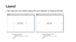
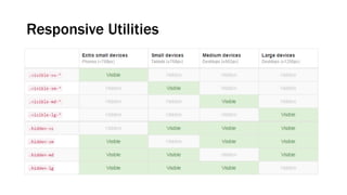
![Grid System
1. Extra small devices - Phones (<768px) - .col-xs-[num]
2. Small devices - Tablets (≥768px) - .col-sm-[num]
3. Medium devices - Desktops (≥992px) - .col-md-[num]
4. Large devices - Desktops (≥1200px)- .col-lg-[num]](https://image.slidesharecdn.com/bootstrap-150705164322-lva1-app6892/85/Bootstrap-6-320.jpg)
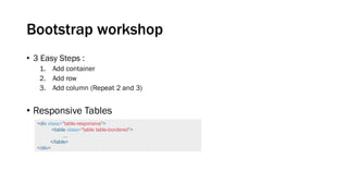

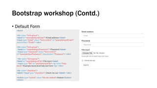
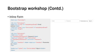


This document provides an overview of Bootstrap, a popular front-end framework for building responsive and mobile-first websites. It discusses how Bootstrap uses media queries and a mobile-first approach to achieve responsiveness across different devices. The document also covers getting started with Bootstrap, its grid system, layouts, forms, and workshops for using Bootstrap components. Finally, it lists some advantages and disadvantages of Bootstrap as well as resources for using and customizing it.


![[InDMF 2013] Indra Purnama - Incubator Role in Startup Industry](https://cdn.slidesharecdn.com/ss_thumbnails/indrapurnama-incubatorroleinstartupindustry-131202010747-phpapp01-thumbnail.jpg?width=640&height=640&fit=bounds)