Linking chart from excel with power point
•Download as DOCX, PDF•
2 likes•272 views

The compilation shows the steps by steps on how work like chart, lines, surfaces and tables from excel can be linked with power point.

Recommended
More Related Content
What's hot
What's hot (20)
Similar to Linking chart from excel with power point
Similar to Linking chart from excel with power point (20)
Recently uploaded
Recently uploaded (20)
Linking chart from excel with power point
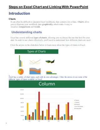
- 1. Steps on Excel Chart and Linking With PowerPoint Introduction Charts It can often be difficult to interpret Excel workbooks that contain a lot of data. Charts allow you to illustrate your workbook data graphically, which make it easy to visualize comparisons and trends. Understanding charts Excel has several different types of charts, allowing you to choose the one that best fits your data. In order to use charts effectively, you'll need to understand how different charts are used. Click the arrows in the slideshow below to learn more about the types of charts in Excel. Excel has a variety of chart types, each with its own advantages. Click the arrows to see some of the different types of charts available in Excel.
- 2.
- 3.
- 4. In addition to chart types, you'll need to understand how to read a chart. Charts contain several different elements, or parts, that can help you interpret the data. Click the buttons in the interactive below to learn about the different parts of a chart. To insert a chart: 1. Select the cells you want to chart, including the column titles and row labels. These cells will be the source data for the chart. In our example, we'll select cells A1:F6.
- 5. 2. From the Insert tab, click the desired Chart command. In our example, we'll select Column. 3. Choose the desired chart type from the drop-down menu. 4. The selectedchart will be inserted in the worksheet.
- 6. If you're not sure which type of chart to use, the Recommended Charts command will suggest several different charts based on the source data. Chart layout and style After inserting a chart, there are several things you may want to change about the way your data is displayed. It's easy to edit a chart's layout and style from the Design tab. Excel allows you to add chart elements—such as chart titles, legends, and data labels—to make your chart easier to read. To add a chart element, click the Add Chart Element command on the Design tab, then choose the desired element from the drop-down menu.
- 7. To edit a chart element, like a chart title, simply double-click the placeholder and begin typing. If you don't want to add chart elements individually, you can use one of Excel's predefined layouts. Simply click the Quick Layout command, then choose the desired layout from the drop-down menu.
- 8. Excel also includes several different chart styles, which allow you to quickly modify the look and feel of your chart. To change the chart style, select the desiredstyle from the Chart styles group. You can also use the chart formatting shortcut buttons to quickly add chart elements, change the chart style, and filter the chart data.
- 9. Other chart options There are many other ways to customize and organize your charts. For example, Excel allows you to rearrange a chart's data, change the chart type, and even move the chart to a different location in the workbook. To switch row and column data: Sometimes you may want to change the way charts group your data. For example, in the chart below, the Book Sales data are grouped by year, with columns for each genre. However, we could switch the rows and columns so the chart will group the data by genre, with columns for each year. In both cases, the chart contains the same data—it's just organized differently.
- 10. 1. Select the chart you want to modify. 2. From the Design tab, select the Switch Row/Column command. 3. The rows and columns will be switched. In our example, the data is now grouped by genre, with columns for each year. To change the chart type: If you find that your data isn't well suited to a certain chart, it's easy to switch to a new chart type. In our example, we'll change our chart from a Column chart to a Line chart. 1. From the Design tab, click the Change Chart Type command. 2. The Change Chart Type dialog box will appear. Select a new chart type and layout, then click OK. In our example, we'll choose a Line chart.
- 11. 3. The selectedchart type will appear. In our example, the line chart makes it easier to see trends in the sales data over time. To move a chart: Whenever you insert a new chart, it will appear as an object on the same worksheet that contains its source data. Alternatively, you can move the chart to a new worksheet to help keep your data organized. 1. Select the chart you want to move. 2. Click the Design tab, and then select the Move Chart command.
- 12. 3. The Move Chart dialog box will appear. Select the desiredlocation for the chart. In our example, we'll choose to move it to a New sheet, which will create a new worksheet. 4. Click OK. 5. The chart will appear in the selected location. In our example, the chart now appears on a new worksheet.
- 13. Challenge! 1. Open an existing Excel workbook. 2. Use worksheet data to create a chart. If you are using the example, use the cell range A1:F6 as the source data for the chart. 3. Change the chart layout. If you are using the example, select Layout 8. 4. Apply a chart style. 5. Move the chart. If you are using the example, move the chart to a new worksheet named Book Sales Data: 2008-2012. How to Link Excel chart in PowerPoint2010 Applies To: PowerPoint 2010 You can insert and link a chart from an Excel workbook into your PowerPoint presentation. When you edit the data in the spreadsheet, the chart on the PowerPoint slide can be easily updated. To insert a linked Excel chart in PowerPoint 2010, do the following: 1. Open the Excel workbook that has the chart that you want. NOTES: o The workbook must be saved before the chart data can be linked in the PowerPoint file. o If you move the Excel file to another folder, the link between the chart in the PowerPoint presentation and the data in the Excel spreadsheet breaks. 2. Select the chart. 3. On the Home tab, in the Clipboard group, click Copy 4. Open the PowerPoint presentation that you want and select the slide that you want to insert the chart into. 5. On the Home tab, in the Clipboard group, click the arrow below Paste, and then do one of the following: o If you want the chart to keep its look and appearance from the Excel file, select Keep Source Formatting & Link Data . o If you want the chart to use the look and appearance of the PowerPoint presentation, select Use Destination Theme & Link Data . TIP: When you want to update the data in the PowerPoint file, select the chart, and then under Chart Tools, on the Design tab, in the Data group, click Refresh Data.
- 14. How to Change the data in an existing chart Applies To: PowerPoint 2010 If your PowerPoint 2010 presentation contains a chart, you can edit the chart data directly in PowerPoint, whether the chart is embedded in or linked to your presentation. Also, you can update or refresh the data in a linked chart without having to go to the program in which you created the chart 1. On the slide, select the chart that you want to change. The green Chart Tools contextual tab appears at the top of the PowerPoint window. If you do not see the Chart Tools tab or the Design tab under it, make sure that you click the chart to select it. NOTE: The Design tab under Chart Tools is not the same as the default Design tab in PowerPoint. The Chart Tools tab appears only when a chart is selected, and the Design, Layout and Format tabs under it provide different commands that relate only to the selected chart. 2. Do one of the following: 3. To edit an embedded chart (created in PowerPoint using the Insert Chart command): 4. Under Chart Tools, on the Design tab, in the Data group, click Edit Data. Microsoft Excel opens in a new window and displays the worksheet for the selected chart. 5. In the Excel worksheet, click the cell that contains the title or the data that you want to change, and then enter the new information. 6. Close the Excel file. PowerPoint refreshes and saves the chart automatically. 7. To edit a linked chart (created in another program and copied into PowerPoint): 8. Make changes to the chart data in the spreadsheet program in which it was created. 9. In PowerPoint, under Chart Tools, on the Design tab, in the Data group, click Refresh Data.