
Recommended
More Related Content
What's hot
What's hot (20)
Similar to Typography
Similar to Typography (20)
Recently uploaded
Recently uploaded (20)
Typography
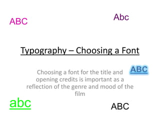
- 1. Typography – Choosing a Font Choosing a font for the title and opening credits is important as a reflection of the genre and mood of the film ABC abc Abc ABC
- 2. Use of Font in Film • Choosing a font for the title and opening credits is important as a reflection of the genre and mood of the film. • It is also good to consider how much you want the words to stand out, or if it is best they blend in. Psycho (1960): The font chosen for this film works with the bluntness of the title, because it is in capitals, and white is stands out against the background. The Runaways (2010): Because the movie is set in the 70’s the font reflects the typography commonly used at that time. It is slightly italic which suggests movement (linking with the title) and the red color suggests action of the film
- 3. Font Analysis for Crime/Thriller Genres: Inception (2010): The font here is quite serious – rounded and small so it is easy to read Black Swan (2010): In comparison, the font used for this film is more sophisticated and feminine, reflecting on the themes of the movie, such as ballet. Both titles are a white font standing out against a black background which looks very bold and dramatic. This gives little away about the content of the movie, which is a typical convention of thrillers as you want the audience to be intrigued and gripped when they see it.
- 4. Possible Font Options • INQUISITION - Avenir Next Condensed Regular • INQUISITION - Century Gothic • INQUISITION - Birch Std • INQUISITION - Copperplate • INQUISITION - Orator Std
- 5. Final Font Choice • The final font we chose to use was Birch Std because we thought it looked like a font typical of mystery and crime and looked the best with our title name. • We took inspiration from the other movie titles we looked at and decided to use a white font on a black background as this adds drama and tension. • The white font also works with the credits, as a lot of our scenes are quite dark, so when laid on top, the words stand out.