Download to read offline
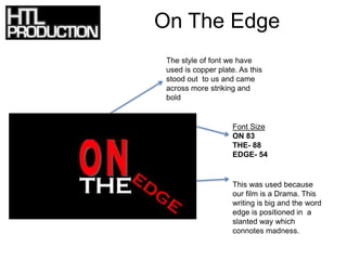

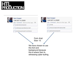

The document discusses the font choices for different sections of a film production. Copperplate font was used for the title "On The Edge" because it is striking and bold, fitting for a drama film. The words are in different sizes to connote madness. Arial font in size 16 was used for the text "I AM NOT A LOSER" to make it stand out and convey the main character's struggles. Arial font in size 12 with a Facebook background was used for the credits and scenes of cyber bullying on social media.


